Dimensionality Reduction, Animated

Sep 10, 2024 • 27 min read.
Understanding your data is key in any data science project. Visualization is useful for this, but can be challenging when the data has a high dimensionality. This includes complex data such as text, images, and sensor measurements. You could create a scatter plot matrix, but this can only show how any two features interact and fails to capture structure across many dimensions.
There’s an entire subfield within machine learning concerned with exactly this challenge: dimensionality reduction. Dimensionality reduction algorithms can help you gain insight into your high-dimensional data and reveal whether there’s any structure. The current state-of-the-art dimensionality reduction algorithm is UMAP, which stands for Uniform Manifold Approximation and Projection for Dimension Reduction.
In this post we’re going to apply UMAP to the MNIST dataset, a collection of 70,000 handwritten digits. Each digit is an image of 28 by 28 grayscale pixels, making the dimensionality of the dataset 784. UMAP will embed this dataset into two dimensions, allowing us to understand its structure.
To be honest, the MNIST dataset is already used way too often in machine learning demos, including those about UMAP. What’s done less often, is look at how UMAP creates an embedding, by visualizing the intermediate results at every step (also known as an epoch).
Result
The result is an animation where each frame is an epoch. On the right are random samples of each digit, to give us an idea of how all the variations look like and to serve as a legend.
There are a couple of interesting things to note:
- UMAP has a decent embedding already after a couple of epochs.
- The long shape of cluster “1” is probably because the way a “1” is written, depends mostly on the angle. Other digits have more degrees of freedom.
- The clusters “3”, “5”, “8” are close together. Probably because they’re often confused.
- The same can be said for clusters “4”, “7”, and “9”.
- Towards the end of the optimization the noisiness is reduced.
Applying UMAP
The notebook prepare.ipynb applies UMAP and prepares the data necessary to generate the visualizations and animations. It creates two files: data/digits.parquet and data/epochs.parquet. Because these two files are already present in the repository, you don’t necessarily need to run this notebook.
from plotnine import *
import polars as pl

from util import combine_plots

pl.Config.set_tbl_cols(10);
Understanding handwritten digits as high-dimensional vectors
Machine learning algorithms, such as UMAP, assume that each row is a data point.
That means that one hand-written digit is a row of 784 values, in other words, a high-dimensional vector.
The values, by the way, vary from 0 to 255 to represent the amount of ink.
Here’s a portion of the very wide DataFrame df_digits.
df_digits = pl.read_parquet("data/digits.parquet")
df_digits| pixel1 | pixel2 | pixel3 | pixel4 | pixel5 | … | pixel781 | pixel782 | pixel783 | pixel784 | digit |
|---|---|---|---|---|---|---|---|---|---|---|
| i64 | i64 | i64 | i64 | i64 | … | i64 | i64 | i64 | i64 | cat |
| 0 | 0 | 0 | 0 | 0 | … | 0 | 0 | 0 | 0 | "5" |
| 0 | 0 | 0 | 0 | 0 | … | 0 | 0 | 0 | 0 | "0" |
| 0 | 0 | 0 | 0 | 0 | … | 0 | 0 | 0 | 0 | "4" |
| 0 | 0 | 0 | 0 | 0 | … | 0 | 0 | 0 | 0 | "1" |
| 0 | 0 | 0 | 0 | 0 | … | 0 | 0 | 0 | 0 | "9" |
| … | … | … | … | … | … | … | … | … | … | … |
| 0 | 0 | 0 | 0 | 0 | … | 0 | 0 | 0 | 0 | "8" |
| 0 | 0 | 0 | 0 | 0 | … | 0 | 0 | 0 | 0 | "9" |
| 0 | 0 | 0 | 0 | 0 | … | 0 | 0 | 0 | 0 | "6" |
| 0 | 0 | 0 | 0 | 0 | … | 0 | 0 | 0 | 0 | "7" |
| 0 | 0 | 0 | 0 | 0 | … | 0 | 0 | 0 | 0 | "1" |
Our goal is to reduce the dimensionality from 784 to 2, so that we can create a scatter plot.
Plot digits
To better understanding what the handwritten digits actually look like, we can visualize them using Plotnine.
For this, we need to wrangle a wide row into a long DataFrame of x and y values.
def get_pixels(df_, seed=None):
    if seed is not None:
        pl.set_random_seed(seed)

    return (
        df_
        .with_row_index()
        .with_columns(pl.col("index").shuffle())
        .sort("index")
        .group_by("digit").first()
        .drop("index")
        .unpivot(index=["digit"])
        .with_columns(pixel=pl.col("variable").str.strip_prefix("pixel").cast(pl.UInt16))
        .with_columns(x=(pl.col("pixel")-1) % 28,
                      y=27-(pl.col("pixel")-1) // 28)
        .drop("variable", "pixel")
    )
Here’s what the result looks like for a hand-written “7”:
df_pixels = get_pixels(df_digits, seed=42)
df_pixels.filter(pl.col("digit") == "7")| digit | value | x | y |
|---|---|---|---|
| cat | i64 | u16 | u16 |
| "7" | 0 | 0 | 27 |
| "7" | 0 | 1 | 27 |
| "7" | 0 | 2 | 27 |
| "7" | 0 | 3 | 27 |
| "7" | 0 | 4 | 27 |
| … | … | … | … |
| "7" | 0 | 23 | 0 |
| "7" | 0 | 24 | 0 |
| "7" | 0 | 25 | 0 |
| "7" | 0 | 26 | 0 |
| "7" | 0 | 27 | 0 |
If we make this long DataFrame square, and squint our eyes, we can actually see a “7”:
with pl.Config(tbl_rows=30, tbl_cols=30):
display(df_pixels.filter(pl.col("digit") == "7").pivot("x", values="value"))| digit | y | 0 | 1 | 2 | 3 | 4 | 5 | 6 | 7 | 8 | 9 | 10 | 11 | 12 | 13 | 14 | 15 | 16 | 17 | 18 | 19 | 20 | 21 | 22 | 23 | 24 | 25 | 26 | 27 |
|---|---|---|---|---|---|---|---|---|---|---|---|---|---|---|---|---|---|---|---|---|---|---|---|---|---|---|---|---|---|
| cat | u16 | i64 | i64 | i64 | i64 | i64 | i64 | i64 | i64 | i64 | i64 | i64 | i64 | i64 | i64 | i64 | i64 | i64 | i64 | i64 | i64 | i64 | i64 | i64 | i64 | i64 | i64 | i64 | i64 |
| "7" | 27 | 0 | 0 | 0 | 0 | 0 | 0 | 0 | 0 | 0 | 0 | 0 | 0 | 0 | 0 | 0 | 0 | 0 | 0 | 0 | 0 | 0 | 0 | 0 | 0 | 0 | 0 | 0 | 0 |
| "7" | 26 | 0 | 0 | 0 | 0 | 0 | 0 | 0 | 0 | 0 | 0 | 0 | 0 | 0 | 0 | 0 | 0 | 0 | 0 | 0 | 0 | 0 | 0 | 0 | 0 | 0 | 0 | 0 | 0 |
| "7" | 25 | 0 | 0 | 0 | 0 | 0 | 0 | 0 | 0 | 0 | 0 | 0 | 0 | 0 | 0 | 0 | 0 | 0 | 0 | 0 | 0 | 0 | 0 | 0 | 0 | 0 | 0 | 0 | 0 |
| "7" | 24 | 0 | 0 | 0 | 0 | 0 | 0 | 0 | 0 | 0 | 0 | 0 | 0 | 0 | 0 | 0 | 0 | 0 | 0 | 0 | 0 | 0 | 0 | 0 | 0 | 0 | 0 | 0 | 0 |
| "7" | 23 | 0 | 0 | 0 | 0 | 0 | 0 | 0 | 0 | 0 | 0 | 0 | 0 | 0 | 0 | 0 | 0 | 0 | 0 | 0 | 0 | 0 | 0 | 0 | 0 | 0 | 0 | 0 | 0 |
| "7" | 22 | 0 | 0 | 0 | 0 | 0 | 0 | 0 | 0 | 0 | 0 | 0 | 0 | 0 | 0 | 0 | 0 | 0 | 0 | 0 | 0 | 0 | 0 | 0 | 0 | 0 | 0 | 0 | 0 |
| "7" | 21 | 0 | 0 | 0 | 0 | 0 | 0 | 0 | 0 | 0 | 0 | 0 | 0 | 0 | 0 | 0 | 0 | 0 | 0 | 0 | 0 | 0 | 0 | 0 | 0 | 0 | 0 | 0 | 0 |
| "7" | 20 | 0 | 0 | 0 | 0 | 0 | 0 | 0 | 0 | 0 | 0 | 0 | 0 | 0 | 32 | 66 | 160 | 159 | 159 | 187 | 254 | 130 | 0 | 0 | 0 | 0 | 0 | 0 | 0 |
| "7" | 19 | 0 | 0 | 0 | 0 | 0 | 0 | 0 | 0 | 40 | 184 | 225 | 225 | 225 | 239 | 253 | 254 | 253 | 253 | 253 | 253 | 185 | 0 | 0 | 0 | 0 | 0 | 0 | 0 |
| "7" | 18 | 0 | 0 | 0 | 0 | 0 | 0 | 0 | 0 | 45 | 240 | 251 | 253 | 253 | 245 | 243 | 150 | 101 | 67 | 253 | 253 | 102 | 0 | 0 | 0 | 0 | 0 | 0 | 0 |
| "7" | 17 | 0 | 0 | 0 | 0 | 0 | 0 | 0 | 0 | 0 | 32 | 69 | 84 | 84 | 13 | 0 | 0 | 0 | 131 | 253 | 239 | 33 | 0 | 0 | 0 | 0 | 0 | 0 | 0 |
| "7" | 16 | 0 | 0 | 0 | 0 | 0 | 0 | 0 | 0 | 0 | 0 | 0 | 0 | 0 | 0 | 0 | 0 | 39 | 228 | 253 | 188 | 0 | 0 | 0 | 0 | 0 | 0 | 0 | 0 |
| "7" | 15 | 0 | 0 | 0 | 0 | 0 | 0 | 0 | 0 | 0 | 0 | 0 | 0 | 0 | 0 | 0 | 0 | 138 | 253 | 247 | 69 | 0 | 0 | 0 | 0 | 0 | 0 | 0 | 0 |
| "7" | 14 | 0 | 0 | 0 | 0 | 0 | 0 | 0 | 0 | 0 | 0 | 0 | 0 | 0 | 0 | 0 | 23 | 234 | 253 | 146 | 0 | 0 | 0 | 0 | 0 | 0 | 0 | 0 | 0 |
| "7" | 13 | 0 | 0 | 0 | 0 | 0 | 0 | 0 | 0 | 0 | 0 | 0 | 0 | 0 | 0 | 0 | 122 | 253 | 226 | 34 | 0 | 0 | 0 | 0 | 0 | 0 | 0 | 0 | 0 |
| "7" | 12 | 0 | 0 | 0 | 0 | 0 | 0 | 0 | 0 | 0 | 0 | 0 | 0 | 0 | 0 | 11 | 240 | 253 | 139 | 0 | 0 | 0 | 0 | 0 | 0 | 0 | 0 | 0 | 0 |
| "7" | 11 | 0 | 0 | 0 | 0 | 0 | 0 | 0 | 0 | 0 | 0 | 0 | 0 | 0 | 0 | 164 | 254 | 239 | 35 | 0 | 0 | 0 | 0 | 0 | 0 | 0 | 0 | 0 | 0 |
| "7" | 10 | 0 | 0 | 0 | 0 | 0 | 0 | 0 | 0 | 0 | 0 | 0 | 0 | 0 | 113 | 254 | 255 | 98 | 0 | 0 | 0 | 0 | 0 | 0 | 0 | 0 | 0 | 0 | 0 |
| "7" | 9 | 0 | 0 | 0 | 0 | 0 | 0 | 0 | 0 | 0 | 0 | 0 | 0 | 9 | 221 | 253 | 181 | 3 | 0 | 0 | 0 | 0 | 0 | 0 | 0 | 0 | 0 | 0 | 0 |
| "7" | 8 | 0 | 0 | 0 | 0 | 0 | 0 | 0 | 0 | 0 | 0 | 0 | 0 | 203 | 253 | 249 | 56 | 0 | 0 | 0 | 0 | 0 | 0 | 0 | 0 | 0 | 0 | 0 | 0 |
| "7" | 7 | 0 | 0 | 0 | 0 | 0 | 0 | 0 | 0 | 0 | 0 | 0 | 0 | 209 | 253 | 159 | 0 | 0 | 0 | 0 | 0 | 0 | 0 | 0 | 0 | 0 | 0 | 0 | 0 |
| "7" | 6 | 0 | 0 | 0 | 0 | 0 | 0 | 0 | 0 | 0 | 0 | 0 | 48 | 249 | 247 | 60 | 0 | 0 | 0 | 0 | 0 | 0 | 0 | 0 | 0 | 0 | 0 | 0 | 0 |
| "7" | 5 | 0 | 0 | 0 | 0 | 0 | 0 | 0 | 0 | 0 | 0 | 0 | 127 | 253 | 182 | 0 | 0 | 0 | 0 | 0 | 0 | 0 | 0 | 0 | 0 | 0 | 0 | 0 | 0 |
| "7" | 4 | 0 | 0 | 0 | 0 | 0 | 0 | 0 | 0 | 0 | 0 | 7 | 203 | 253 | 130 | 0 | 0 | 0 | 0 | 0 | 0 | 0 | 0 | 0 | 0 | 0 | 0 | 0 | 0 |
| "7" | 3 | 0 | 0 | 0 | 0 | 0 | 0 | 0 | 0 | 0 | 0 | 165 | 253 | 240 | 32 | 0 | 0 | 0 | 0 | 0 | 0 | 0 | 0 | 0 | 0 | 0 | 0 | 0 | 0 |
| "7" | 2 | 0 | 0 | 0 | 0 | 0 | 0 | 0 | 0 | 0 | 23 | 229 | 253 | 117 | 0 | 0 | 0 | 0 | 0 | 0 | 0 | 0 | 0 | 0 | 0 | 0 | 0 | 0 | 0 |
| "7" | 1 | 0 | 0 | 0 | 0 | 0 | 0 | 0 | 0 | 0 | 13 | 148 | 221 | 30 | 0 | 0 | 0 | 0 | 0 | 0 | 0 | 0 | 0 | 0 | 0 | 0 | 0 | 0 | 0 |
| "7" | 0 | 0 | 0 | 0 | 0 | 0 | 0 | 0 | 0 | 0 | 0 | 0 | 0 | 0 | 0 | 0 | 0 | 0 | 0 | 0 | 0 | 0 | 0 | 0 | 0 | 0 | 0 | 0 | 0 |
However, we have Plotnine at our disposal, so let’s use that instead.
The following function uses the geom_tile() and facet_wrap() functions.
We’re going to use it to create a legend of all 10 digits.
def plot_digits(df_, height=3):
    return (
        ggplot(df_, aes("x", "y", alpha="value", fill="digit"))
        + geom_tile()
        + coord_fixed()
        + facet_wrap("digit", ncol=2)
        + guides(alpha=guide_legend(None))
        + scale_alpha_continuous(range=(0, 1))
        + scale_fill_brewer(type="qual", palette=3)
        + theme_void()
        + theme(
            figure_size=(3, height),
            plot_background=element_rect(fill="black"),
            legend_position="none",
            strip_text=element_blank(),
        )
)plot_digits(df_pixels.filter(pl.col("digit") == "7"))
plot_digits(df_pixels, height=8)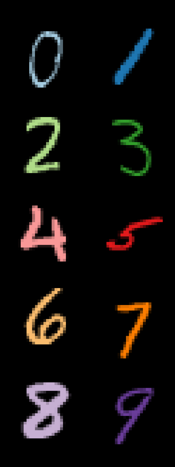
Note that we’re using an unsupervised algorithm here, meaning that UMAP doesn’t know which high-dimensional vector belongs to which digit. The coloring is only used for visualization purposes.
Plot embedding
To plot an embedding, we’re going to read the Parquet file data/epochs.parquet into a DataFrame called df_epochs.
This is a very long DataFrame containing the x and y position of each digit at every epoch.
df_epochs = pl.read_parquet("data/epochs.parquet")
df_epochs| index | x | y | digit | epoch |
|---|---|---|---|---|
| u32 | f32 | f32 | cat | u16 |
| 0 | 0.481639 | 0.526492 | "5" | 0 |
| 1 | 0.61237 | 0.573228 | "0" | 0 |
| 2 | 0.42596 | 0.636468 | "4" | 0 |
| 3 | 0.400917 | 0.414444 | "1" | 0 |
| 4 | 0.41914 | 0.602288 | "9" | 0 |
| … | … | … | … | … |
| 29995 | 0.382934 | 0.505783 | "8" | 199 |
| 29996 | 0.36772 | 0.719987 | "9" | 199 |
| 29997 | 0.826281 | 0.416917 | "6" | 199 |
| 29998 | 0.207882 | 0.718433 | "7" | 199 |
| 29999 | 0.1964 | 0.368493 | "1" | 199 |
From the 60,000 available digits, we use 30,000 of them. We let UMAP optimize for 200 epochs. This is to keep the final animation below 10MB so that GitHub can include it in the README.
num_digits = df_epochs.select(pl.col("index").max()).item() + 1
num_epochs = df_epochs.select(pl.col("epoch").max()).item() + 1
The following function creates a scatter plot using the geom_point() function.
The max_epoch argument is used to add a progress bar (using the annotate() function) underneath the title.
The majority of the code is responsible for styling the plot.
The legend argument is set to False when we combine the scatter plot with the visualizations of the digits show above.
The dpi argument is only used to create the small image at the beginning of this notebook.
def plot_embedding(df_, epoch, max_epochs, legend=True, dpi=100):
    df_ = (df_.filter(pl.col("epoch") == epoch))

    frame = (
        ggplot(df_, aes("x", "y", color="digit"))
        + geom_point(size=0.04, alpha=1)
        + annotate("segment", x=0, y=1.05, xend=epoch/max_epochs, yend=1.05,
                   color="white", size=1)
        + guides(colour=guide_legend(override_aes={"size": 5, "alpha": 1}))
        + scale_color_brewer(type="qual", palette=3)
        + scale_x_continuous(limits=(0, 1), expand=(0, 0.001, 0, 0.001))
        + scale_y_continuous(limits=(0, 1.06), expand=(0, 0.01, 0, 0.01))
        + labs(title="MNIST data embedded into two dimensions by UMAP",
               subtitle="Each point is a handwritten digit")
        + theme_void(base_size=16, base_family="Futura")
        + theme(
            text=element_text(color="white"),
            plot_title=element_text(ha="left"),
            plot_caption=element_text(ha="left"),
            axis_title=element_blank(),
            axis_text=element_blank(),
            plot_margin=0.05,
            plot_background=element_rect(fill="black"),
            figure_size=(8, 8),
            dpi=dpi
        )
    )

    if legend:
        frame += theme(
            legend_position=(1, 0),
            legend_direction='horizontal',
            legend_title=element_blank(),
        )
    else:
         frame += theme(legend_position="none")
    return frame
# Create a small image to add to the beginning of this notebook
plot_embedding(df_epochs, num_epochs-1, num_epochs, legend=True, dpi=50).save("images/intro.png", verbose=False)Initial embedding
UMAP begins by constructing a weighted k-nearest neighbor graph from the high-dimensional data. It then performs spectral embedding, which involves computing the eigenvectors of the graph Laplacian. This step provides an initial low-dimensional representation of the data.
plot_embedding(df_epochs, 0, num_epochs)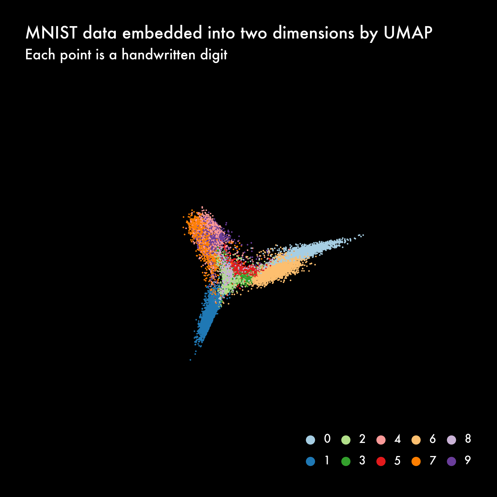
Intermediate embeddings
After the spectral embedding, UMAP refines the embedding using a non-linear optimization technique. It minimizes a cross-entropy loss function that aligns the high-dimensional data structure with the low-dimensional representation. This optimization is done using stochastic gradient descent.
plot_embedding(df_epochs, num_epochs//4, num_epochs)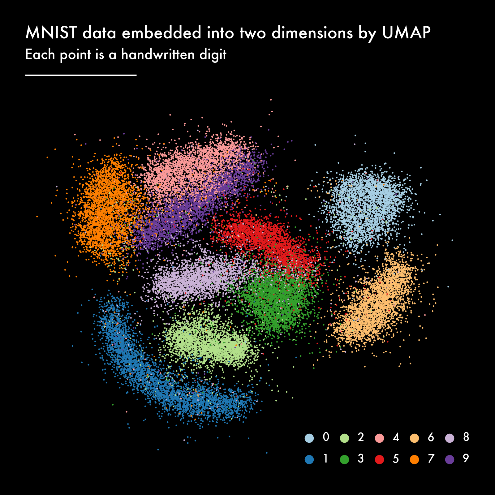
Final embedding
As the optimization progresses, the algorithm approaches a local minimum of the loss function. The gradients of the loss function become smaller, leading to smaller updates to the embeddings. This is a natural part of gradient-based optimization processes, where convergence typically slows as the solution nears the optimum.
plot_embedding(df_epochs, num_epochs-1, num_epochs)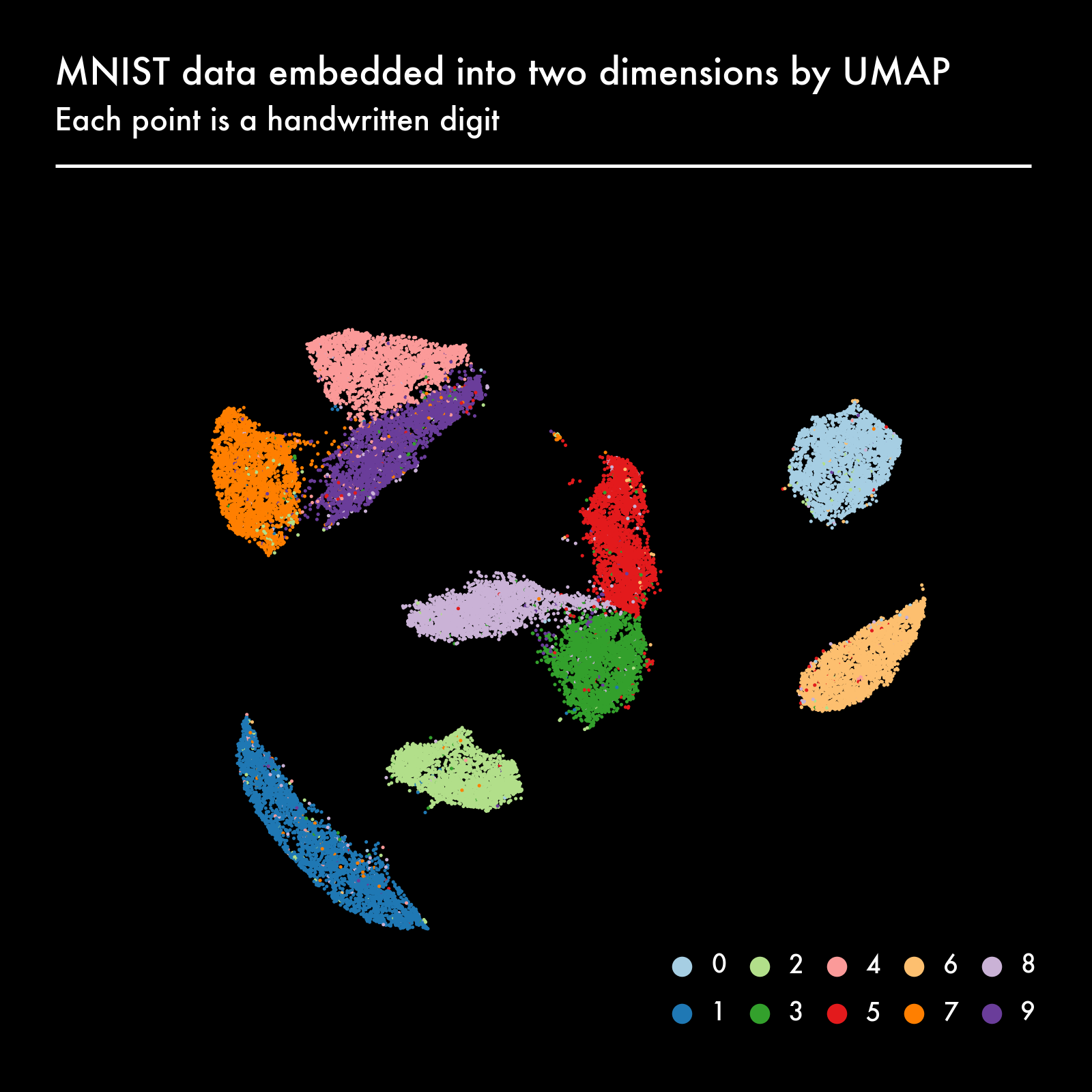
Combine the embedding and the legend into one picture
We use the function combine_plots() from util.py to put the embedding and the legend next to each other.
combine_plots([
    plot_embedding(df_epochs, num_epochs-1, num_epochs, legend=False),
    plot_digits(get_pixels(df_digits, seed=42), height=8)
], "images/combined.png", orientation="horizontal")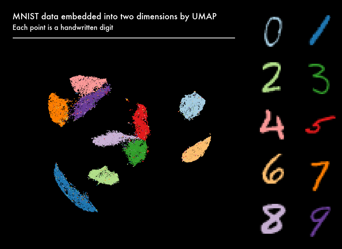
Animate
To create the animation, we first generate all the frames as individual PNG files.
for i in range(num_epochs):
    combine_plots([
        plot_embedding(df_epochs, i, num_epochs, legend=False),
        plot_digits(get_pixels(df_digits), height=8)
    ], f"frames/combined-{i:06}.png", orientation="horizontal")
We then use ffmpeg to stitch the 200 PNG files into an MP4 movie.
(Plotnine offers a PlotnineAnimation class to animate ggplot objects, but at the time of writing it had some issues.) Note that Plotnine uses matplotlib under the hood, which, in turn, uses ffmpeg to create animations.
The most important argument is -i, which specifies the PNG files. The arguments -pix_fmt, -vcodec, and -crf define the video encoding and compression. The argument -y causes ffmpeg to override existing files.
%%bash
ffmpeg \
  -i frames/combined-%06d.png \
  -framerate 30 \
  -pix_fmt yuv420p \
  -vcodec libx264 \
  -crf 22 \
  -y \
  -loglevel error \
  movies/umap.mp4
Final result
Conclusion
There are a couple of interesting things to note about this animation:
- UMAP has a decent embedding already after a couple of epochs.
- The long shape of cluster “1” is probably because the way a “1” is written, depends mostly on the angle. Other digits have more degrees of freedom.
- The clusters “3”, “5”, “8” are close together. Probably because they’re often confused.
- The same can be said for clusters “4”, “7”, and “9”.
- Towards the end of the optimization the noisiness is reduced.
This animation suggests that visualizing and animating intermediate results of otherwise complicated algorithms can help us understand them. They can be complementary to the math and the implementation of the algorithms.
References
- GitHub repository
- UMAP
- Forked version of UMAP that saves intermediate embeddings
- MNIST Database
- ffmpeg
Would you like to receive an email whenever I have a new blog post, organize an event, or have an important announcement to make? Sign up to my newsletter: