Plotnine: Grammar of Graphics for Python

Jul 7, 2024 • 93 min read.
- Upgrade to Plotnine version 0.13.6 (from version 0.6.0)
- Use Polars 1.0 instead of Pandas (I’m coindicentally writing the chapter “From Pandas to Polars” at the moment.)
- Wrap long expressions in parentheses and break them before the plus operator (to conform to PEP8)
The original version of this post is still available if you’re interested.
Preface
Plotnine is a data visualisation package for Python based on the grammar of graphics, created by Hassan Kibirige. Its API is similar to ggplot2, a widely successful R package by Hadley Wickham and others.[1]
I’m a staunch proponent of ggplot2. The underlying grammar of graphics is accompanied by a consistent API that allows you to quickly and iteratively create different types of beautiful data visualisations while rarely having to consult the documentation. A welcoming set of properties when doing exploratory data analysis.
I must admit that I haven’t tried every data visualisation package there is for Python, but when it comes to the most popular ones, I personally find them either convenient but limited (pandas), flexible but complicated (matplotlib), or beautiful but inconsistent (seaborn). Your mileage may vary. plotnine, on the other hand, shows a lot of promise. I estimate it currently has a 95% coverage of ggplot2’s functionality, and it’s still actively being developed. All in all, as someone who uses both R and Python, I’m very pleased to be able to transfer my ggplot2 knowledge to the Python ecosystem.
I figured that plotnine could use a good tutorial so that perhaps more Pythonistas would give this package a shot. Instead of writing one from scratch, I turned to the, in my opinion, best free tutorial for ggplot2: R for Data Science by Hadley Wickham and Garrett Grolemund, published by O’Reilly Media in 2016.
All I had to do was translate[2] the visualization chapters (chapter 3 and 28) from R and ggplot2 to Python and plotnine. I would like to thank Hadley, Garrett, and O’Reilly Media, for granting me permission to do so. Translating an existing text is quicker than writing a new one, and has the benefit that it becomes possible to compare both the syntax and coverage of plotnine to ggplot2.
However, while quicker, translating is not always straightforward. I have tried to change as little as possible to the original text while making sure that the text and the code are still in sync. In case any errors or falsehoods have been introduced due to translation, then I’m the one to blame. For example, to the best of my knowledge, neither authors have made any claims about plotnine. If you find such an error and think it is fixable, then it would be greatly appreciated if you’d let me know by creating an issue on Github. Thank you. The section numbers in this tutorial link back to the corresponding section of the original text, in case you want to compare them.[3] Only this preface and the few footnotes scattered among the text are entirely mine.
Without further ado, let’s start learning about plotnine!
Cheers,
Jeroen
3 Data visualisation
3.1 Introduction
“The simple graph has brought more information to the data analyst’s mind than any other device.” — John Tukey
This tutorial will teach you how to visualise your data using plotnine. Python has many packages for making graphs, but plotnine is one of the most elegant and most versatile. plotnine implements the grammar of graphics, a coherent system for describing and building graphs. With plotnine, you can do more faster by learning one system and applying it in many places.
If you’d like to learn more about the theoretical underpinnings of plotnine before you start, I’d recommend reading The Layered Grammar of Graphics.
3.1.1 Prerequisites
This tutorial focusses on plotnine. We’ll also use a little bit of Polars and numpy for data manipulation. To access the datasets, help pages, and functions that we will use in this tutorial, import[4] the necessary packages by running this code:
from plotnine import *
from plotnine import data

import polars as pl
import numpy as np
If you run this code and get the error message ModuleNotFoundError: No module named '...', you’ll need to first install it, then run the code once again.
! pip install 'plotnine[all]' 'polars[all]'You only need to install a package once, but you need to import it every time you run your script or (re)start the kernel.
3.2 First steps
Let’s use our first graph to answer a question: Do cars with big engines use more fuel than cars with small engines? You probably already have an answer, but try to make your answer precise. What does the relationship between engine size and fuel efficiency look like? Is it positive? Negative? Linear? Nonlinear?
3.2.1 The mpg DataFrame
You can test your answer with the mpg DataFrame found in plotnine.data. A DataFrame is a rectangular collection of variables (in the columns) and observations (in the rows). mpg contains observations collected by the US Environmental Protection Agency on 38 models of car.
mpg = pl.from_pandas(data.mpg)
mpg
shape: (234, 11)
┌──────────────┬────────┬───────┬──────┬───┬─────┬─────┬─────┬─────────┐
│ manufacturer ┆ model ┆ displ ┆ year ┆ … ┆ cty ┆ hwy ┆ fl ┆ class │
│ --- ┆ --- ┆ --- ┆ --- ┆ ┆ --- ┆ --- ┆ --- ┆ --- │
│ cat ┆ cat ┆ f64 ┆ i64 ┆ ┆ i64 ┆ i64 ┆ cat ┆ cat │
╞══════════════╪════════╪═══════╪══════╪═══╪═════╪═════╪═════╪═════════╡
│ audi ┆ a4 ┆ 1.8 ┆ 1999 ┆ … ┆ 18 ┆ 29 ┆ p ┆ compact │
│ audi ┆ a4 ┆ 1.8 ┆ 1999 ┆ … ┆ 21 ┆ 29 ┆ p ┆ compact │
│ audi ┆ a4 ┆ 2.0 ┆ 2008 ┆ … ┆ 20 ┆ 31 ┆ p ┆ compact │
│ audi ┆ a4 ┆ 2.0 ┆ 2008 ┆ … ┆ 21 ┆ 30 ┆ p ┆ compact │
│ audi ┆ a4 ┆ 2.8 ┆ 1999 ┆ … ┆ 16 ┆ 26 ┆ p ┆ compact │
│ … ┆ … ┆ … ┆ … ┆ … ┆ … ┆ … ┆ … ┆ … │
│ volkswagen ┆ passat ┆ 2.0 ┆ 2008 ┆ … ┆ 19 ┆ 28 ┆ p ┆ midsize │
│ volkswagen ┆ passat ┆ 2.0 ┆ 2008 ┆ … ┆ 21 ┆ 29 ┆ p ┆ midsize │
│ volkswagen ┆ passat ┆ 2.8 ┆ 1999 ┆ … ┆ 16 ┆ 26 ┆ p ┆ midsize │
│ volkswagen ┆ passat ┆ 2.8 ┆ 1999 ┆ … ┆ 18 ┆ 26 ┆ p ┆ midsize │
│ volkswagen ┆ passat ┆ 3.6 ┆ 2008 ┆ … ┆ 17 ┆ 26 ┆ p ┆ midsize │
└──────────────┴────────┴───────┴──────┴───┴─────┴─────┴─────┴─────────┘Among the variables in mpg are:
-
displ, a car’s engine size, in litres. -
hwy, a car’s fuel efficiency on the highway, in miles per gallon (mpg). A car with a low fuel efficiency consumes more fuel than a car with a high fuel efficiency when they travel the same distance.
To learn more about mpg, open its help page by running ?mpg.
3.2.2 Creating a ggplot
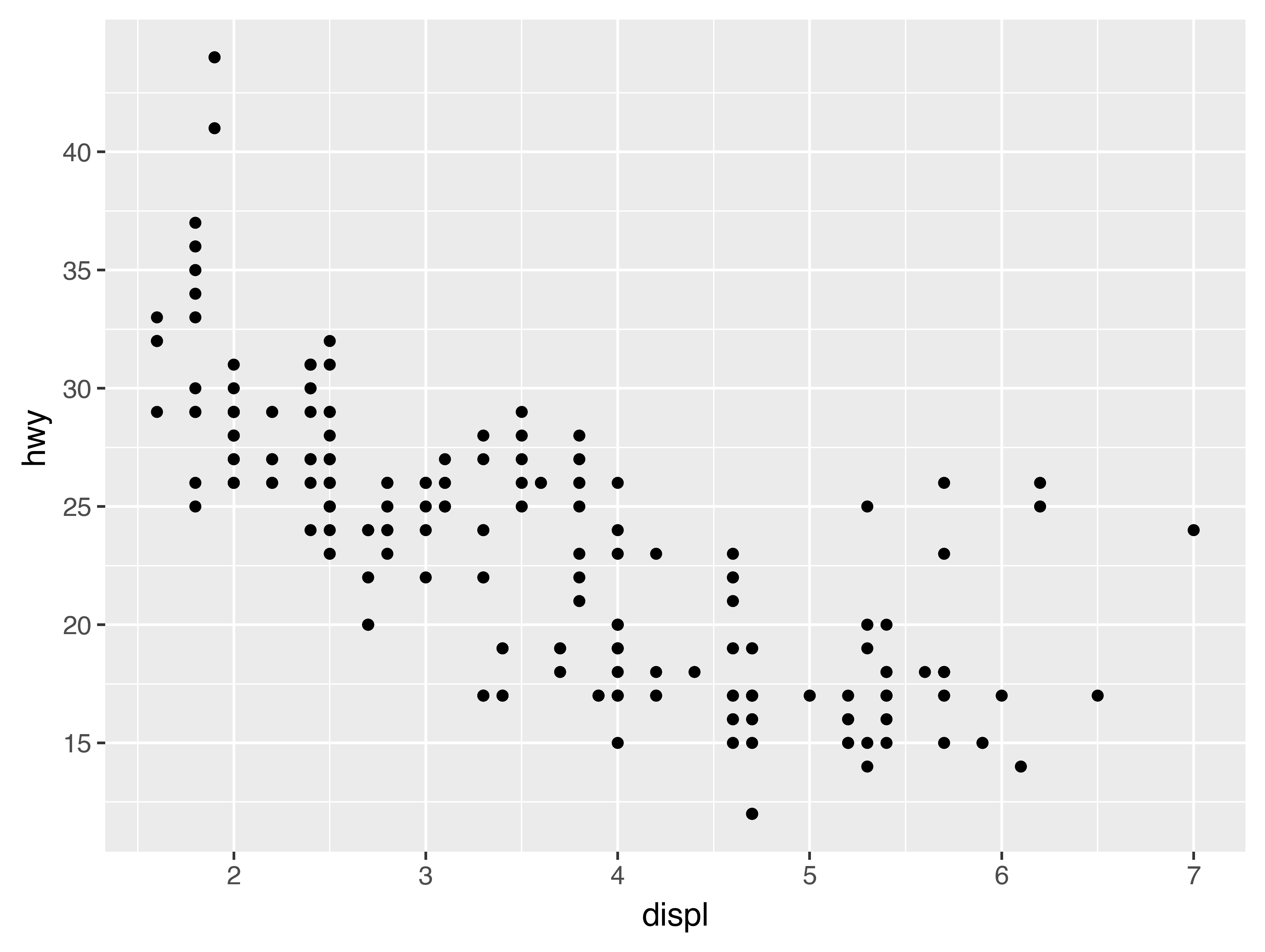
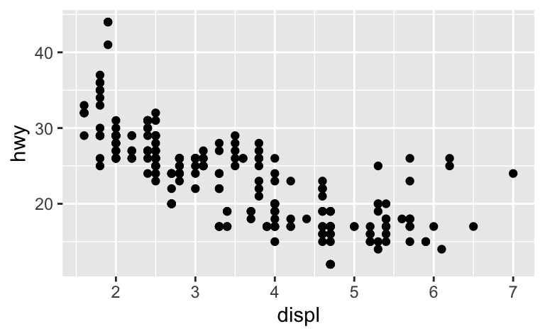
To plot mpg, run this code to put displ on the x-axis and hwy on the y-axis:
(
    ggplot(data=mpg)
    + geom_point(mapping=aes(x="displ", y="hwy"))
)
The plot shows a negative relationship between engine size (displ) and fuel efficiency (hwy). In other words, cars with big engines use more fuel. Does this confirm or refute your hypothesis about fuel efficiency and engine size?
With plotnine, you begin a plot with the function ggplot(). ggplot() creates a coordinate system that you can add layers to. The first argument of ggplot() is the dataset to use in the graph. So ggplot(data=mpg) creates an empty graph, but it’s not very interesting so I’m not going to show it here.
You complete your graph by adding one or more layers to ggplot(). The function geom_point() adds a layer of points to your plot, which creates a scatterplot. plotnine comes with many geom functions that each add a different type of layer to a plot. You’ll learn a whole bunch of them throughout this tutorial.
Each geom function in plotnine takes a mapping argument. This defines how variables in your dataset are mapped to visual properties. The mapping argument is always paired with aes(), and the x and y arguments of aes() specify which variables to map to the x and y axes. plotnine looks for the mapped variables in the data argument, in this case, mpg.
3.2.3 A graphing template
Let’s turn this code into a reusable template for making graphs with plotnine. To make a graph, replace the bracketed sections in the code below with a dataset, a geom function, or a collection of mappings.
(
    ggplot(data=DATA)
    + GEOM_FUNCTION(mapping=aes(MAPPINGS))
)
The rest of this tutorial will show you how to complete and extend this template to make different types of graphs. We will begin with the MAPPINGS component.
3.2.4 Exercises
-
Run
ggplot(data=mpg). What do you see? -
How many rows are in
mpg? How many columns? -
What does the
drvvariable describe? Read the help for?mpgto find out. -
Make a scatterplot of
hwyvscyl. -
What happens if you make a scatterplot of
classvsdrv? Why is the plot not useful?
3.3 Aesthetic mappings
“The greatest value of a picture is when it forces us to notice what we never expected to see.” — John Tukey
In the plot below, one group of points (highlighted in red) seems to fall outside of the linear trend. These cars have a higher mileage than you might expect. How can you explain these cars?
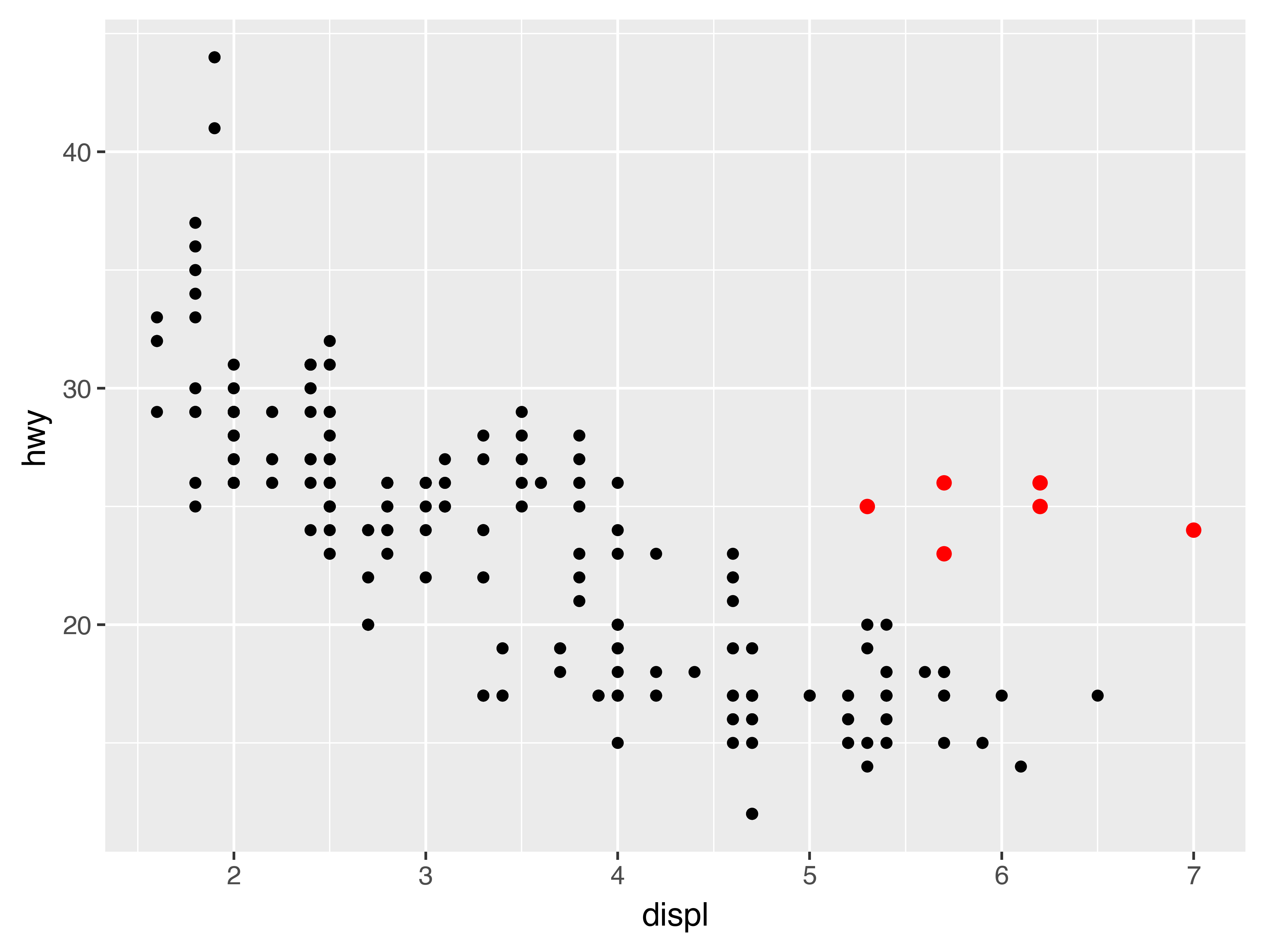
Let’s hypothesize that the cars are hybrids. One way to test this hypothesis is to look at the class value for each car. The class variable of the mpg dataset classifies cars into groups such as compact, midsize, and SUV. If the outlying points are hybrids, they should be classified as compact cars or, perhaps, subcompact cars (keep in mind that this data was collected before hybrid trucks and SUVs became popular).
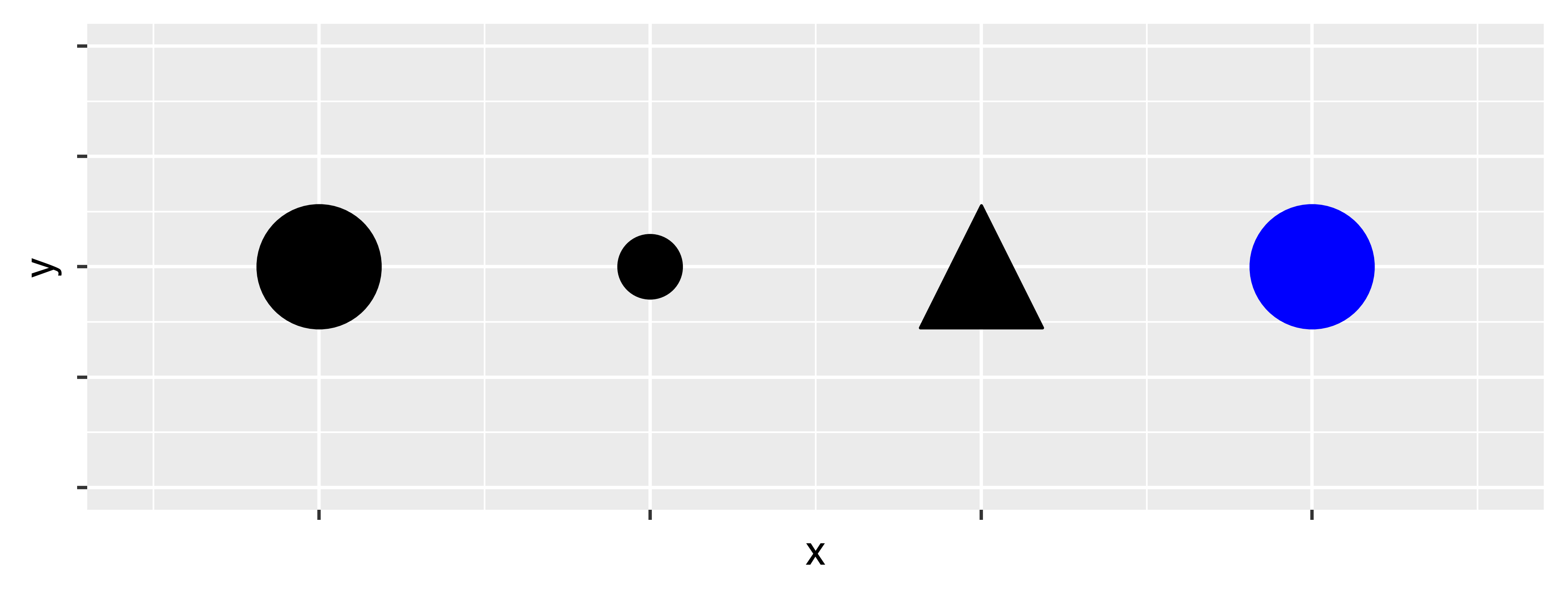
You can add a third variable, like class, to a two dimensional scatterplot by mapping it to an aesthetic. An aesthetic is a visual property of the objects in your plot. Aesthetics include things like the size, the shape, or the color of your points. You can display a point (like the one below) in different ways by changing the values of its aesthetic properties. Since we already use the word “value” to describe data, let’s use the word “level” to describe aesthetic properties. Here we change the levels of a point’s size, shape, and color to make the point small, triangular, or blue:
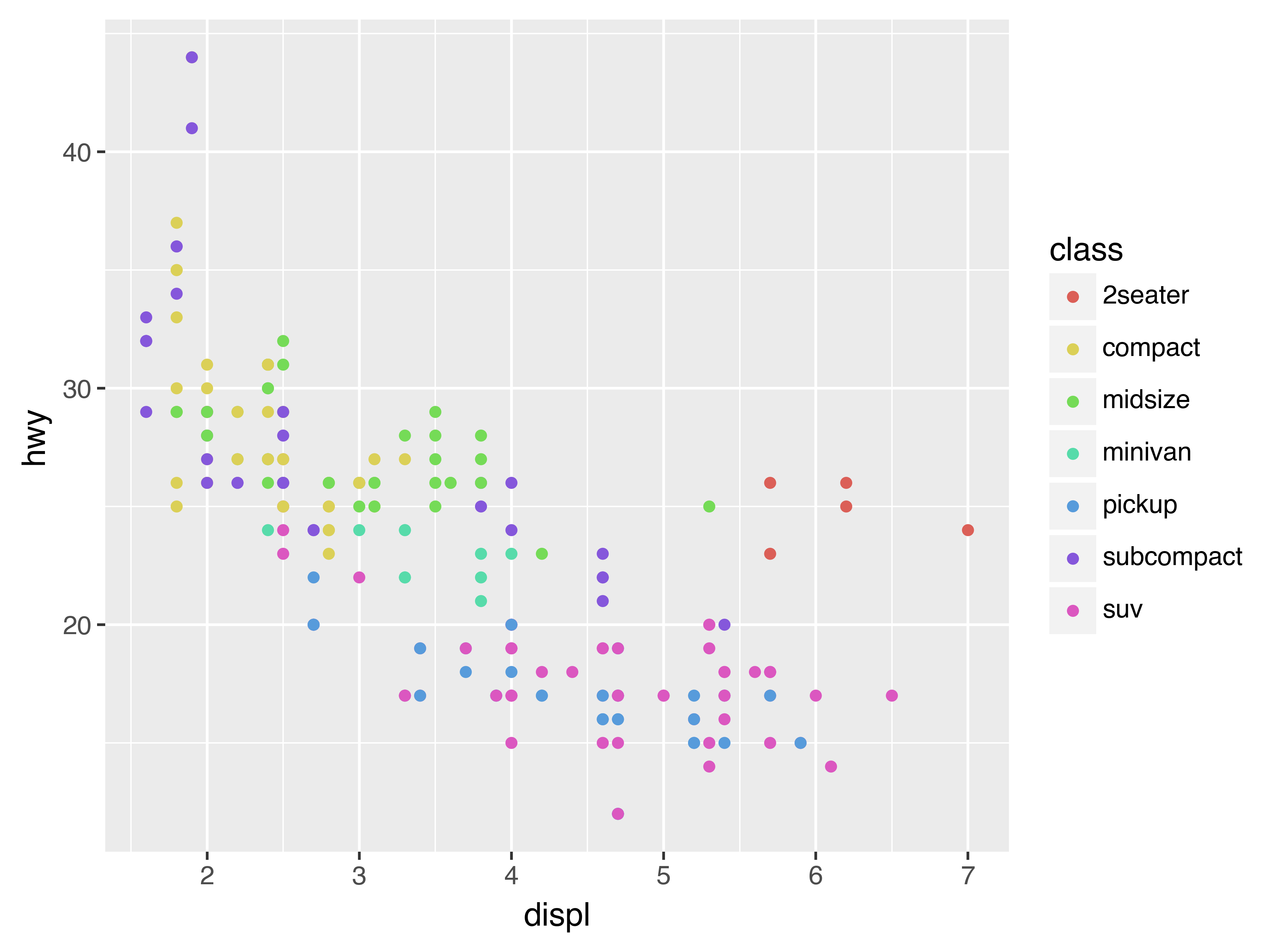
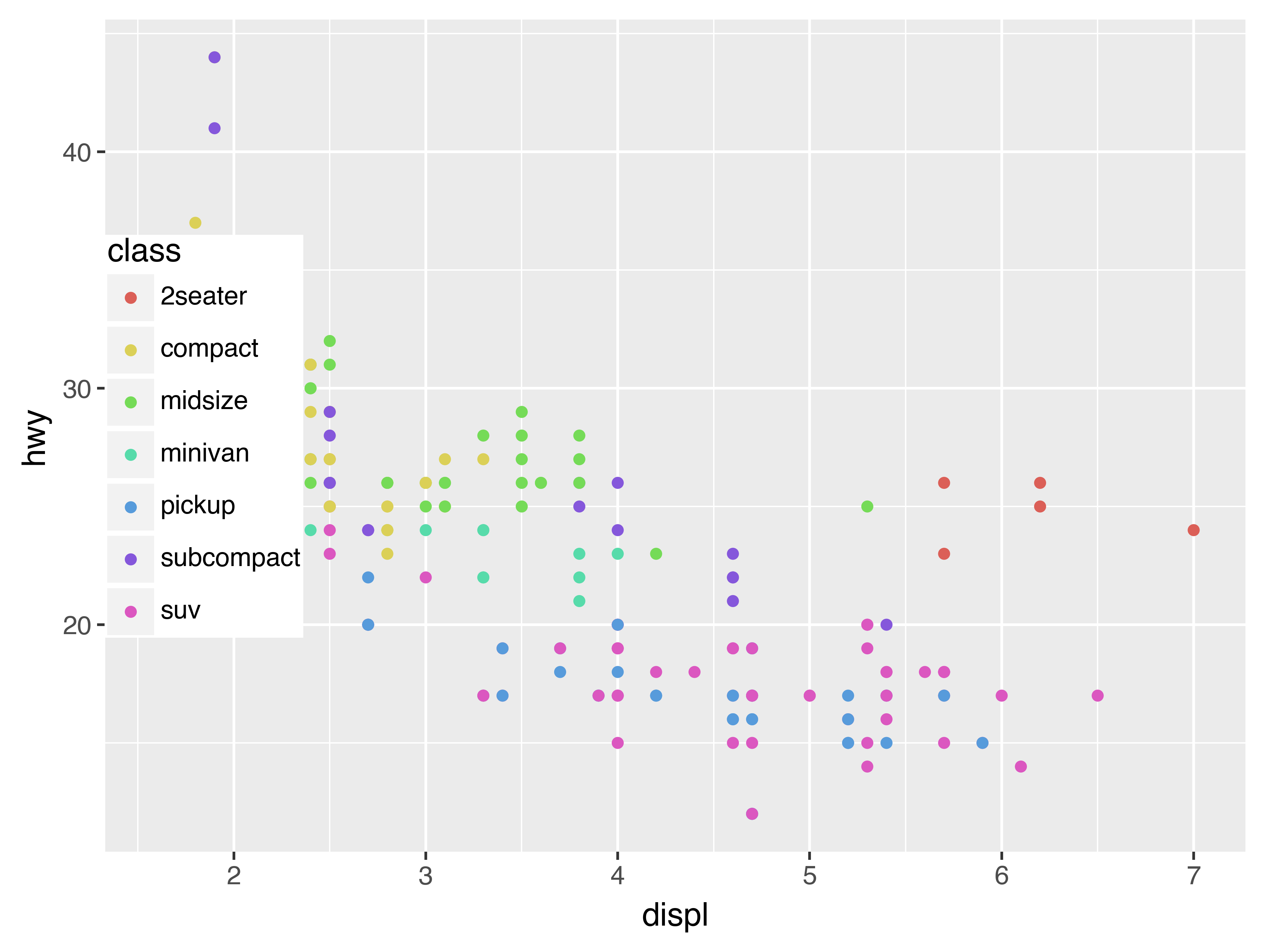
You can convey information about your data by mapping the aesthetics in your plot to the variables in your dataset. For example, you can map the colors of your points to the class variable to reveal the class of each car.
(
    ggplot(data=mpg)
    + geom_point(mapping=aes(x="displ", y="hwy", color="class"))
)
(If you prefer British English, like Hadley, you can use colour instead of color.)
To map an aesthetic to a variable, associate the name of the aesthetic to the name of the variable inside aes(). plotnine will automatically assign a unique level of the aesthetic (here a unique color) to each unique value of the variable, a process known as scaling. plotnine will also add a legend that explains which levels correspond to which values.
The colors reveal that many of the unusual points are two-seater cars. These cars don’t seem like hybrids, and are, in fact, sports cars! Sports cars have large engines like SUVs and pickup trucks, but small bodies like midsize and compact cars, which improves their gas mileage. In hindsight, these cars were unlikely to be hybrids since they have large engines.
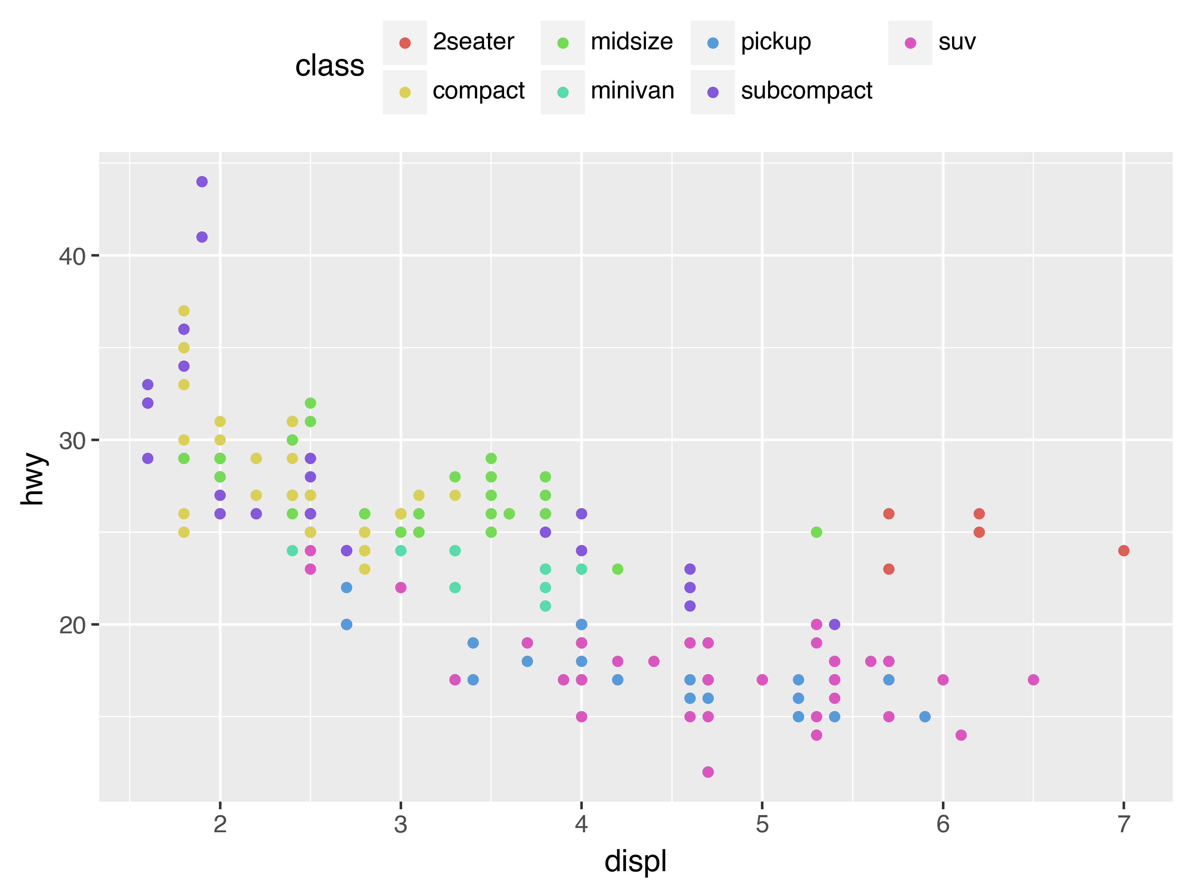
In the above example, we mapped class to the color aesthetic, but we could have mapped class to the size aesthetic in the same way. In this case, the exact size of each point would reveal its class affiliation. We get a warning here, because mapping an unordered variable (class) to an ordered aesthetic (size) is not a good idea.
(
    ggplot(data=mpg)
    + geom_point(mapping=aes(x="displ", y="hwy", size="class"))
)
/Users/jeroen/repos/mine/jj-com/posts/plotnine/venv/lib/python3.12/site-packages/plotnine/scales/scale_size.py:51: PlotnineWarning: Using size for a discrete variable is not advised.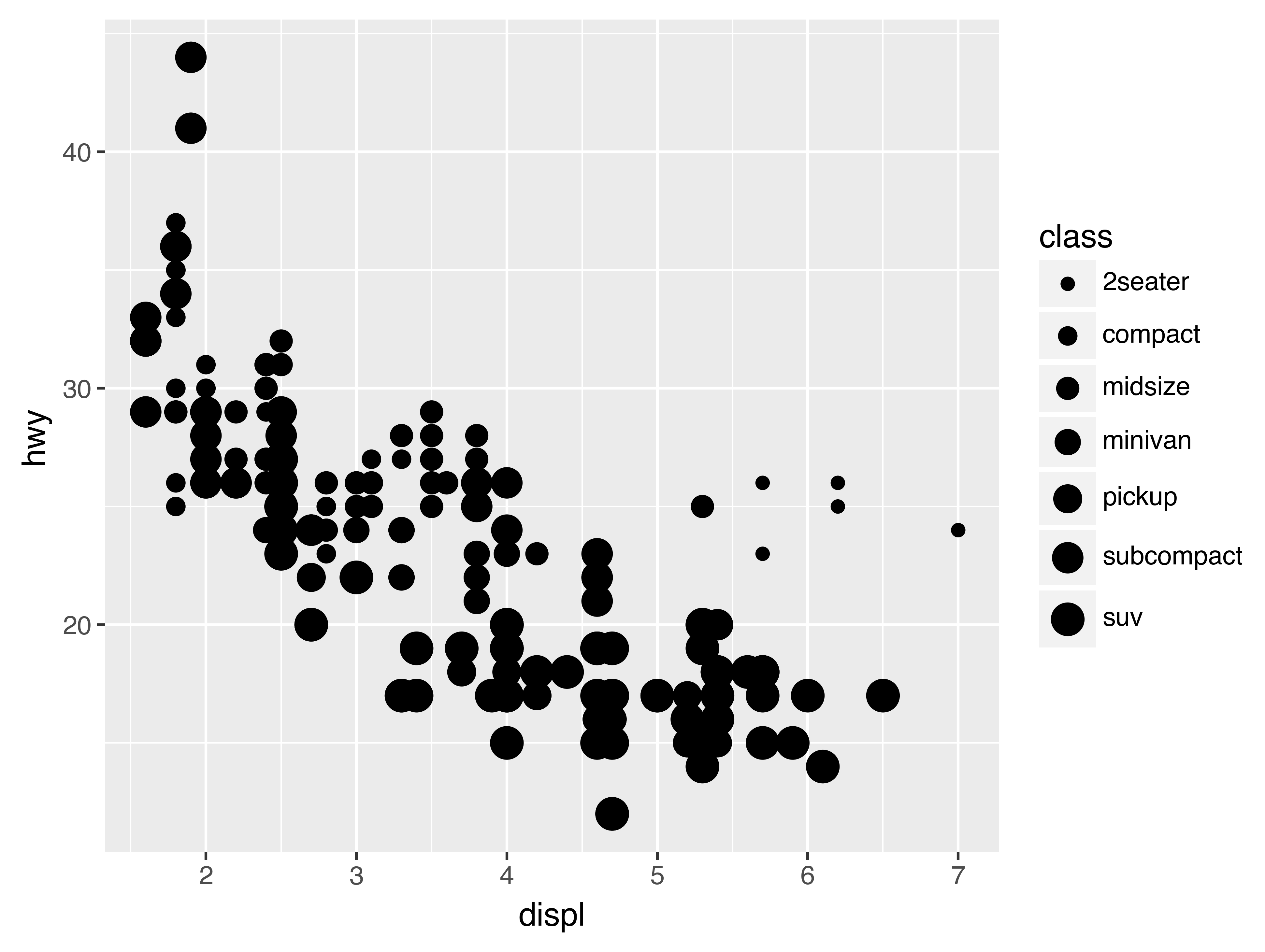
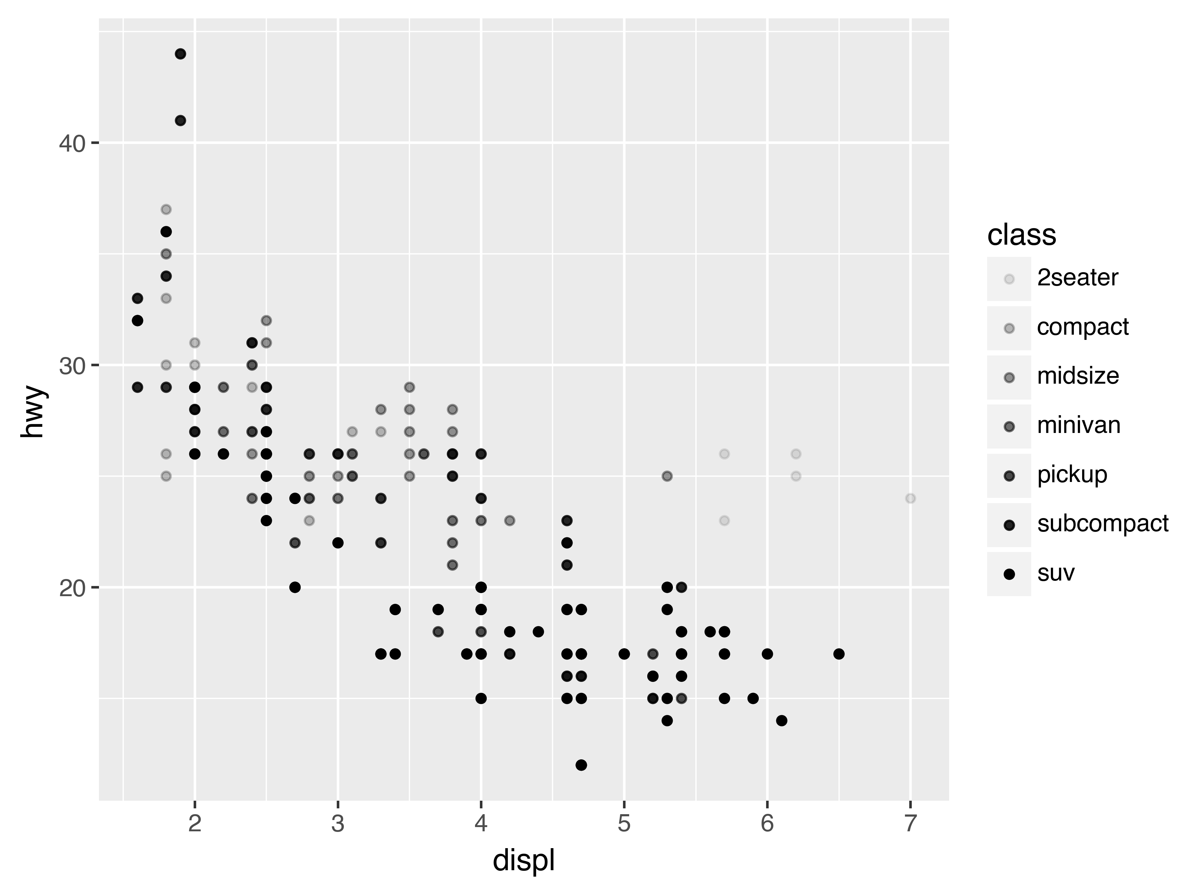
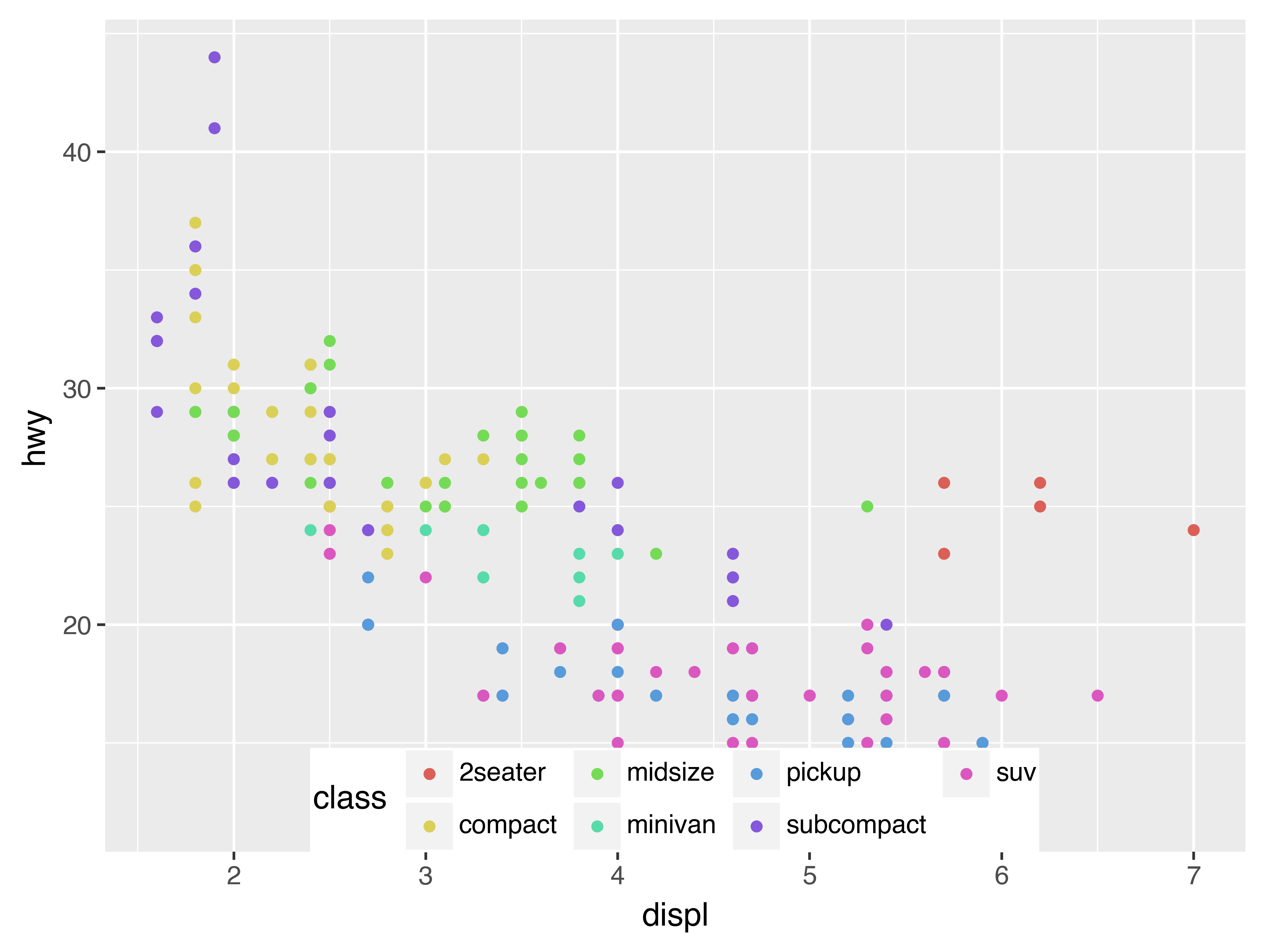
Similarly, we could have mapped class to the alpha aesthetic, which controls the transparency of the points.
(
    ggplot(data=mpg)
    + geom_point(mapping=aes(x="displ", y="hwy", alpha="class"))
)
For each aesthetic, you use aes() to associate the name of the aesthetic with a variable to display. The aes() function gathers together each of the aesthetic mappings used by a layer and passes them to the layer’s mapping argument. The syntax highlights a useful insight about x and y: the x and y locations of a point are themselves aesthetics, visual properties that you can map to variables to display information about the data.
Once you map an aesthetic, plotnine takes care of the rest. It selects a reasonable scale to use with the aesthetic, and it constructs a legend that explains the mapping between levels and values. For x and y aesthetics, plotnine does not create a legend, but it creates an axis line with tick marks and a label. The axis line acts as a legend; it explains the mapping between locations and values.
You can also set the aesthetic properties of your geom manually. For example, we can make all of the points in our plot blue:
(
    ggplot(data=mpg)
    + geom_point(mapping=aes(x="displ", y="hwy"), color="blue")
)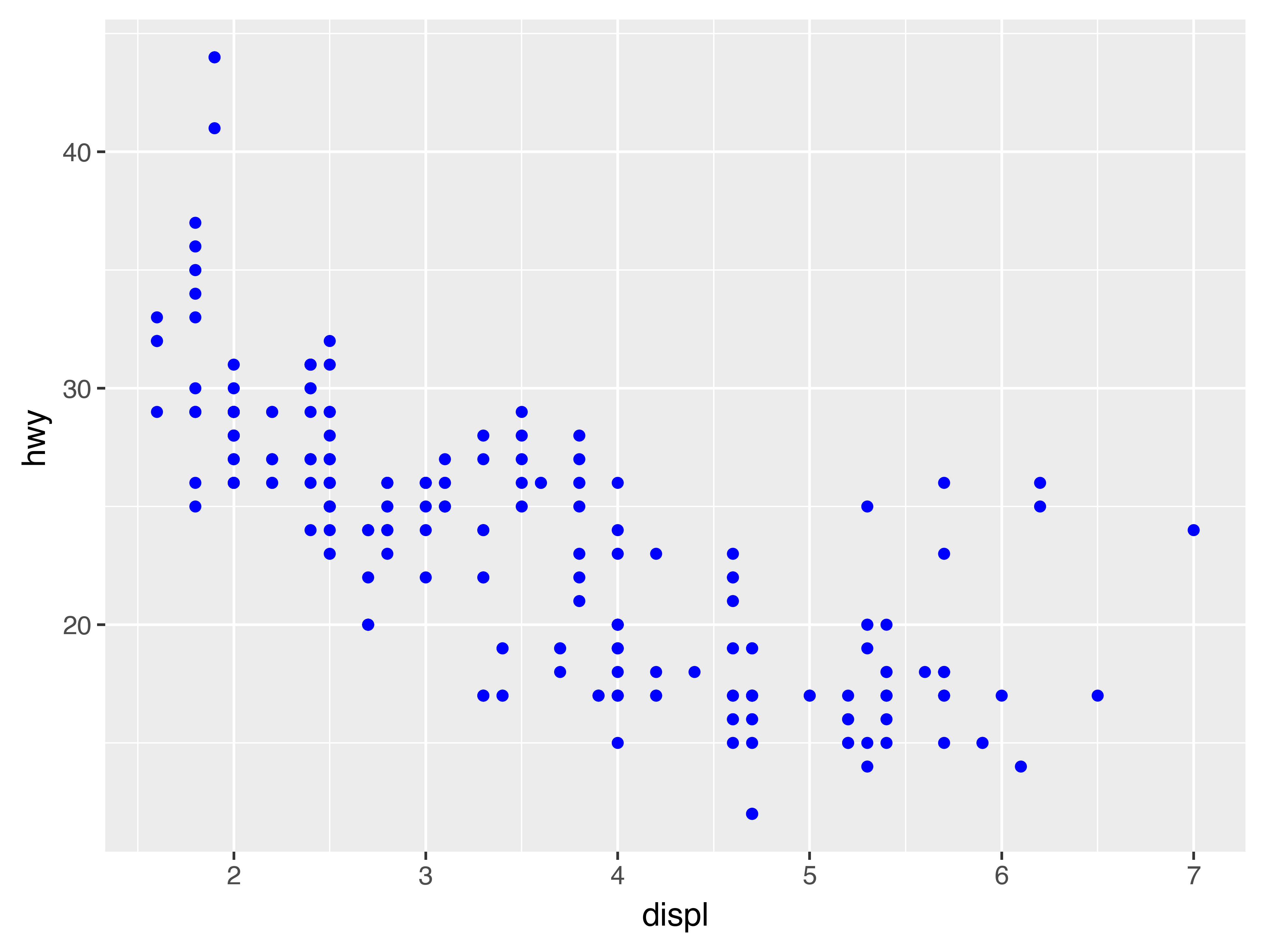
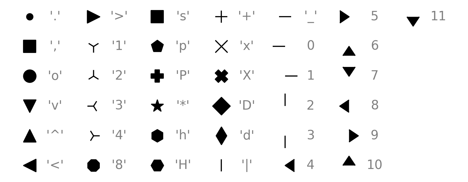
Here, the color doesn’t convey information about a variable, but only changes the appearance of the plot. To set an aesthetic manually, set the aesthetic by name as an argument of your geom function; i.e. it goes outside of aes(). You’ll need to pick a level that makes sense for that aesthetic:
- The name of a color as a string.
- The size of a point in mm.
- The shape of a point as a character or number, as shown below.
3.3.1 Exercises[5]
-
Which variables in
mpgare categorical? Which variables are continuous? (Hint: type?mpgto read the documentation for the dataset). How can you see this information when you runmpg? -
Map a continuous variable to
color,size, andshape. How do these aesthetics behave differently for categorical vs. continuous variables? -
What happens if you map the same variable to multiple aesthetics?
-
What does the
strokeaesthetic do? What shapes does it work with? (Hint: use?geom_point) -
What happens if you map an aesthetic to something other than a variable name, like
aes(colour="displ < 5")? Note, you’ll also need to specify x and y.
3.4 Common problems
As you start to run Python code, you’re likely to run into problems. Don’t worry — it happens to everyone. I have been writing Python code for years, and every day I still write code that doesn’t work!
Start by carefully comparing the code that you’re running to the code in the book. Python is extremely picky, and a misplaced character can make all the difference. Make sure that every ( is matched with a ) and every " is paired with another ".
If you’re still stuck, try the help. You can get help about any Python function by running ?function_name. Don’t worry if the help doesn’t seem that helpful - instead skip down to the examples and look for code that matches what you’re trying to do.
If that doesn’t help, carefully read the error message. Sometimes the answer will be buried there! But when you’re new to Python, the answer might be in the error message but you don’t yet know how to understand it. Another great tool is Google: try googling the error message, as it’s likely someone else has had the same problem, and has gotten help online.
3.5 Facets
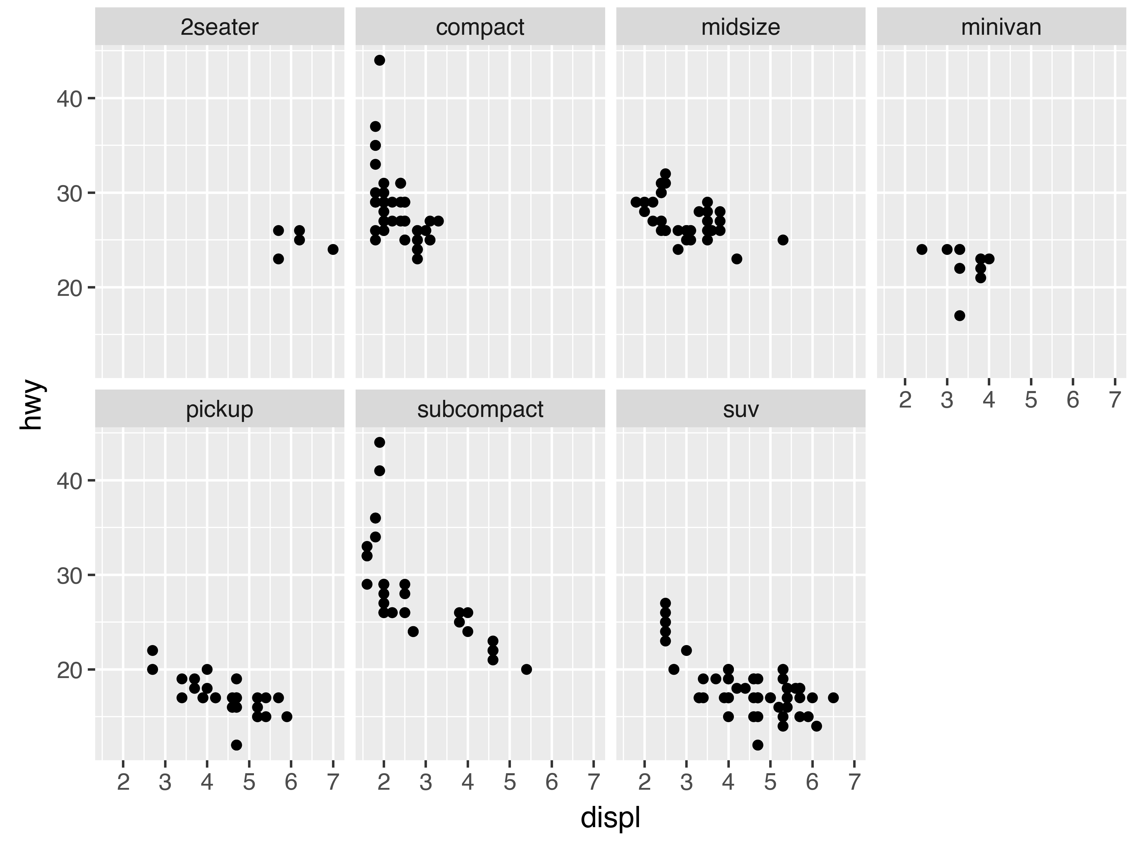
One way to add additional variables is with aesthetics. Another way, particularly useful for categorical variables, is to split your plot into facets, subplots that each display one subset of the data.
To facet your plot by a single variable, use facet_wrap(). The first argument of facet_wrap() should be a formula, which you create with ~ followed by a variable name (here “formula” is the name of a data structure in Python, not a synonym for “equation”). The variable that you pass to facet_wrap() should be discrete.
(
    ggplot(data=mpg)
    + geom_point(mapping=aes(x="displ", y="hwy"))
    + facet_wrap("class", nrow=2)
)
To facet your plot on the combination of two variables, add facet_grid() to your plot call. The first argument of facet_grid() is also a formula. This time the formula should contain two variable names separated by a ~.
(
    ggplot(data=mpg)
    + geom_point(mapping=aes(x="displ", y="hwy"))
    + facet_grid("drv ~ cyl")
)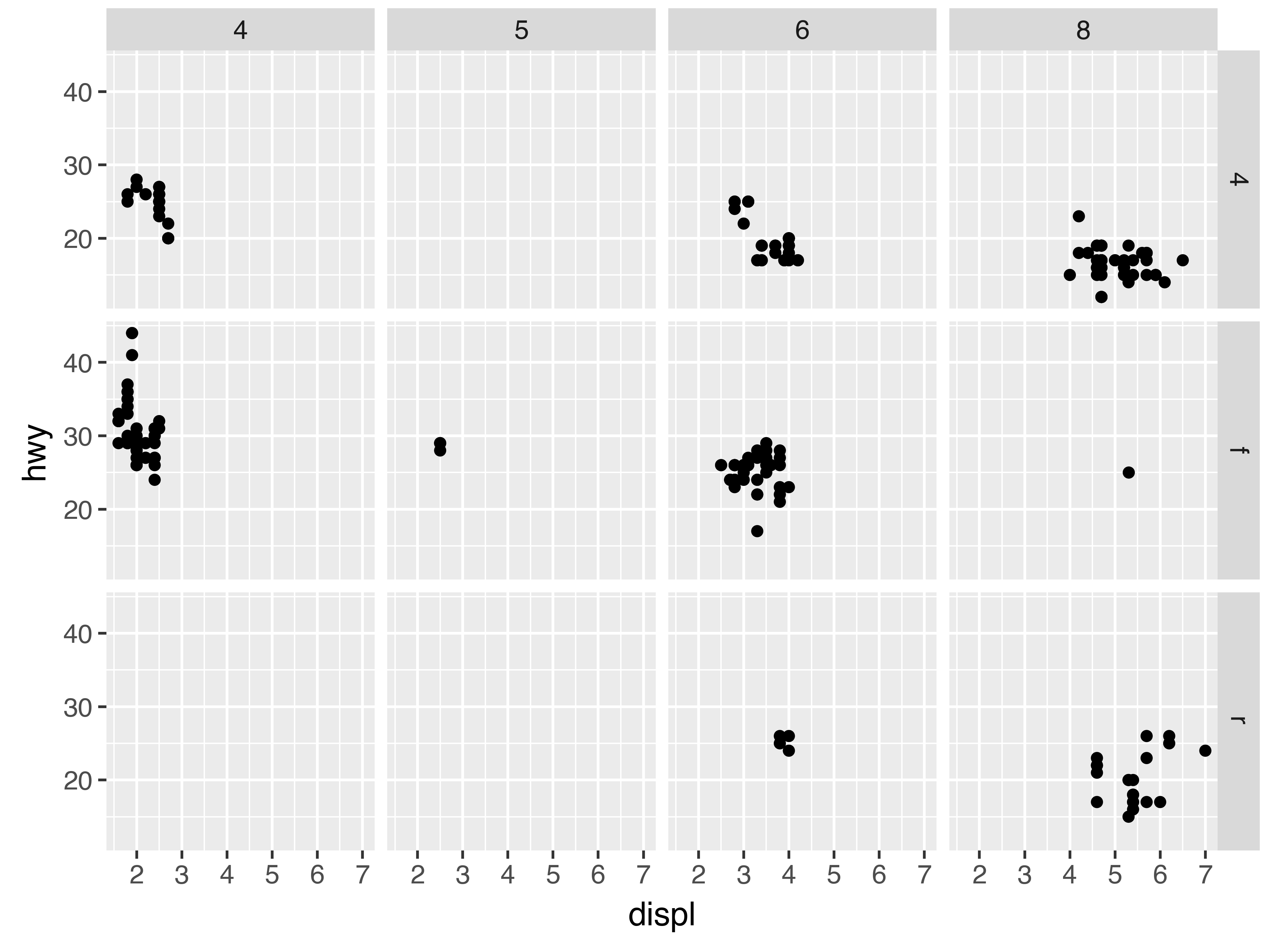
If you prefer to not facet in the rows or columns dimension, use a . instead of a variable name, e.g. + facet_grid(". ~ cyl").
3.5.1 Exercises
-
What happens if you facet on a continuous variable?
-
What do the empty cells in plot with
facet_grid("drv ~ cyl")mean? How do they relate to this plot?( ggplot(data=mpg) + geom_point(mapping=aes(x="drv", y="cyl")) ) -
What plots does the following code make? What does
.do?( ggplot(data=mpg) + geom_point(mapping=aes(x="displ", y="hwy")) + facet_grid("drv ~ .") ) ( ggplot(data=mpg) + geom_point(mapping=aes(x="displ", y="hwy")) + facet_grid(". ~ cyl") ) -
Take the first faceted plot in this section:
(
    ggplot(data=mpg)
    + geom_point(mapping=aes(x="displ", y="hwy"))
    + facet_wrap("class", nrow=2)
)
What are the advantages to using faceting instead of the colour aesthetic? What are the disadvantages? How might the balance change if you had a larger dataset?
-
Read
?facet_wrap. What doesnrowdo? What doesncoldo? What other options control the layout of the individual panels? Why doesn’tfacet_grid()havenrowandncolarguments? -
When using
facet_grid()you should usually put the variable with more unique levels in the columns. Why?
3.6 Geometric objects
How are these two plots similar?
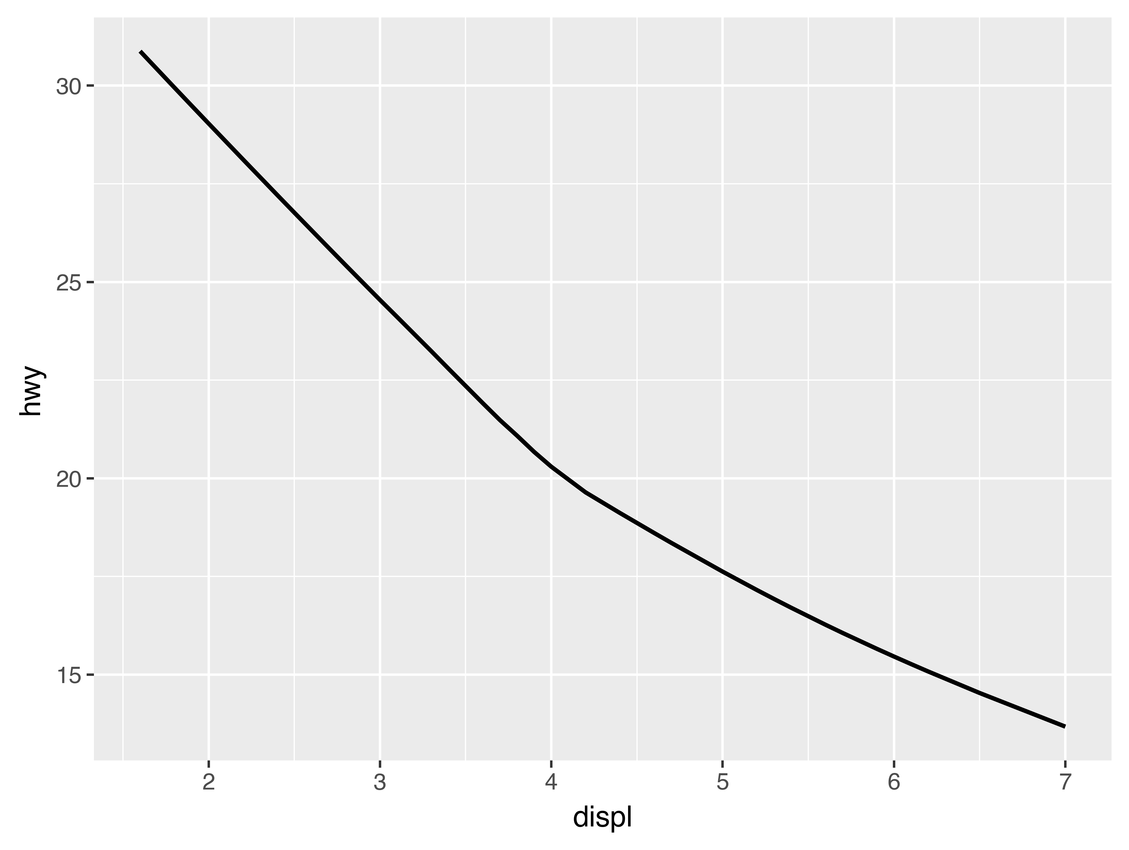
Both plots contain the same x variable, the same y variable, and both describe the same data. But the plots are not identical. Each plot uses a different visual object to represent the data. In plotnine syntax, we say that they use different geoms.
A geom is the geometrical object that a plot uses to represent data. People often describe plots by the type of geom that the plot uses. For example, bar charts use bar geoms, line charts use line geoms, boxplots use boxplot geoms, and so on. Scatterplots break the trend; they use the point geom. As we see above, you can use different geoms to plot the same data. The plot on the left uses the point geom, and the plot on the right uses the smooth geom, a smooth line fitted to the data.
To change the geom in your plot, change the geom function that you add to ggplot().
For instance, to make the plots above, you can use this code:
# Left
(
    ggplot(data=mpg)
    + geom_point(mapping=aes(x="displ", y="hwy"))
)

# Right
(
    ggplot(data=mpg)
    + geom_smooth(mapping=aes(x="displ", y="hwy"))
)
Every geom function in plotnine takes a mapping argument. However, not every aesthetic works with every geom. You could set the shape of a point, but you couldn’t set the “shape” of a line. On the other hand, you could set the linetype of a line. geom_smooth() will draw a different line, with a different linetype, for each unique value of the variable that you map to linetype.
(
    ggplot(data=mpg)
    + geom_smooth(mapping=aes(x="displ", y="hwy", linetype="drv"))
)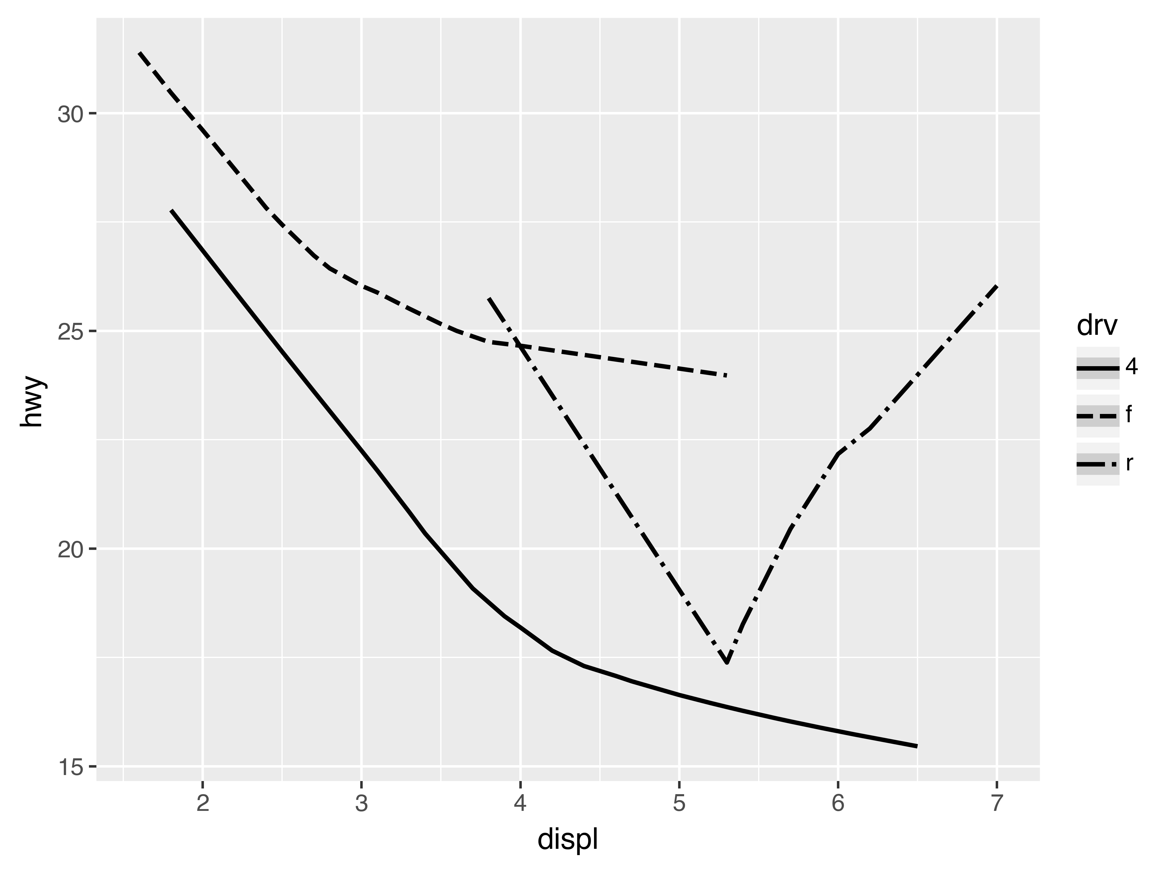
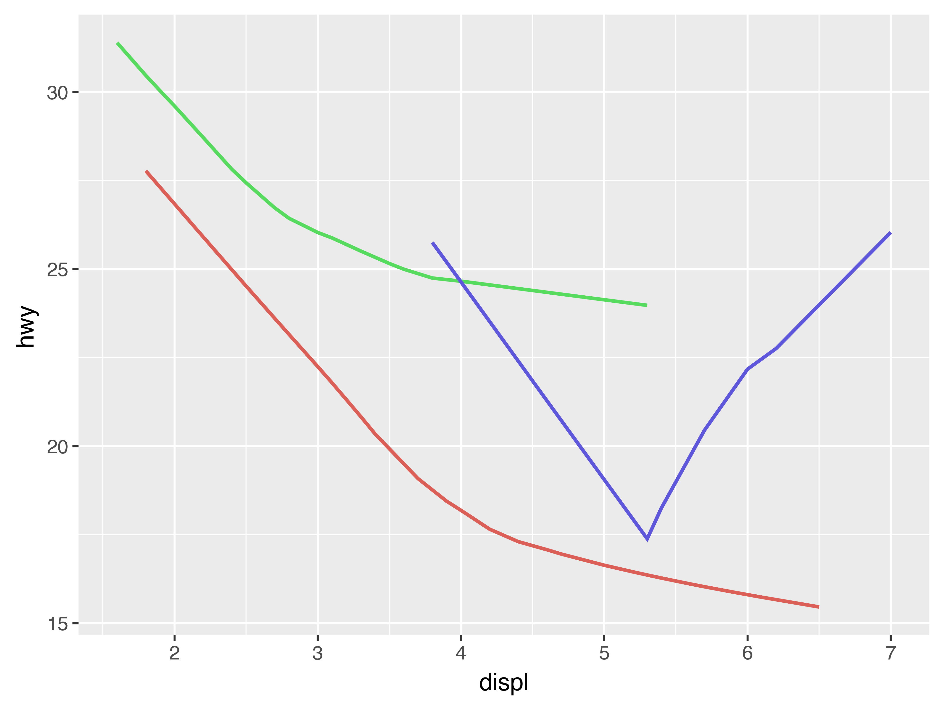
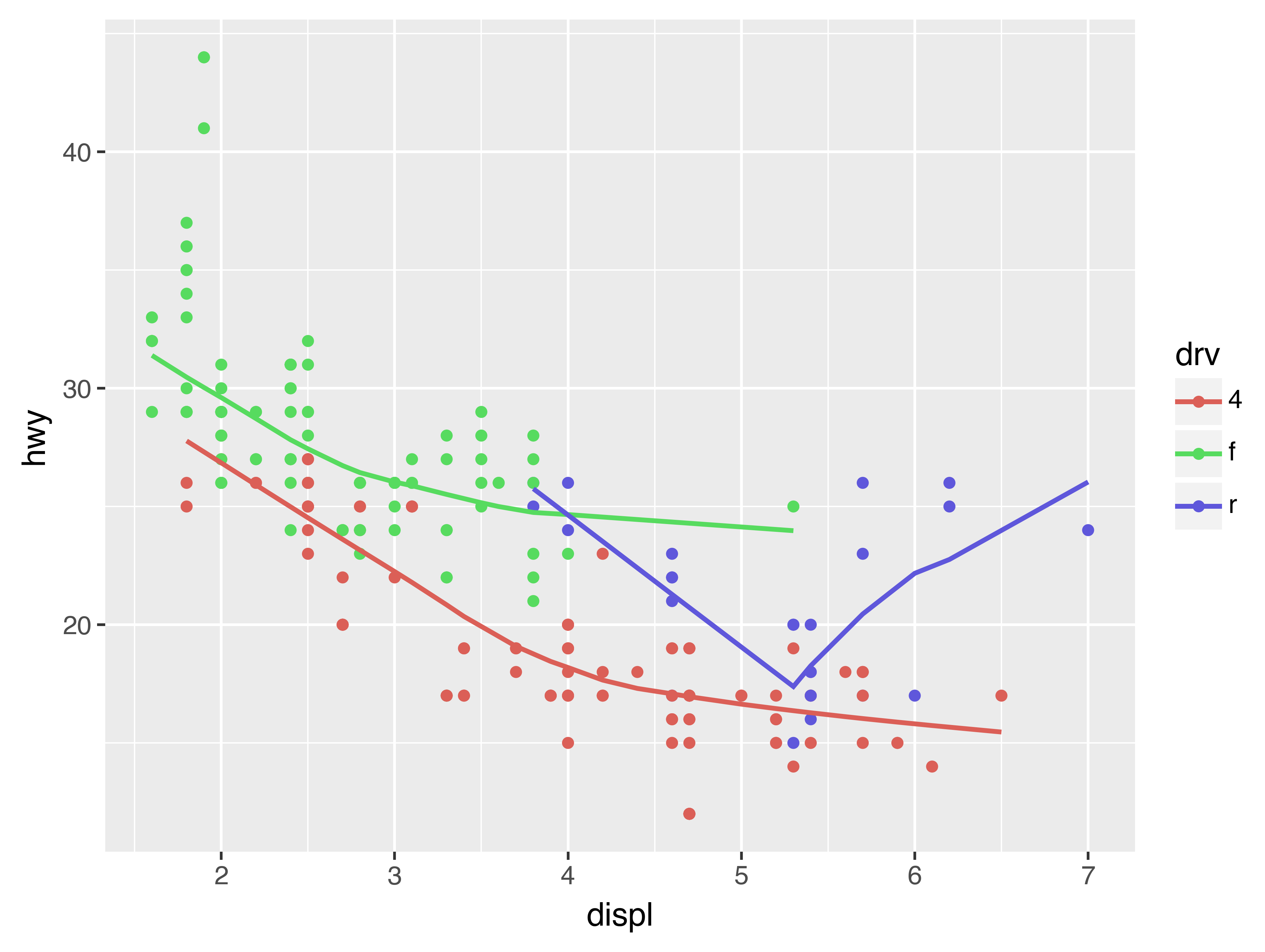
Here geom_smooth() separates the cars into three lines based on their drv value, which describes a car’s drivetrain. One line describes all of the points with a 4 value, one line describes all of the points with an f value, and one line describes all of the points with an r value. Here, 4 stands for four-wheel drive, f for front-wheel drive, and r for rear-wheel drive.
If this sounds strange, we can make it more clear by overlaying the lines on top of the raw data and then coloring everything according to drv.
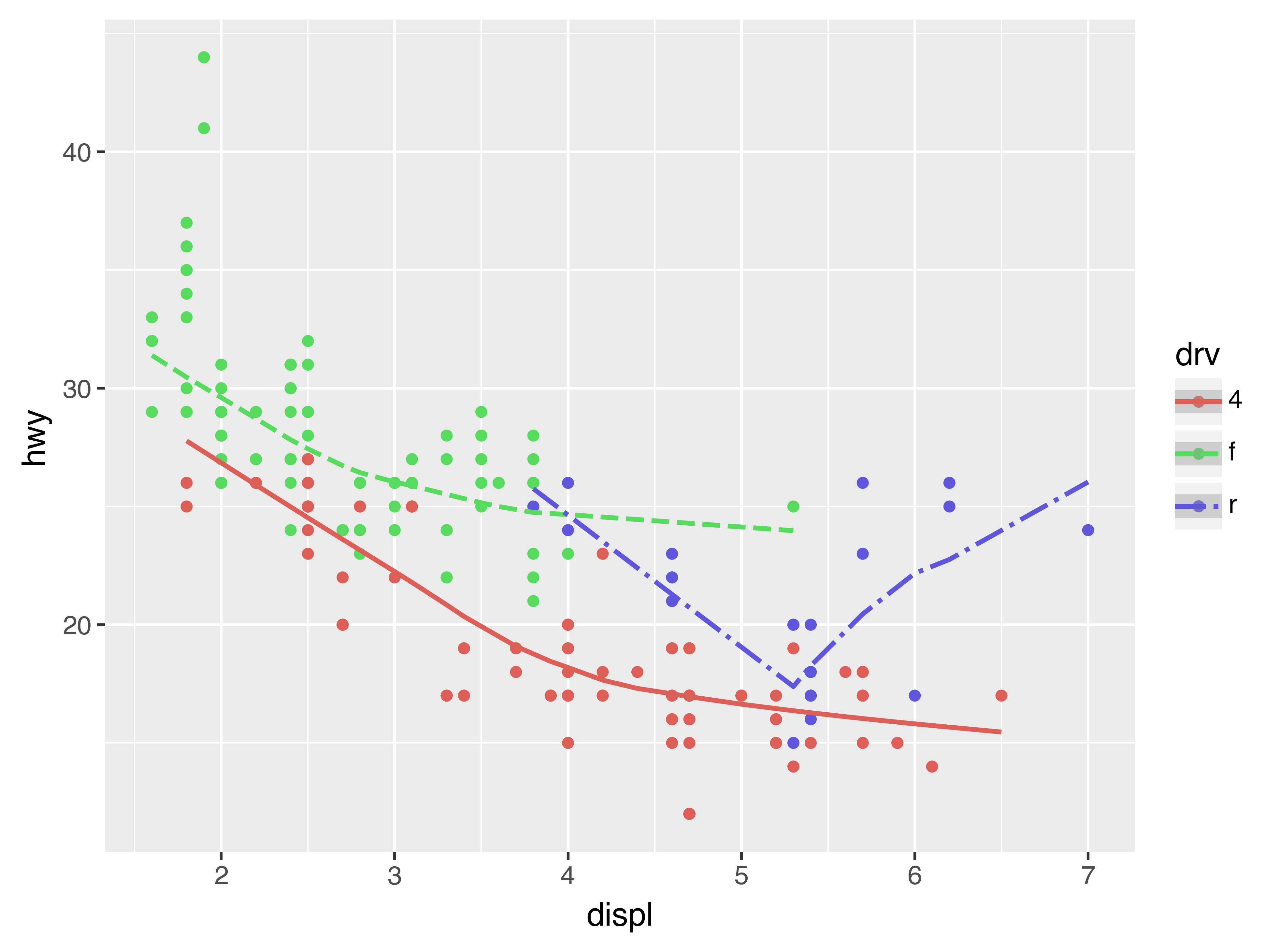
Notice that this plot contains two geoms in the same graph! If this makes you excited, buckle up. We will learn how to place multiple geoms in the same plot very soon.
plotnine provides over 30 geoms. The best way to get a comprehensive overview is the ggplot2 cheatsheet, which you can find at http://rstudio.com/cheatsheets. To learn more about any single geom, use help: ?geom_smooth.
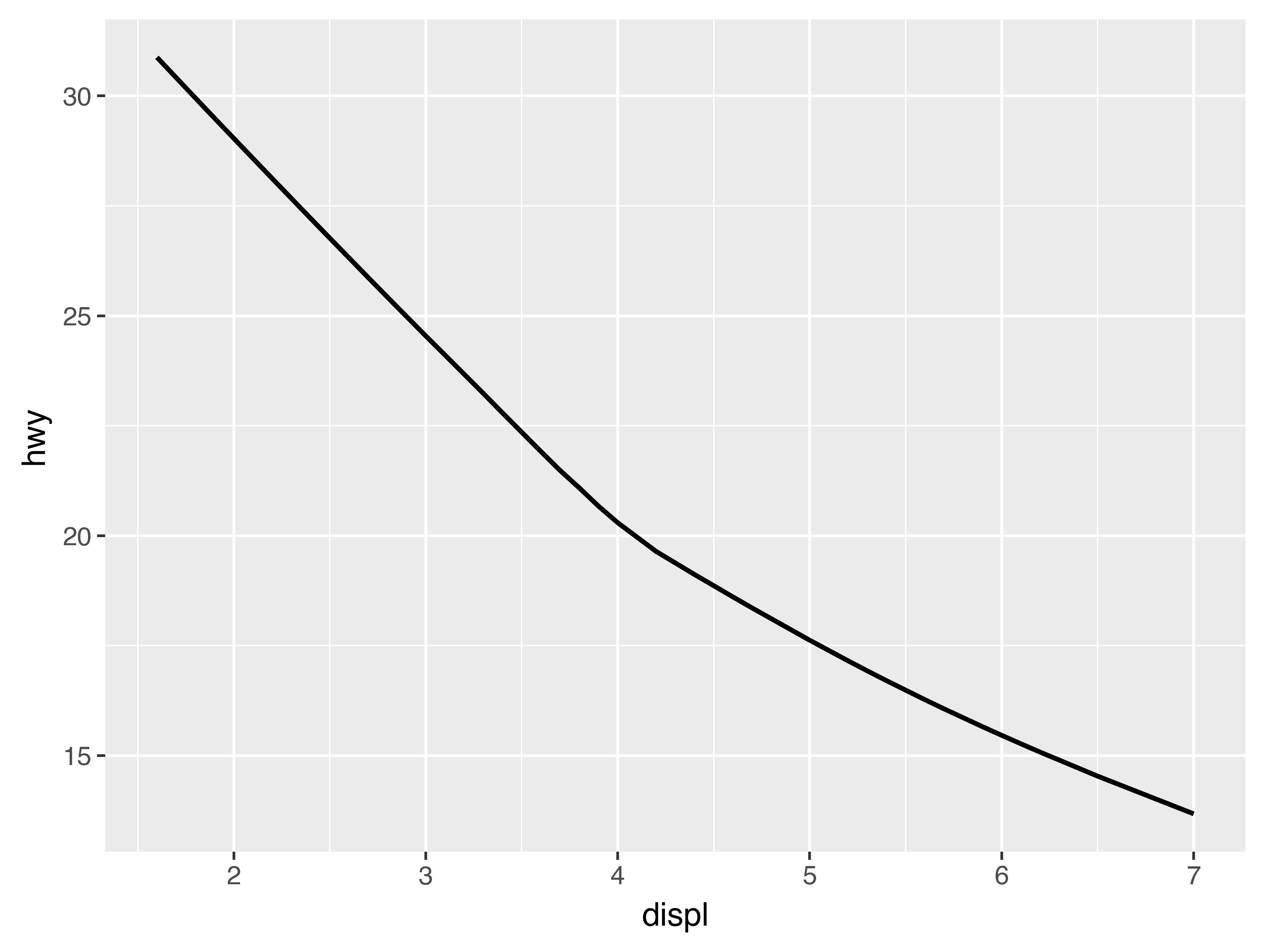
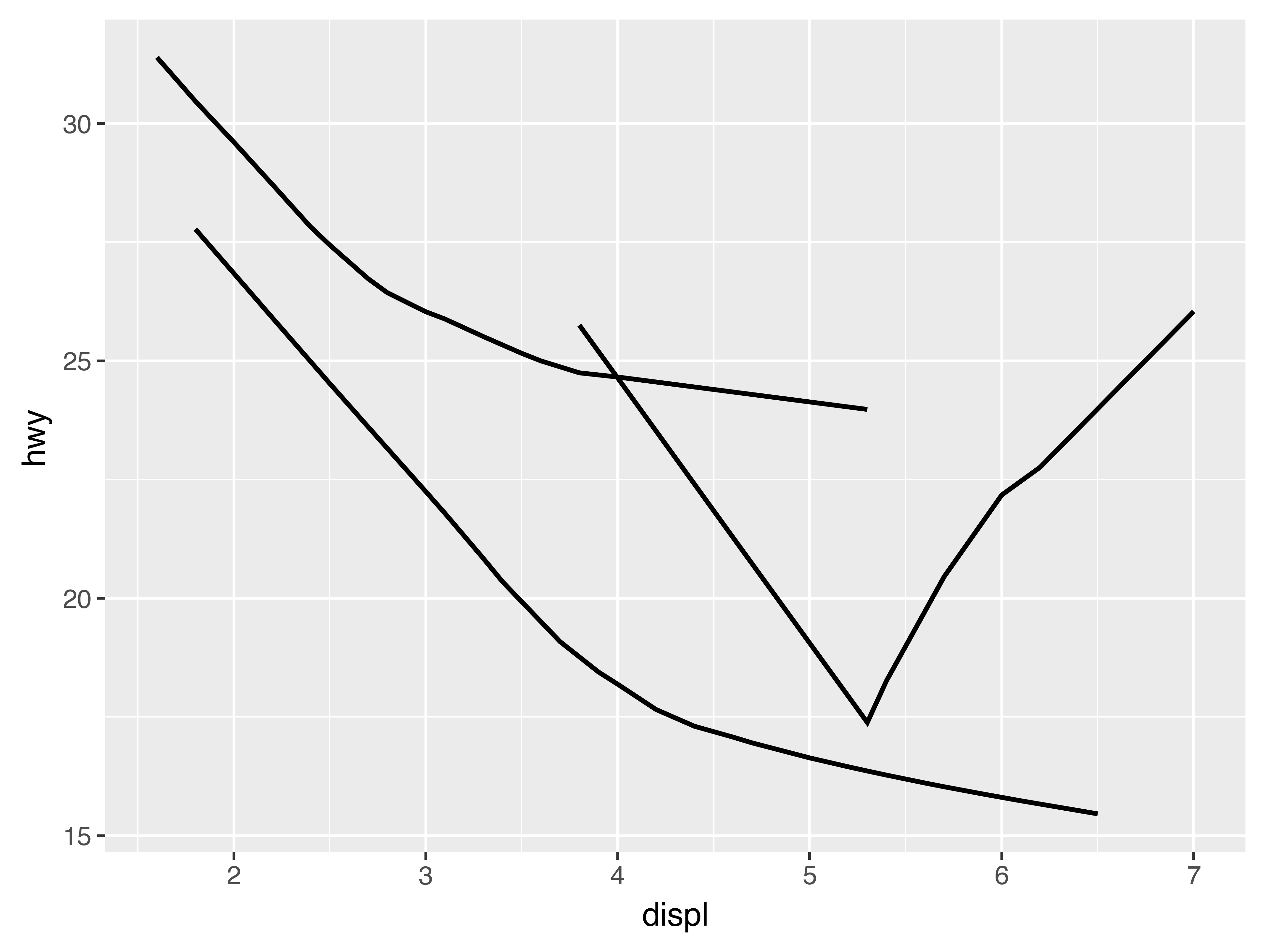
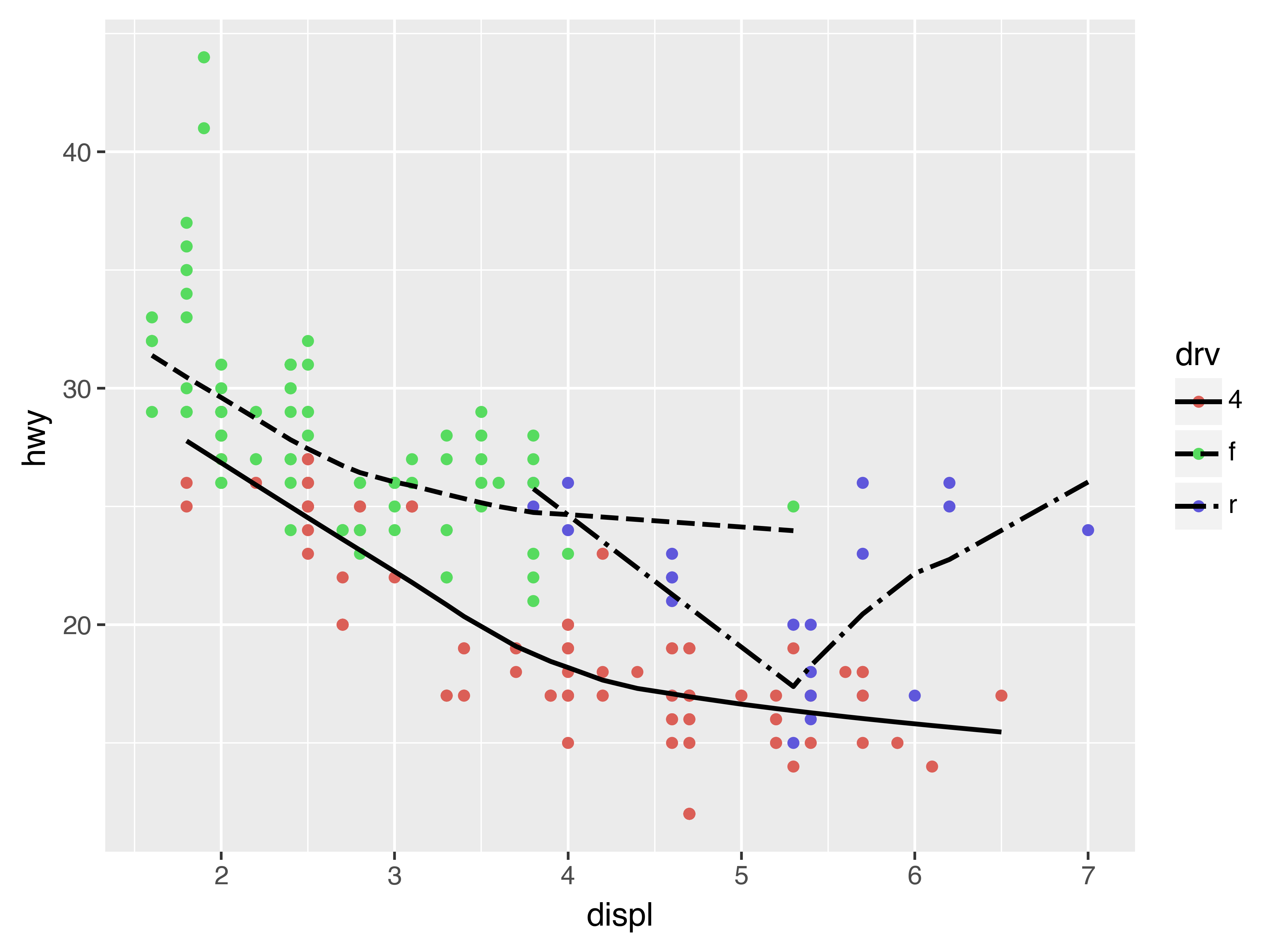
Many geoms, like geom_smooth(), use a single geometric object to display multiple rows of data. For these geoms, you can set the group aesthetic to a categorical variable to draw multiple objects. plotnine will draw a separate object for each unique value of the grouping variable. In practice, plotnine will automatically group the data for these geoms whenever you map an aesthetic to a discrete variable (as in the linetype example). It is convenient to rely on this feature because the group aesthetic by itself does not add a legend or distinguishing features to the geoms.
(
    ggplot(data=mpg)
    + geom_smooth(mapping=aes(x="displ", y="hwy"))
)

(
    ggplot(data=mpg)
    + geom_smooth(mapping=aes(x="displ", y="hwy", group="drv"))
)

(
    ggplot(data=mpg)
    + geom_smooth(mapping=aes(x="displ", y="hwy", color="drv"),
                  show_legend=False)
)
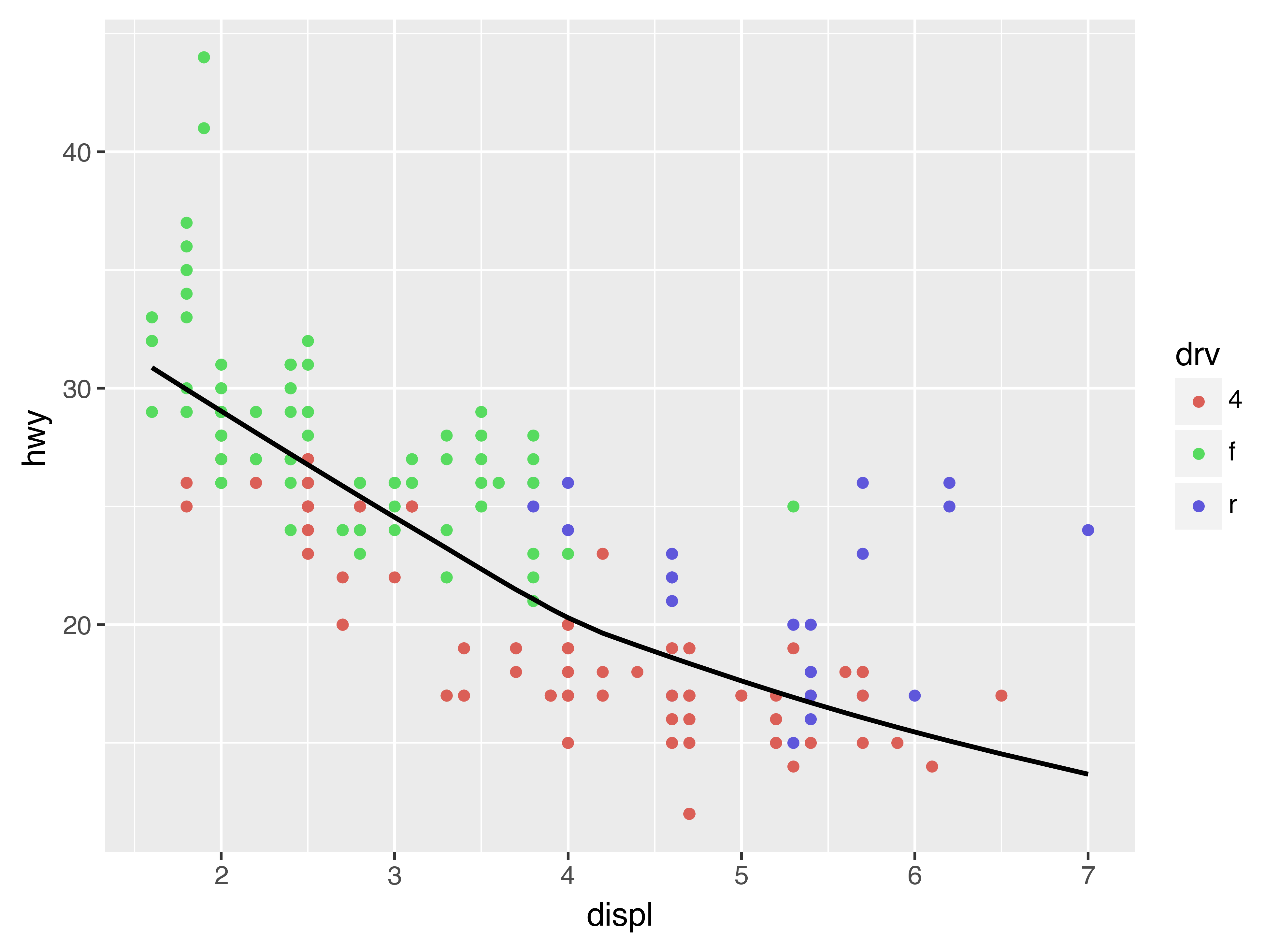
To display multiple geoms in the same plot, add multiple geom functions to ggplot():
(
    ggplot(data=mpg)
    + geom_point(mapping=aes(x="displ", y="hwy"))
    + geom_smooth(mapping=aes(x="displ", y="hwy"))
)
This, however, introduces some duplication in our code. Imagine if you wanted to change the y-axis to display cty instead of hwy. You’d need to change the variable in two places, and you might forget to update one. You can avoid this type of repetition by passing a set of mappings to ggplot(). plotnine will treat these mappings as global mappings that apply to each geom in the graph. In other words, this code will produce the same plot as the previous code:
(
    ggplot(data=mpg, mapping=aes(x="displ", y="hwy"))
    + geom_point()
    + geom_smooth()
)
If you place mappings in a geom function, plotnine will treat them as local mappings for the layer. It will use these mappings to extend or overwrite the global mappings for that layer only. This makes it possible to display different aesthetics in different layers.
(
    ggplot(data=mpg, mapping=aes(x="displ", y="hwy"))
    + geom_point(mapping=aes(color="class"))
    + geom_smooth()
)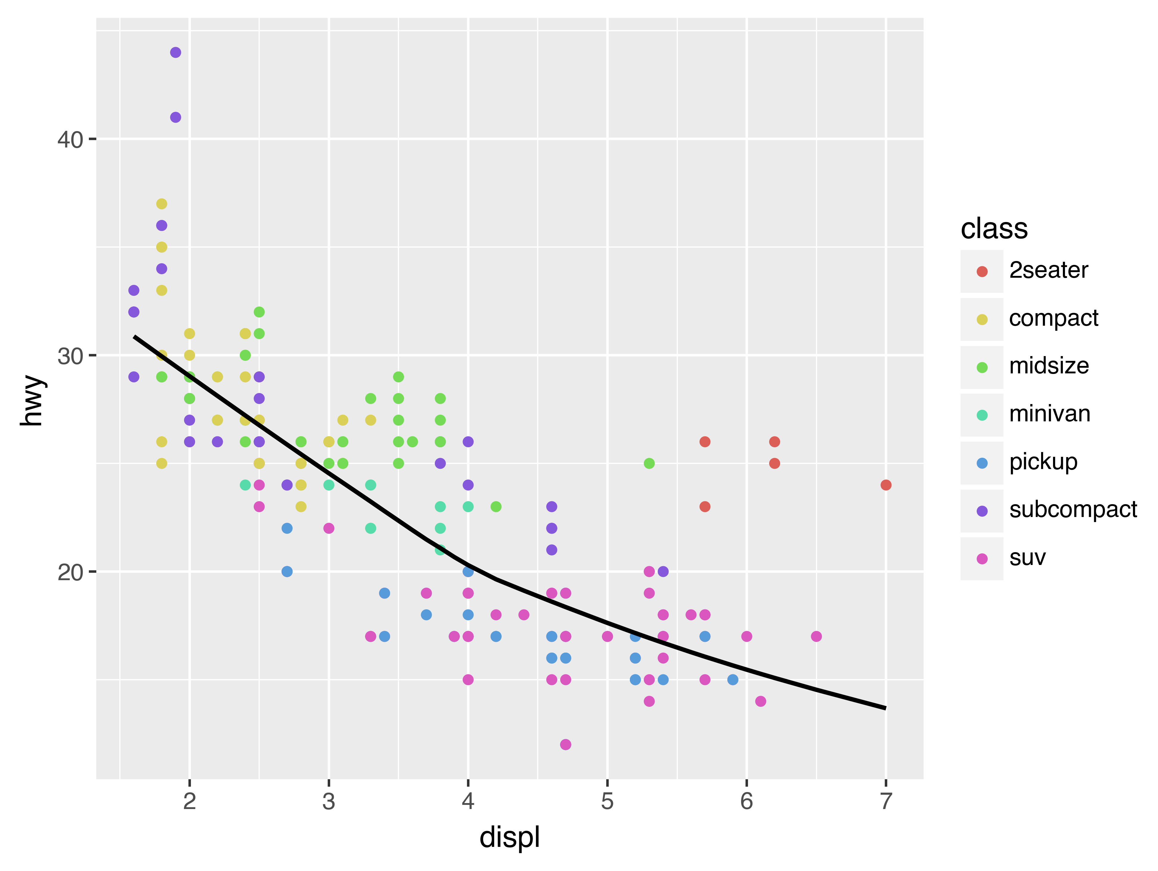
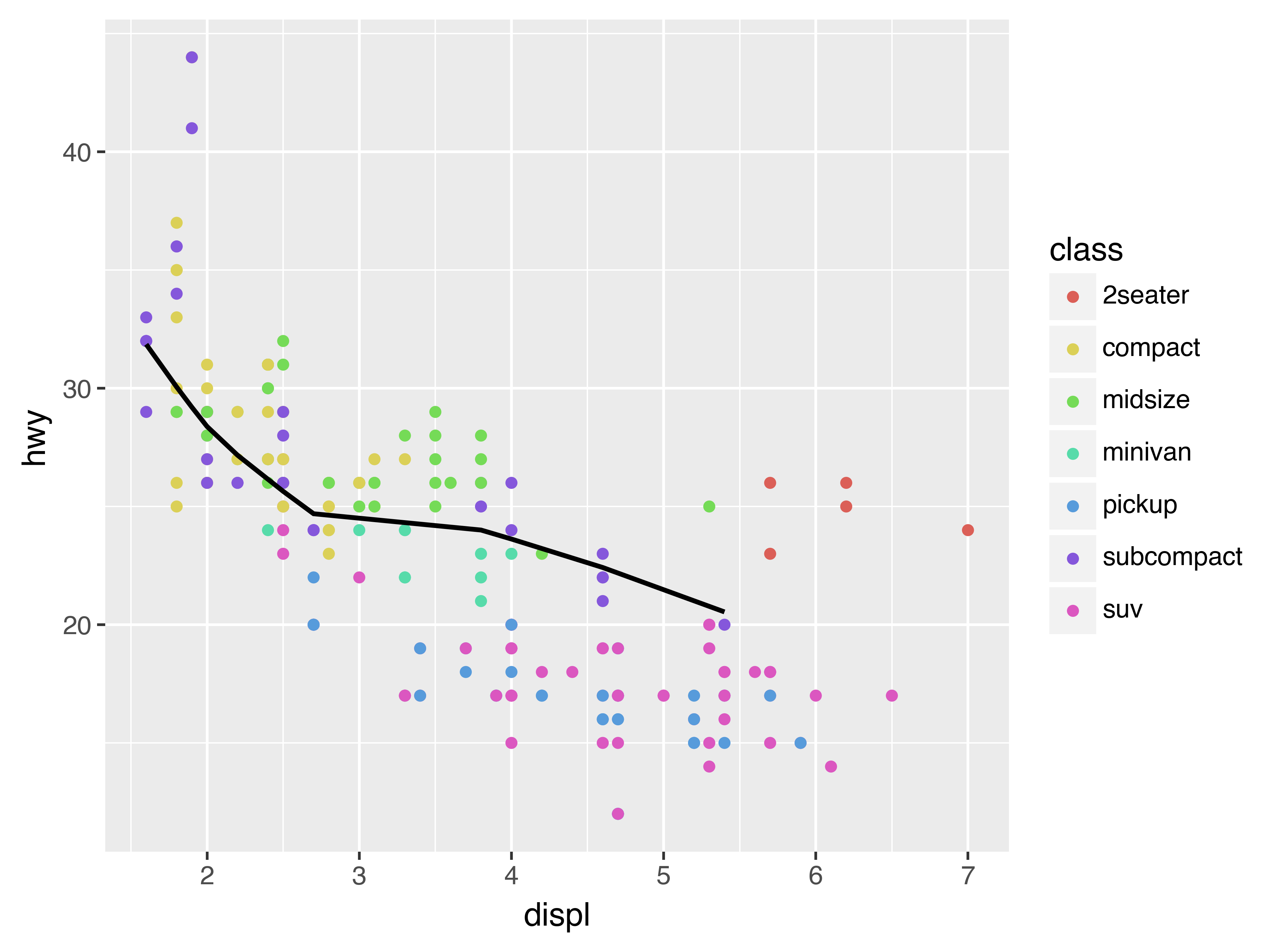
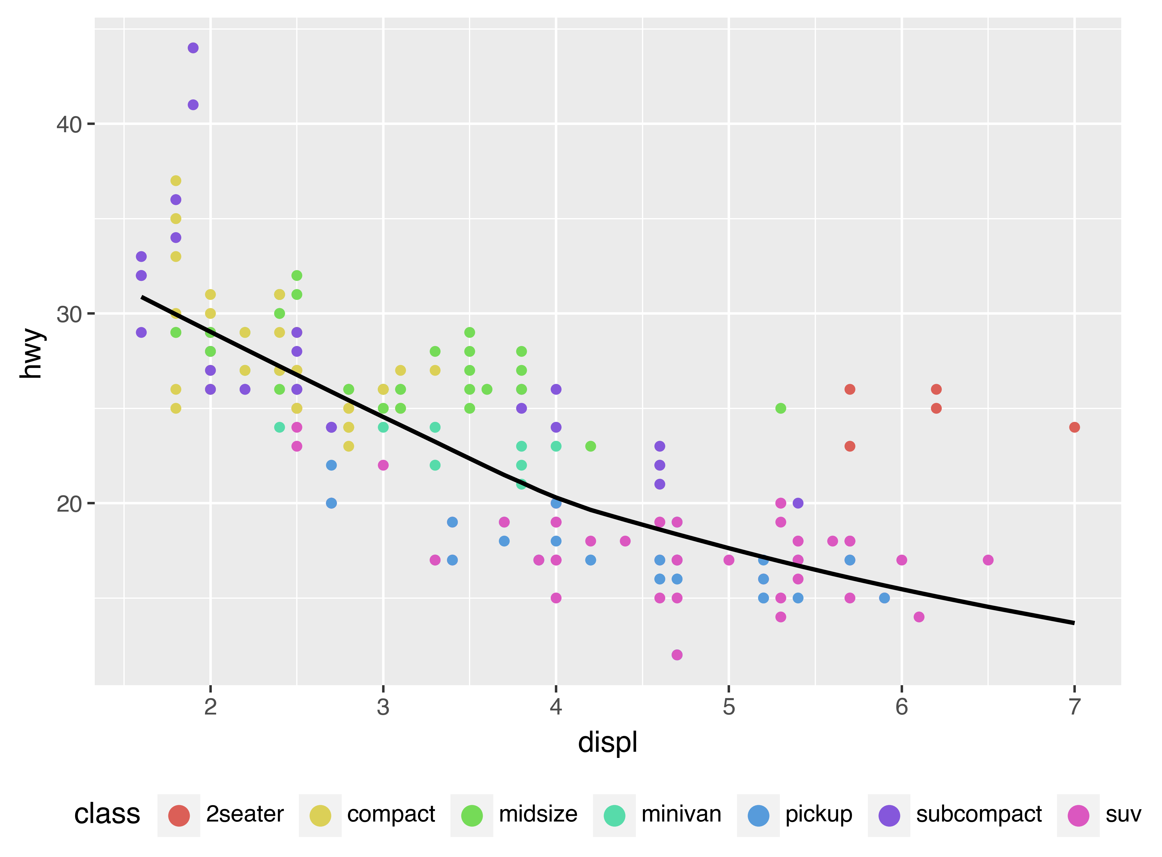
You can use the same idea to specify different data for each layer. Here, our smooth line displays just a subset of the mpg dataset, the subcompact cars. The local data argument in geom_smooth() overrides the global data argument in ggplot() for that layer only.
(
    ggplot(data=mpg, mapping=aes(x="displ", y="hwy"))
    + geom_point(mapping=aes(color="class"))
    + geom_smooth(data=mpg.filter(pl.col("class") == "subcompact"), se=False)
)
3.6.1 Exercises
-
What geom would you use to draw a line chart? A boxplot? A histogram? An area chart?
-
Run this code in your head and predict what the output will look like. Then, run the code in Python and check your predictions.
( ggplot(data=mpg, mapping=aes(x="displ", y="hwy", color="drv")) + geom_point() + geom_smooth(se=False) ) -
What does
show_legend=Falsedo? What happens if you remove it? Why do you think I used it earlier in the chapter? -
What does the
seargument togeom_smooth()do? -
Will these two graphs look different? Why/why not?
( ggplot(data=mpg, mapping=aes(x="displ", y="hwy")) + geom_point() + geom_smooth() ) ( ggplot() + geom_point(data=mpg, mapping=aes(x="displ", y="hwy")) + geom_smooth(data=mpg, mapping=aes(x="displ", y="hwy")) ) -
Recreate the Python code necessary to generate the following graphs.

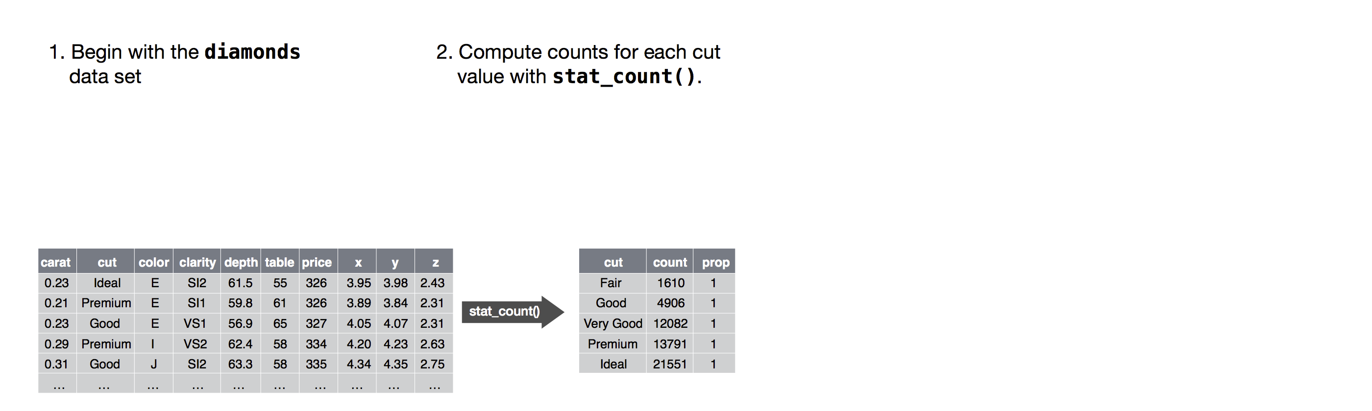
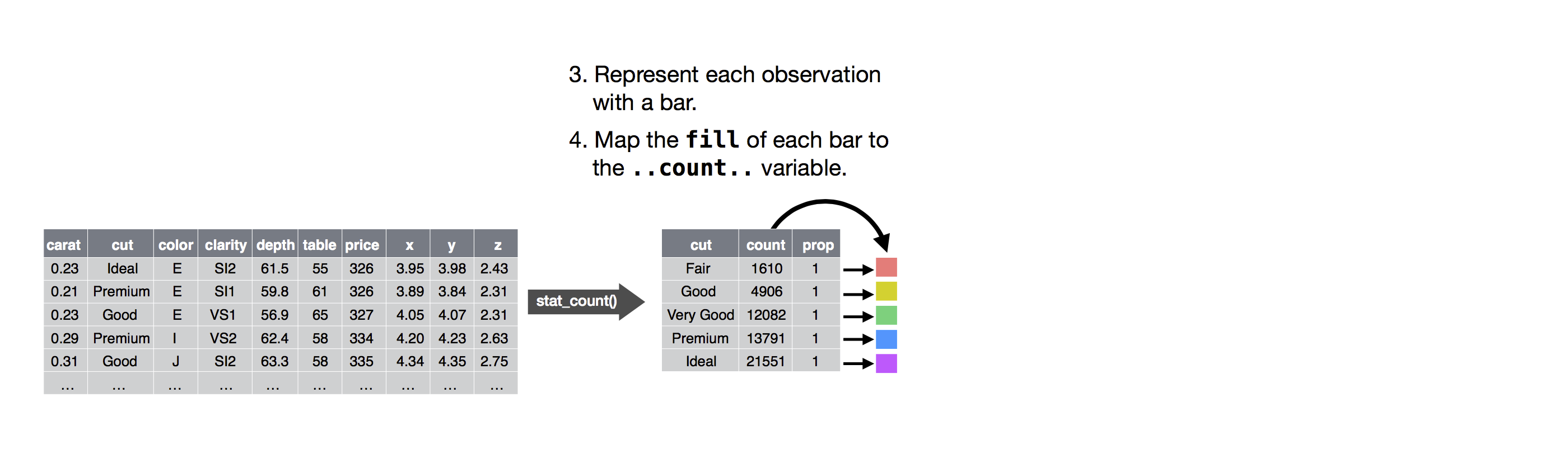
You can learn which stat a geom uses by inspecting the default value for the stat argument. For example, ?geom_bar shows that the default value for stat is “count”, which means that geom_bar() uses stat_count(). stat_count() is documented on the same page as geom_bar(), and if you scroll down you can find a section called “Computed variables”. That describes how it computes two new variables: count and prop.
You can generally use geoms and stats interchangeably. For example, you can recreate the previous plot using stat_count() instead of geom_bar():
diamonds = pl.from_pandas(data.diamonds)

(
    ggplot(data=diamonds)
    + stat_count(mapping=aes(x="cut"))
)
This works because every geom has a default stat; and every stat has a default geom. This means that you can typically use geoms without worrying about the underlying statistical transformation. There are three reasons you might need to use a stat explicitly:
-
You might want to override the default stat. In the code below, I change the stat of
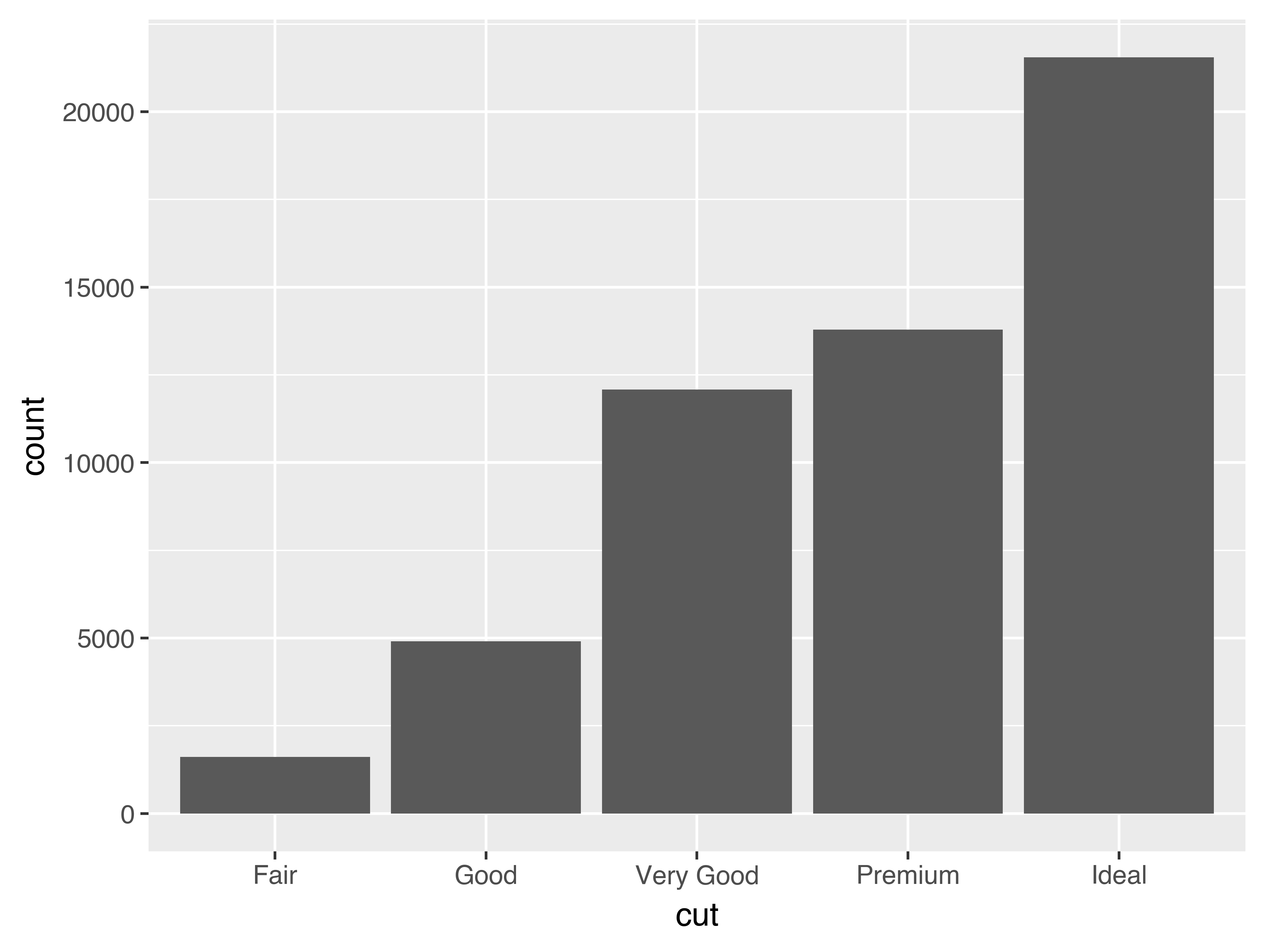
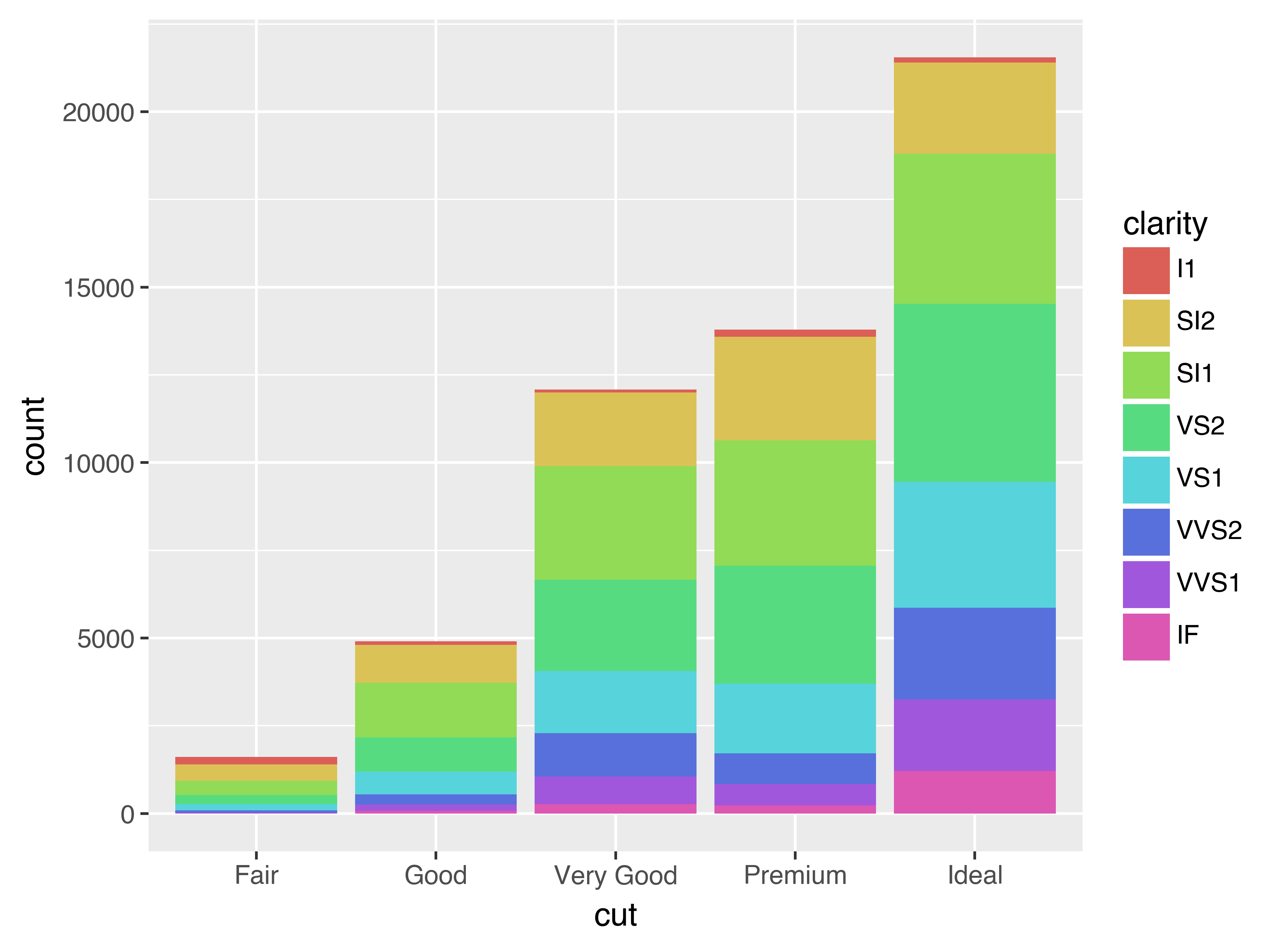
geom_bar()from count (the default) to identity. This lets me map the height of the bars to the raw values of a “y” variable. Unfortunately when people talk about bar charts casually, they might be referring to this type of bar chart, where the height of the bar is already present in the data, or the previous bar chart where the height of the bar is generated by counting rows.demo = pl.DataFrame({"cut": ["Fair", "Good", "Very Good", "Premium", "Ideal"], "freq": [1610, 4906, 12082, 13791, 21551]}) ( ggplot(data=demo) + geom_bar(mapping=aes(x="cut", y="freq"), stat="identity") )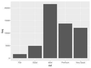
-
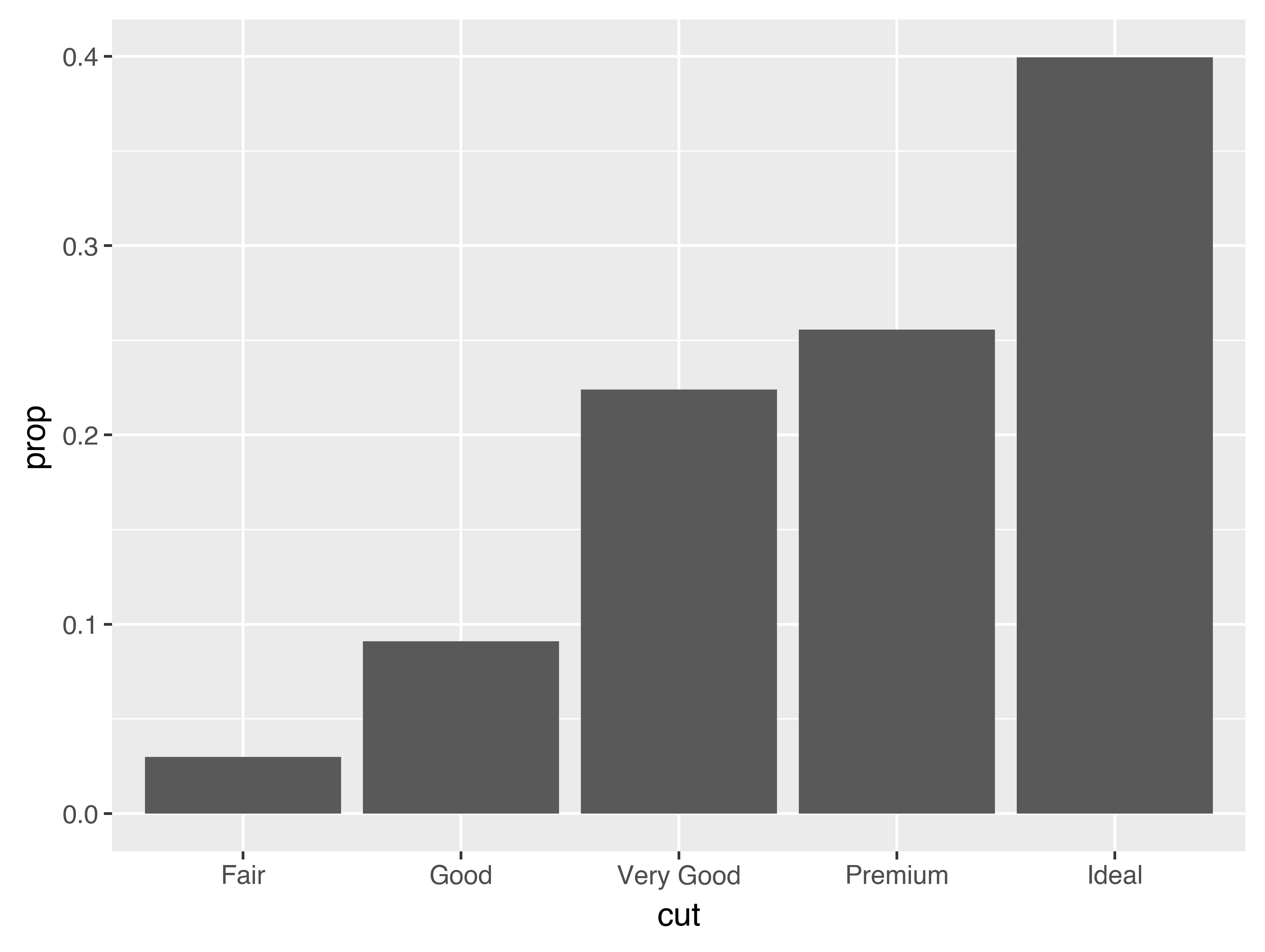
You might want to override the default mapping from transformed variables to aesthetics. For example, you might want to display a bar chart of proportion, rather than count:
(
    ggplot(data=diamonds)
    + geom_bar(mapping=aes(x="cut", y="..prop..", group=1))
)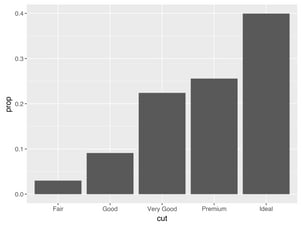
To find the variables computed by the stat, look for the help section titled “computed variables”.
-
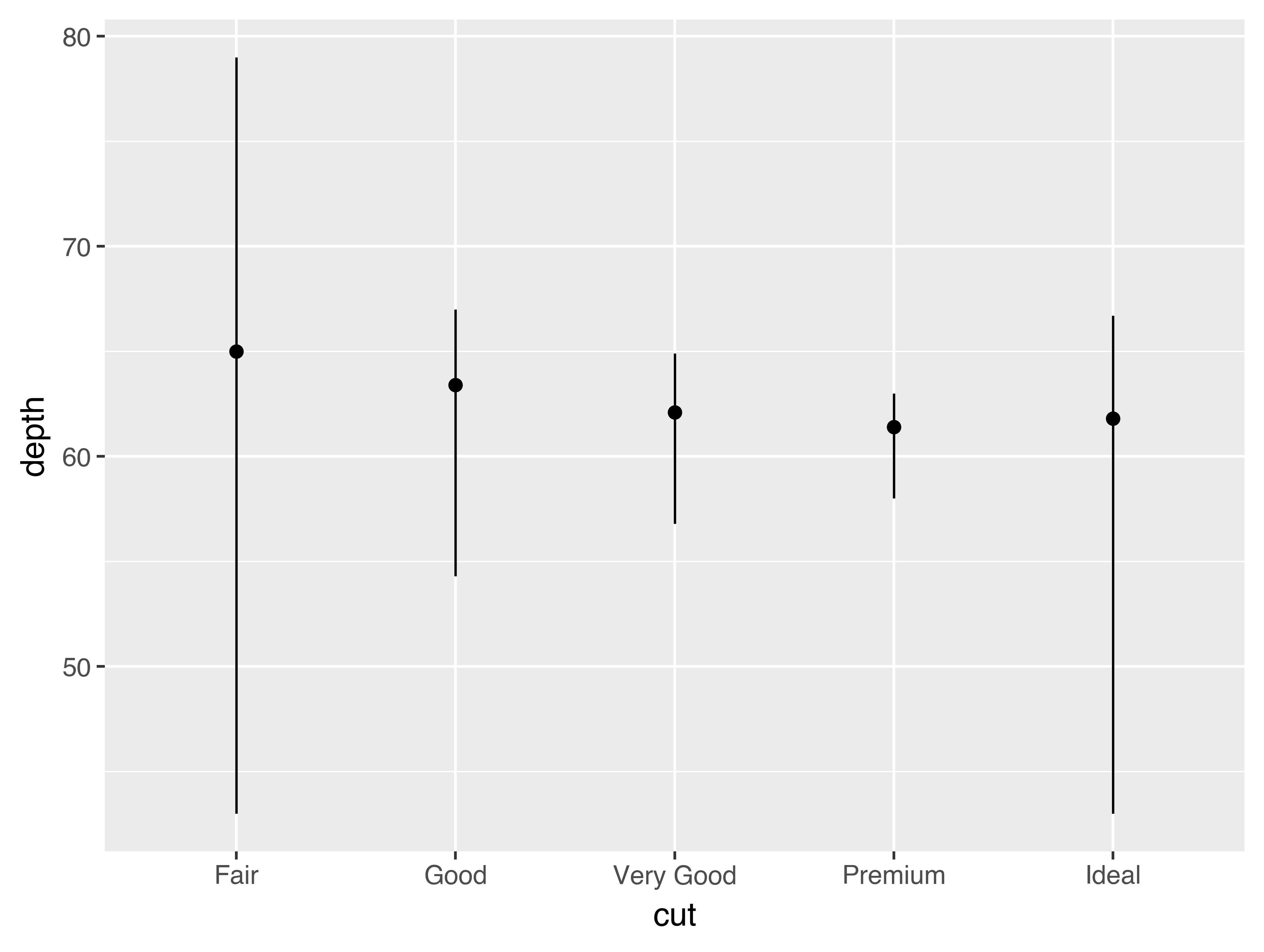
You might want to draw greater attention to the statistical transformation in your code. For example, you might use
stat_summary(), which summarises the y values for each unique x value, to draw attention to the summary that you’re computing:( ggplot(data=diamonds) + stat_summary( mapping=aes(x="cut", y="depth"), fun_ymin=np.min, fun_ymax=np.max, fun_y=np.median) )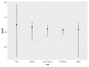

plotnine provides over 20 stats for you to use. Each stat is a function, so you can get help in the usual way, e.g. ?stat_bin. To see a complete list of stats, try the ggplot2 cheatsheet.
3.7.1 Exercises
-
What is the default geom associated with
stat_summary()? How could you rewrite the previous plot to use that geom function instead of the stat function? -
What does
geom_col()do? How is it different togeom_bar()? -
Most geoms and stats come in pairs that are almost always used in concert. Read through the documentation and make a list of all the pairs. What do they have in common?
-
What variables does
stat_smooth()compute? What parameters control its behaviour? -
In our proportion bar chart, we need to set
group=1. Why? In other words what is the problem with these two graphs?ggplot(data=diamonds) +\ geom_bar(mapping=aes(x="cut", y="..prop..")) ggplot(data=diamonds) +\ geom_bar(mapping=aes(x="cut", fill="color", y="..prop.."))
3.8 Position adjustments
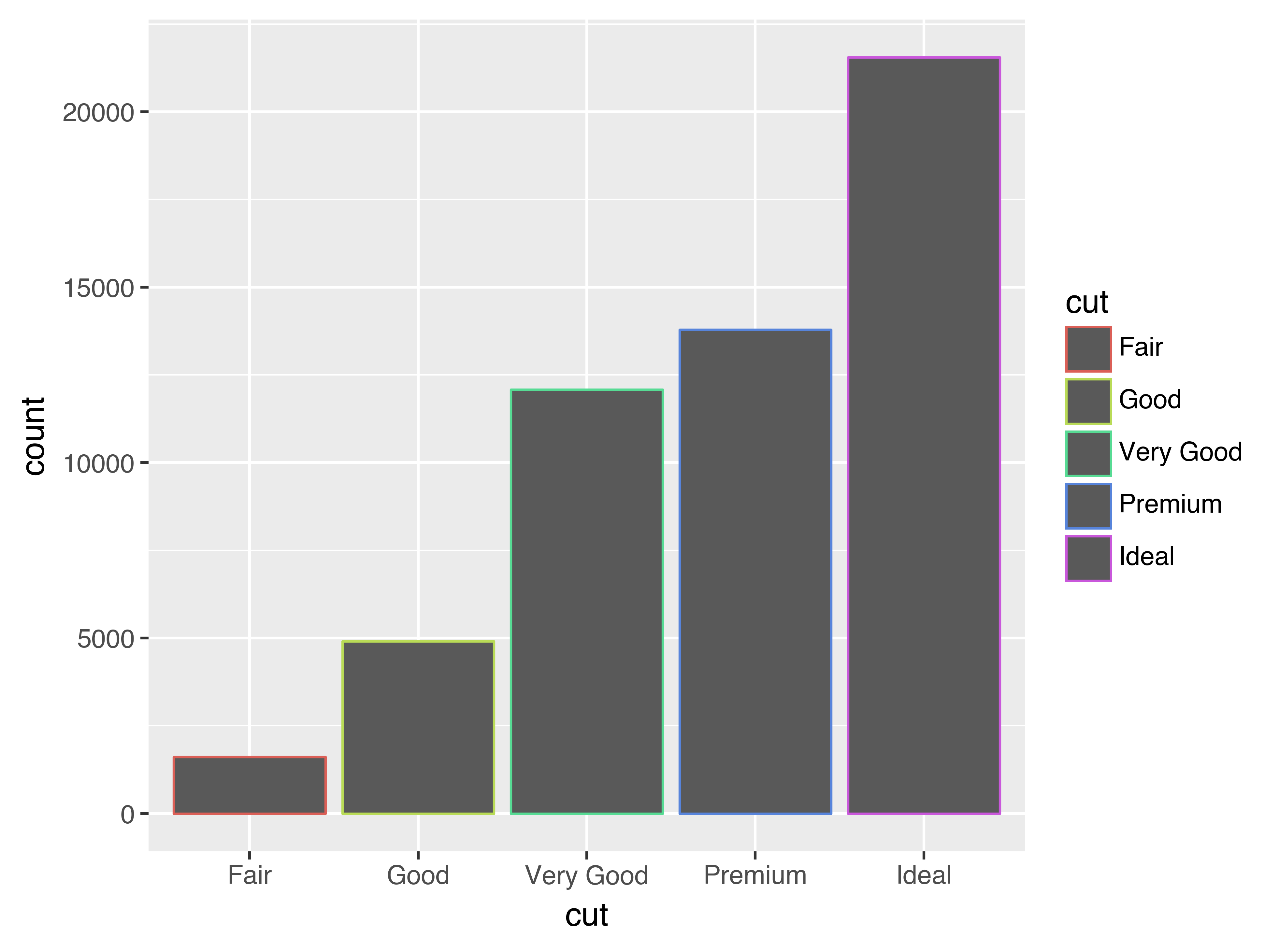
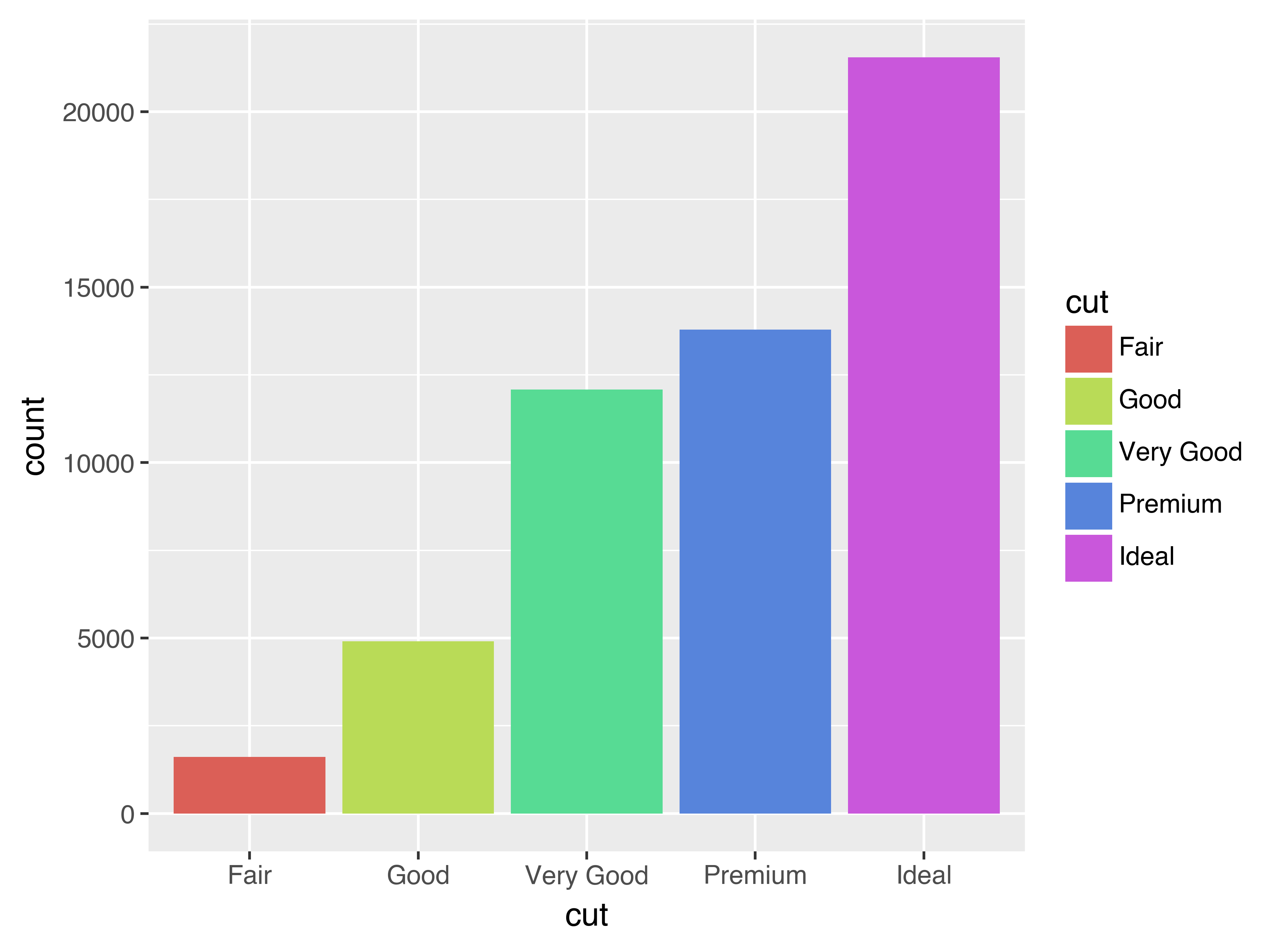
There’s one more piece of magic associated with bar charts. You can colour a bar chart using either the colour aesthetic, or, more usefully, fill:
# Left
(
    ggplot(data=diamonds)
    + geom_bar(mapping=aes(x="cut", colour="cut"))
)

# Right
(
    ggplot(data=diamonds)
    + geom_bar(mapping=aes(x="cut", fill="cut"))
)
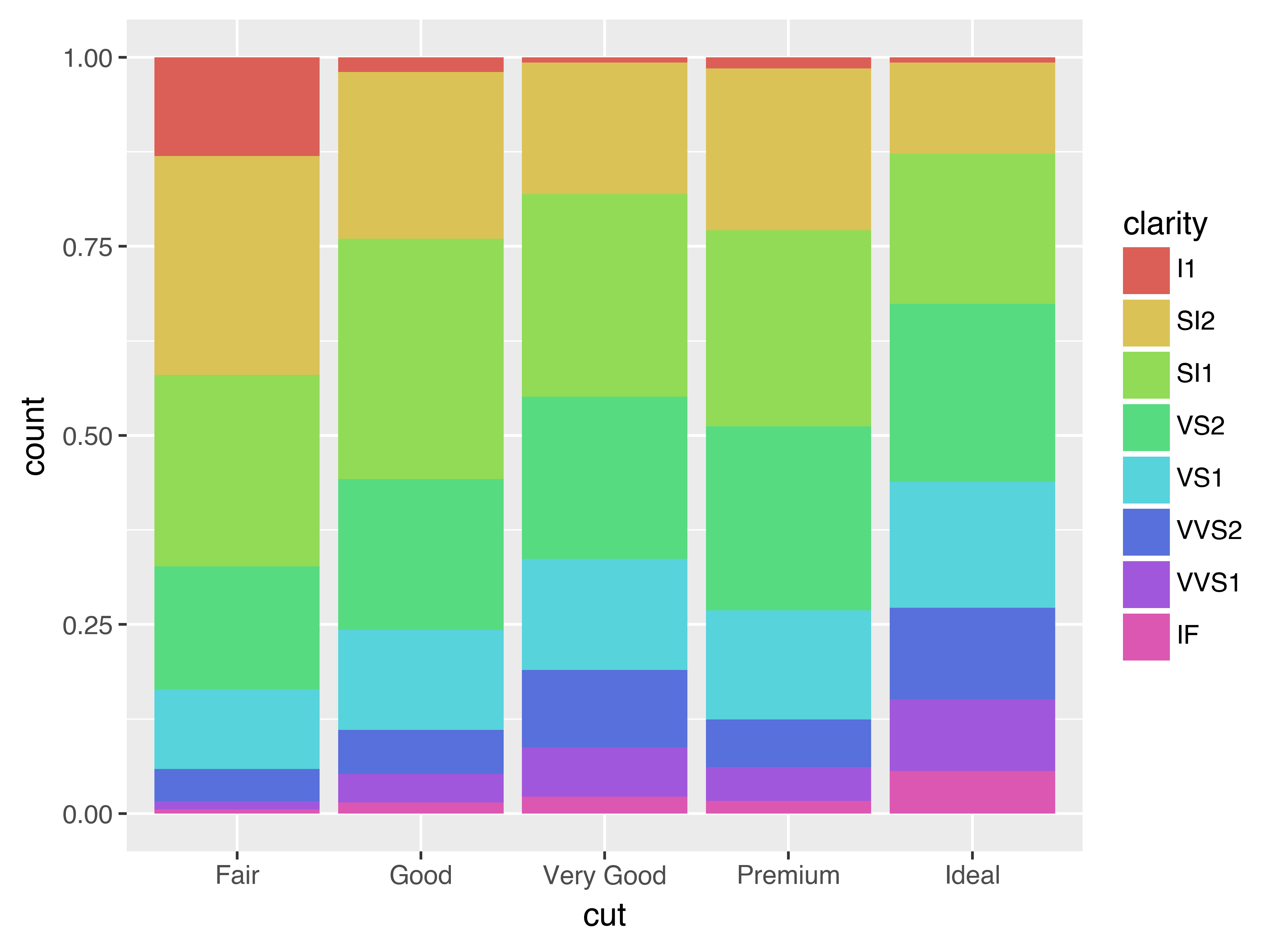
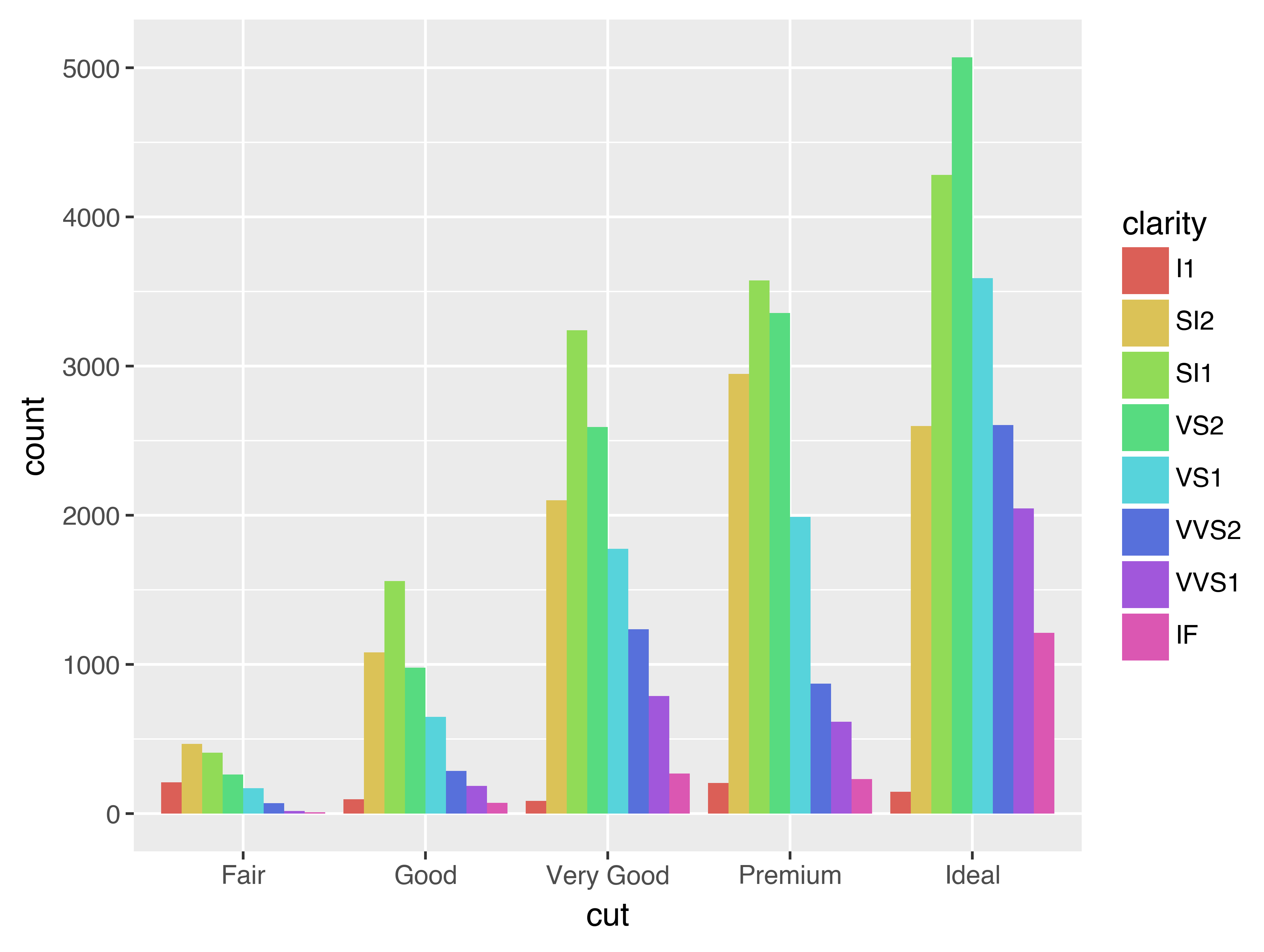
Note what happens if you map the fill aesthetic to another variable, like clarity: the bars are automatically stacked. Each colored rectangle represents a combination of cut and clarity.
(
    ggplot(data=diamonds)
    + geom_bar(mapping=aes(x="cut", fill="clarity"))
)
The stacking is performed automatically by the position adjustment specified by the position argument. If you don’t want a stacked bar chart, you can use one of three other options: "identity", "dodge" or "fill".
-
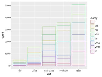
position="identity"will place each object exactly where it falls in the context of the graph. This is not very useful for bars, because it overlaps them. To see that overlapping we either need to make the bars slightly transparent by settingalphato a small value, or completely transparent by settingfill=None.# Left ( ggplot(data=diamonds, mapping=aes(x="cut", fill="clarity")) + geom_bar(alpha=1/5, position="identity") ) # Right ( ggplot(data=diamonds, mapping=aes(x="cut", colour="clarity")) + geom_bar(fill=None, position="identity") )The identity position adjustment is more useful for 2d geoms, like points, where it is the default.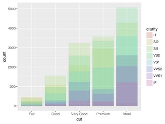
-
position="fill"works like stacking, but makes each set of stacked bars the same height. This makes it easier to compare proportions across groups.( ggplot(data=diamonds) + geom_bar(mapping=aes(x="cut", fill="clarity"), position="fill") )
-
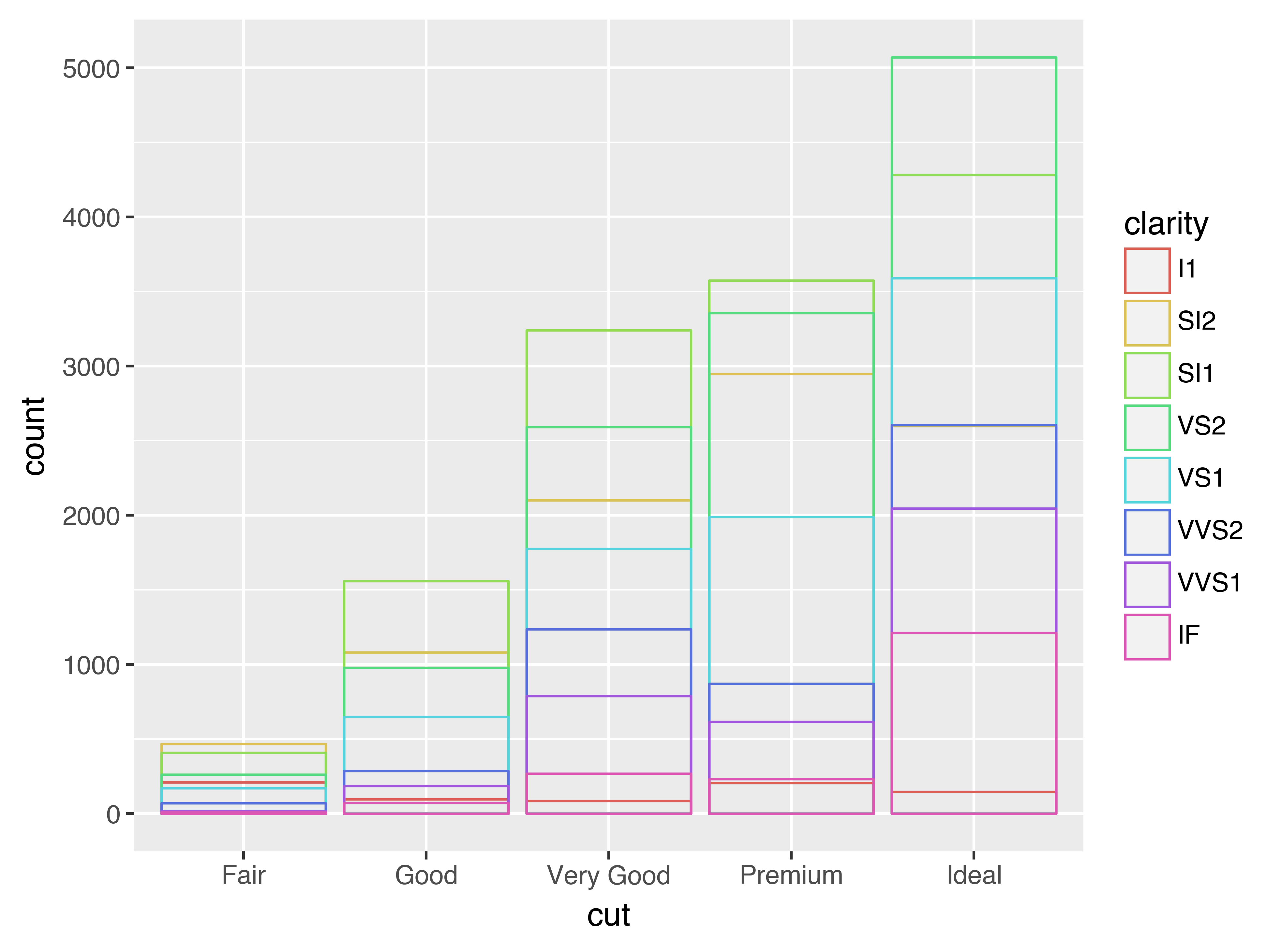
position="dodge"places overlapping objects directly beside one another. This makes it easier to compare individual values.( ggplot(data=diamonds) + geom_bar(mapping=aes(x="cut", fill="clarity"), position="dodge") )

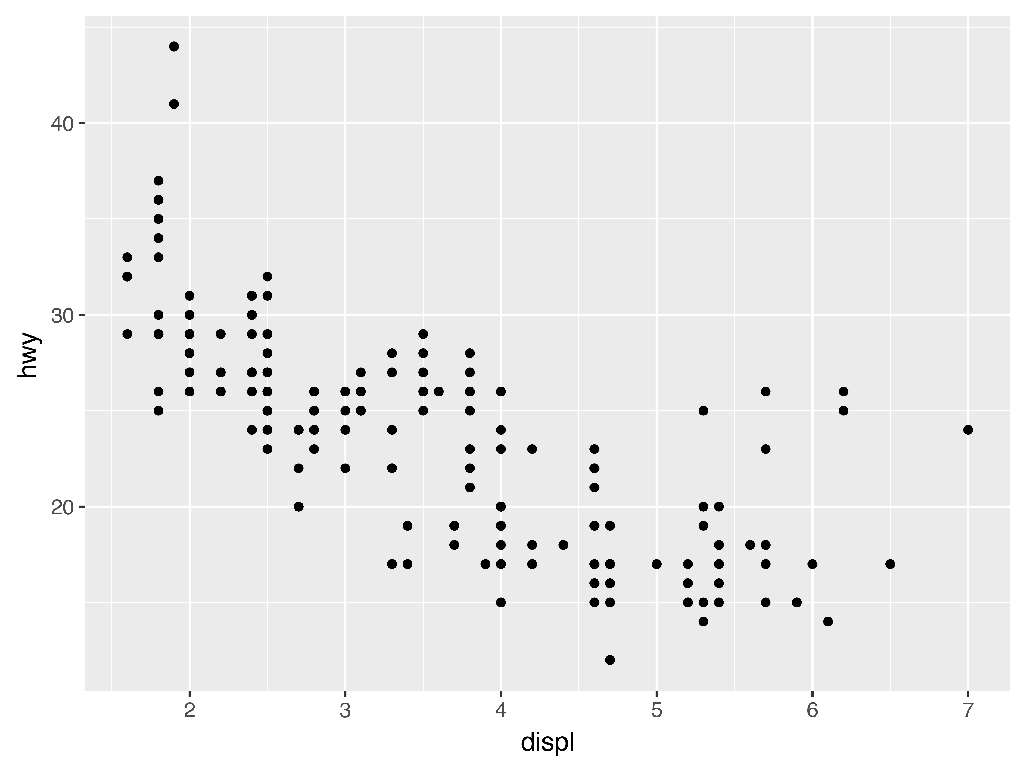
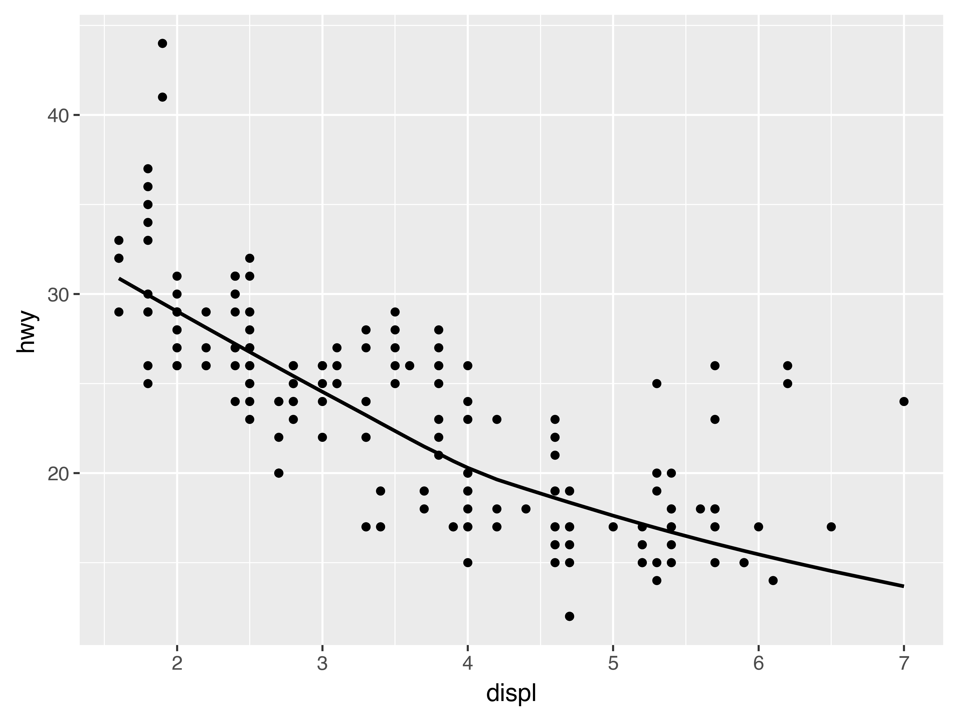
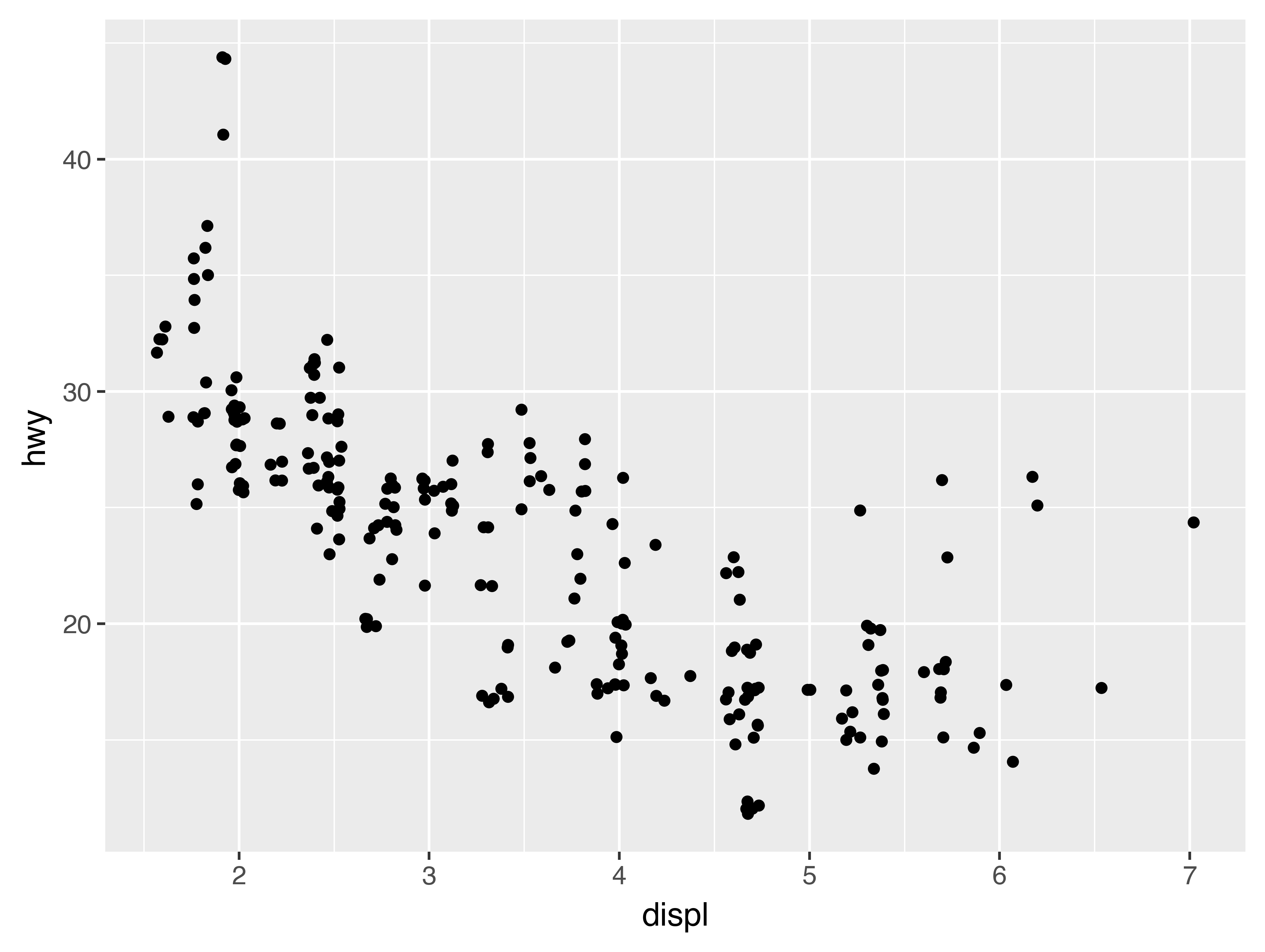
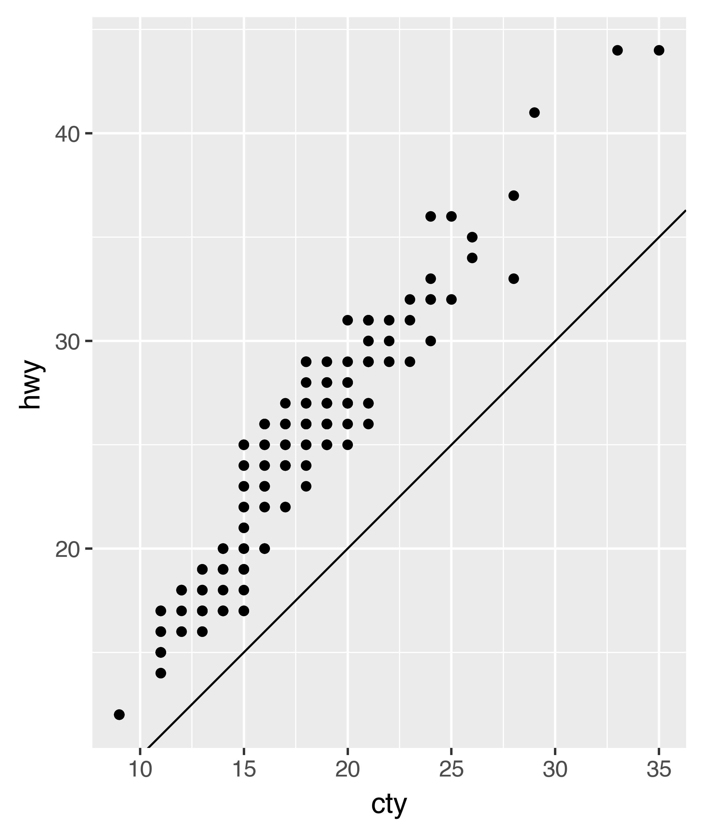
There’s one other type of adjustment that’s not useful for bar charts, but it can be very useful for scatterplots. Recall our first scatterplot. Did you notice that the plot displays only 126 points, even though there are 234 observations in the dataset?

The values of hwy and displ are rounded so the points appear on a grid and many points overlap each other. This problem is known as overplotting. This arrangement makes it hard to see where the mass of the data is. Are the data points spread equally throughout the graph, or is there one special combination of hwy and displ that contains 109 values?
You can avoid this gridding by setting the position adjustment to “jitter”. position="jitter" adds a small amount of random noise to each point. This spreads the points out because no two points are likely to receive the same amount of random noise.
(
    ggplot(data=mpg)
    + geom_point(mapping=aes(x="displ", y="hwy"), position="jitter")
)
Adding randomness seems like a strange way to improve your plot, but while it makes your graph less accurate at small scales, it makes your graph more revealing at large scales. Because this is such a useful operation, plotnine comes with a shorthand for geom_point(position="jitter"): geom_jitter().
To learn more about a position adjustment, look up the help page associated with each adjustment: ?position_dodge, ?position_fill, ?position_identity, ?position_jitter, and ?position_stack.
3.8.1 Exercises
-
What is the problem with this plot? How could you improve it?
(
    ggplot(data=mpg, mapping=aes(x="cty", y="hwy"))
    + geom_point()
)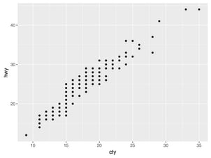
-
What parameters to
geom_jitter()control the amount of jittering? -
Compare and contrast
geom_jitter()withgeom_count(). -
What’s the default position adjustment for
geom_boxplot()? Create a visualisation of thempgdataset that demonstrates it.

3.9 Coordinate systems
Coordinate systems are probably the most complicated part of plotnine. The default coordinate system is the Cartesian coordinate system where the x and y positions act independently to determine the location of each point. There is one other coordinate system that is occasionally helpful.[6]
-
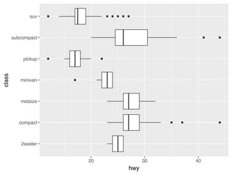
coord_flip()switches the x and y axes. This is useful (for example), if you want horizontal boxplots. It’s also useful for long labels: it’s hard to get them to fit without overlapping on the x-axis.# Left ( ggplot(data=mpg, mapping=aes(x="class", y="hwy")) + geom_boxplot() ) # Right ( ggplot(data=mpg, mapping=aes(x="class", y="hwy")) + geom_boxplot() + coord_flip() )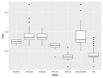

3.9.1 Exercises
-
What does
labs()do? Read the documentation. -
What does the plot below tell you about the relationship between city and highway mpg? Why is
coord_fixed()important? What doesgeom_abline()do?( ggplot(data=mpg, mapping=aes(x="cty", y="hwy")) + geom_point() + geom_abline() + coord_fixed() )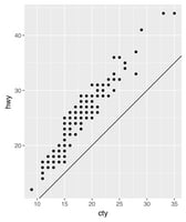
3.10 The layered grammar of graphics
In the previous sections, you learned much more than how to make scatterplots, bar charts, and boxplots. You learned a foundation that you can use to make any type of plot with plotnine. To see this, let’s add position adjustments, stats, coordinate systems, and faceting to our code template:
(
    ggplot(data=DATA)
    + GEOM_FUNCTION(
        mapping=aes(MAPPINGS),
        stat=STAT,
        position=POSITION
    )
    + COORDINATE_FUNCTION
    + FACET_FUNCTION
)
Our new template takes seven parameters, the bracketed words that appear in the template. In practice, you rarely need to supply all seven parameters to make a graph because plotnine will provide useful defaults for everything except the data, the mappings, and the geom function.
The seven parameters in the template compose the grammar of graphics, a formal system for building plots. The grammar of graphics is based on the insight that you can uniquely describe any plot as a combination of a dataset, a geom, a set of mappings, a stat, a position adjustment, a coordinate system, and a faceting scheme.
To see how this works, consider how you could build a basic plot from scratch: you could start with a dataset and then transform it into the information that you want to display (with a stat).
Next, you could choose a geometric object to represent each observation in the transformed data. You could then use the aesthetic properties of the geoms to represent variables in the data. You would map the values of each variable to the levels of an aesthetic.
You’d then select a coordinate system to place the geoms into. You’d use the location of the objects (which is itself an aesthetic property) to display the values of the x and y variables. At that point, you would have a complete graph, but you could further adjust the positions of the geoms within the coordinate system (a position adjustment) or split the graph into subplots (faceting). You could also extend the plot by adding one or more additional layers, where each additional layer uses a dataset, a geom, a set of mappings, a stat, and a position adjustment.

You could use this method to build any plot that you imagine. In other words, you can use the code template that you’ve learned in this chapter to build hundreds of thousands of unique plots.
28 Graphics for communication
28.1 Introduction
Now that you understand your data, you need to communicate your understanding to others. Your audience will likely not share your background knowledge and will not be deeply invested in the data. To help others quickly build up a good mental model of the data, you will need to invest considerable effort in making your plots as self-explanatory as possible. In this chapter, you’ll learn some of the tools that plotnine provides to do so.
The rest of this tutorial focuses on the tools you need to create good graphics. I assume that you know what you want, and just need to know how to do it. For that reason, I highly recommend pairing this chapter with a good general visualisation book. I particularly like The Truthful Art, by Albert Cairo. It doesn’t teach the mechanics of creating visualisations, but instead focuses on what you need to think about in order to create effective graphics.
28.2 Label
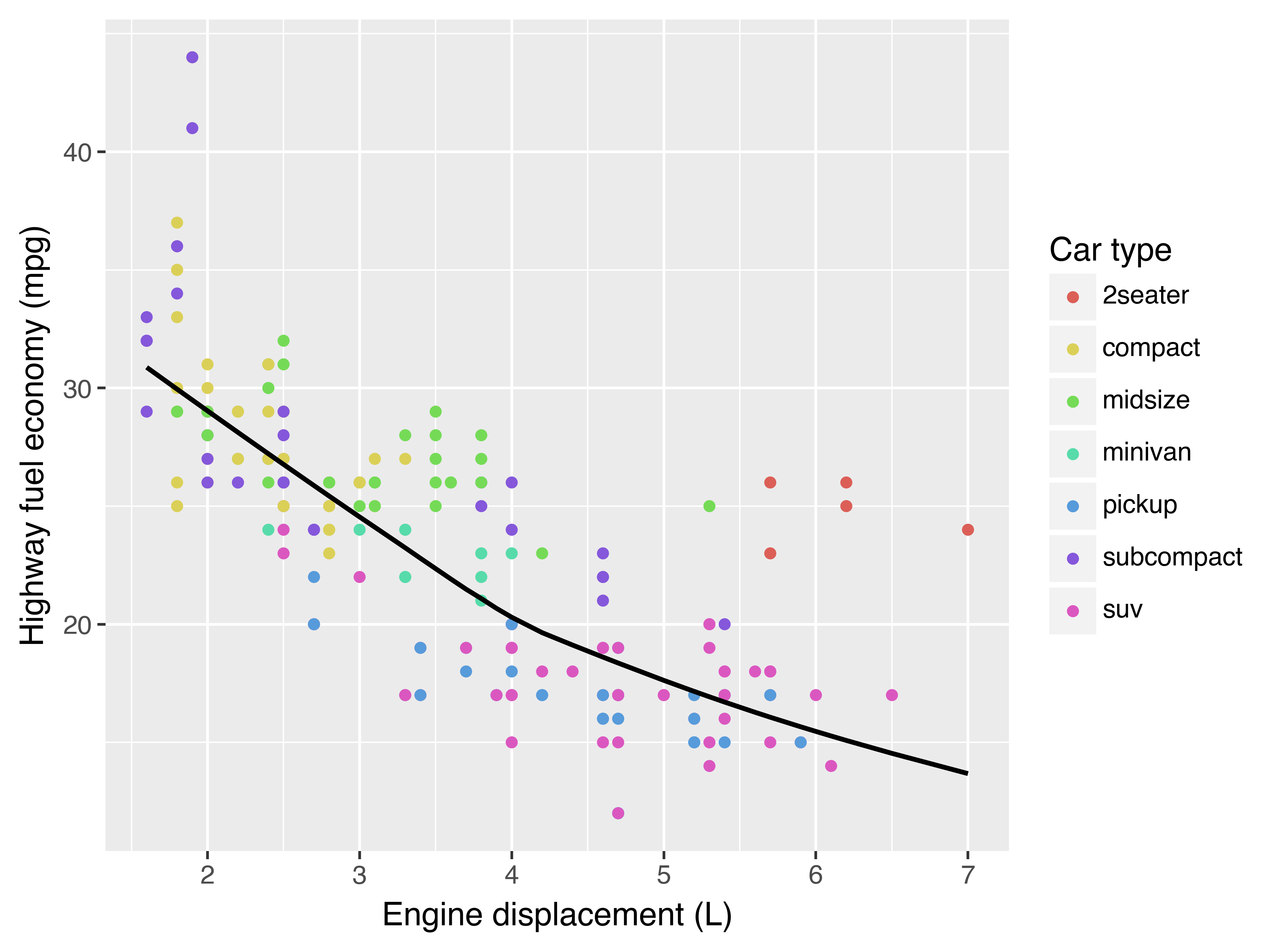
The easiest place to start when turning an exploratory graphic into an expository graphic is with good labels. You add labels with the labs() function. This example adds a plot title, a subtitle, and a caption:
(
ggplot(mpg, aes("displ", "hwy"))
+ geom_point(aes(color="class"))
+ geom_smooth(se=False)
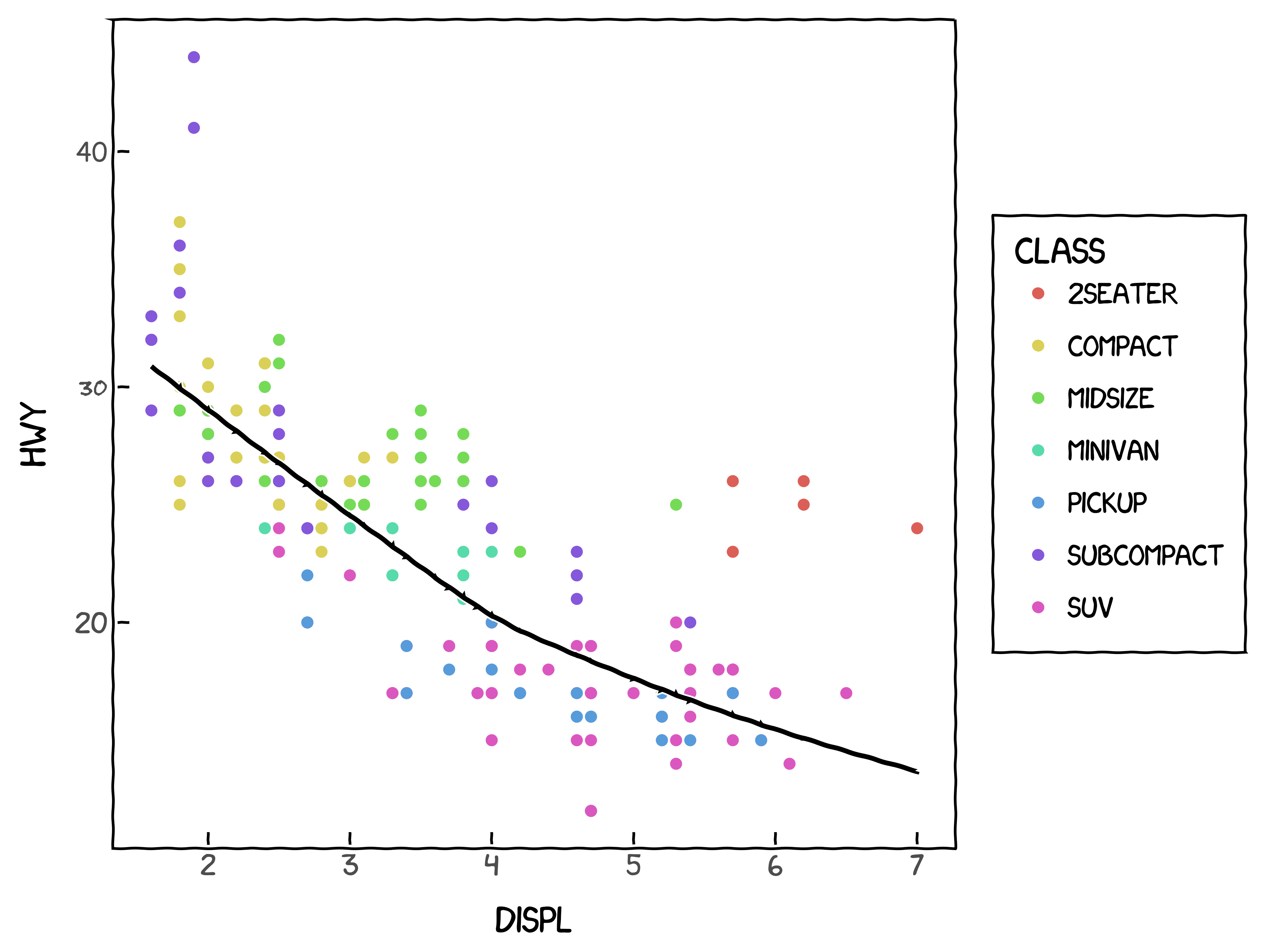
+ labs(title="Fuel efficiency generally decreases with engine size",
subtitle="Two seaters are an exception because of their light weight",
caption="Data from fueleconomy.gov")
)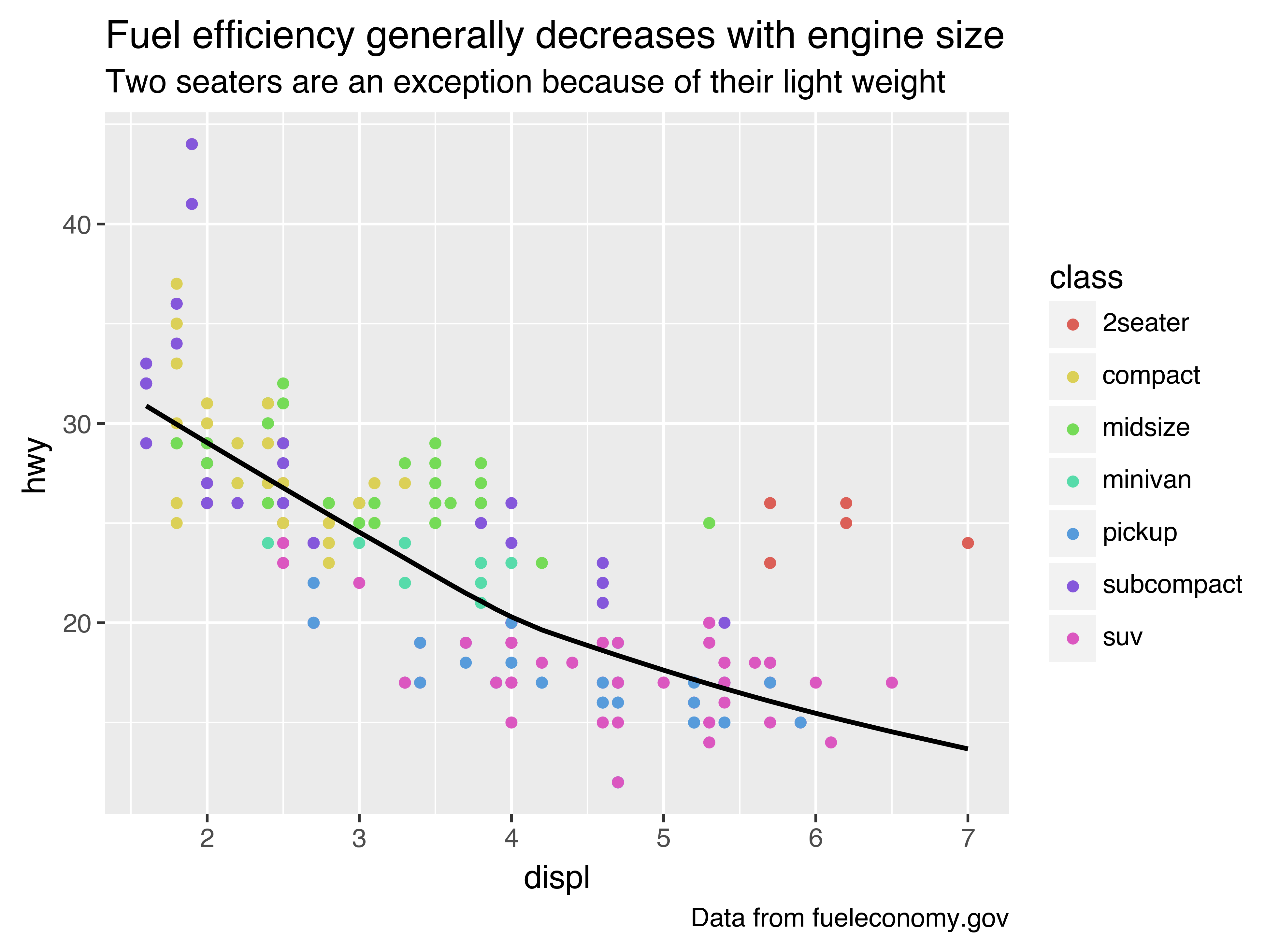
The purpose of a plot title is to summarise the main finding. Avoid titles that just describe what the plot is, e.g. “A scatterplot of engine displacement vs. fuel economy”.
You can also use labs() to replace the axis and legend titles. It’s usually a good idea to replace short variable names with more detailed descriptions, and to include the units.
(
    ggplot(mpg, aes("displ", "hwy"))
    + geom_point(aes(colour="class"))
    + geom_smooth(se=False)
    + labs(x="Engine displacement (L)",
           y="Highway fuel economy (mpg)",
           colour="Car type")
)
It’s possible to use mathematical equations instead of text strings. You have to tell matplotlib, which is used by plotnine to do the actuall plotting, to use LaTeX for rendering text:
df = pl.DataFrame({"x": np.random.uniform(size=10),
                   "y": np.random.uniform(size=10)})

(
    ggplot(df, aes("x", "y"))
    + geom_point()
    + labs(x=r"$\sum_{i = 1}^n{x_i^2}$",
           y=r"$\alpha + \beta + \frac{\delta}{\theta}$")
)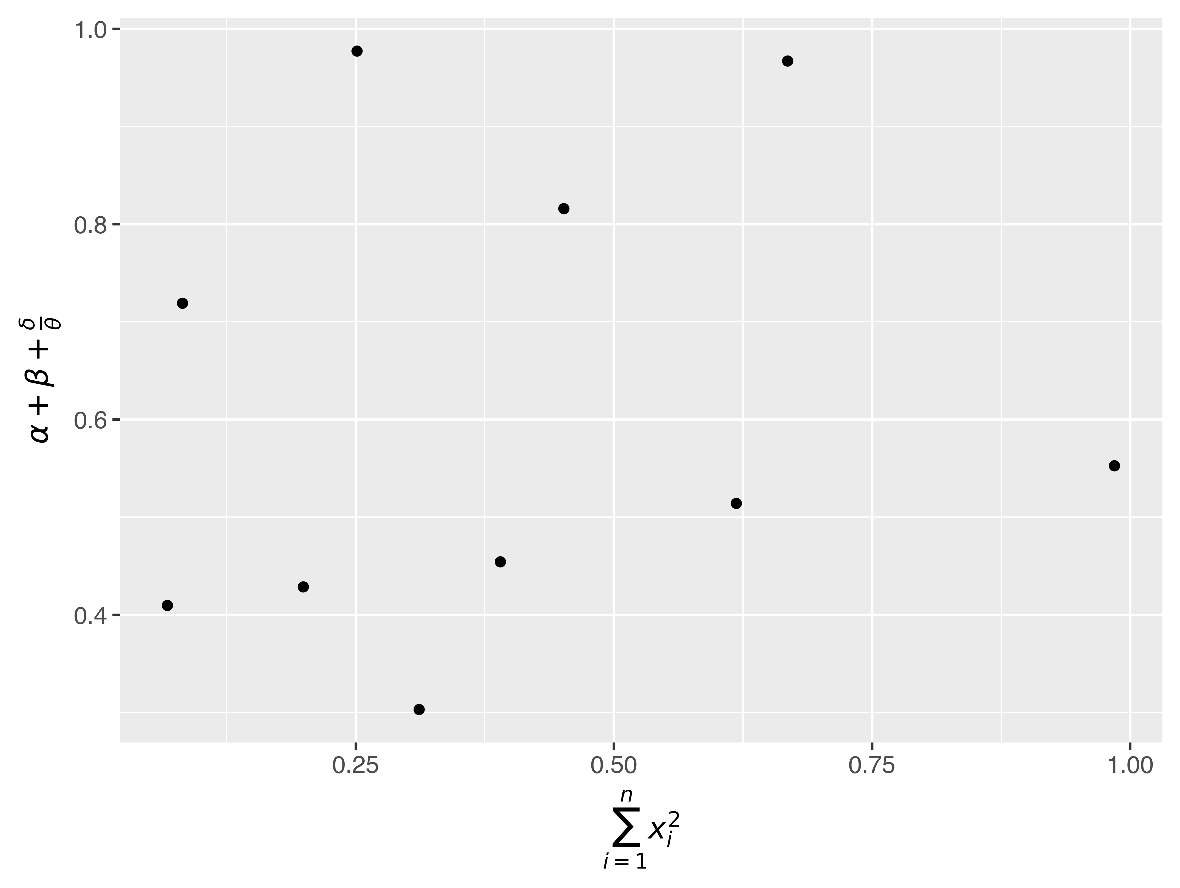
See the matplotlib documentation for more information about how to write mathematical equations using LaTeX.
28.2.1 Exercises
-
Create one plot on the fuel economy data with customised
title,x,y, andcolourlabels. -
The
geom_smooth()is somewhat misleading because thehwyfor large engines is skewed upwards due to the inclusion of lightweight sports cars with big engines. Use your modelling tools to fit and display a better model. -
Take an exploratory graphic that you’ve created in the last month, and add an informative title to make it easier for others to understand.
28.3 Annotations
In addition to labelling major components of your plot, it’s often useful to label individual observations or groups of observations. The first tool you have at your disposal is geom_text(). geom_text() is similar to geom_point(), but it has an additional aesthetic: label. This makes it possible to add textual labels to your plots.
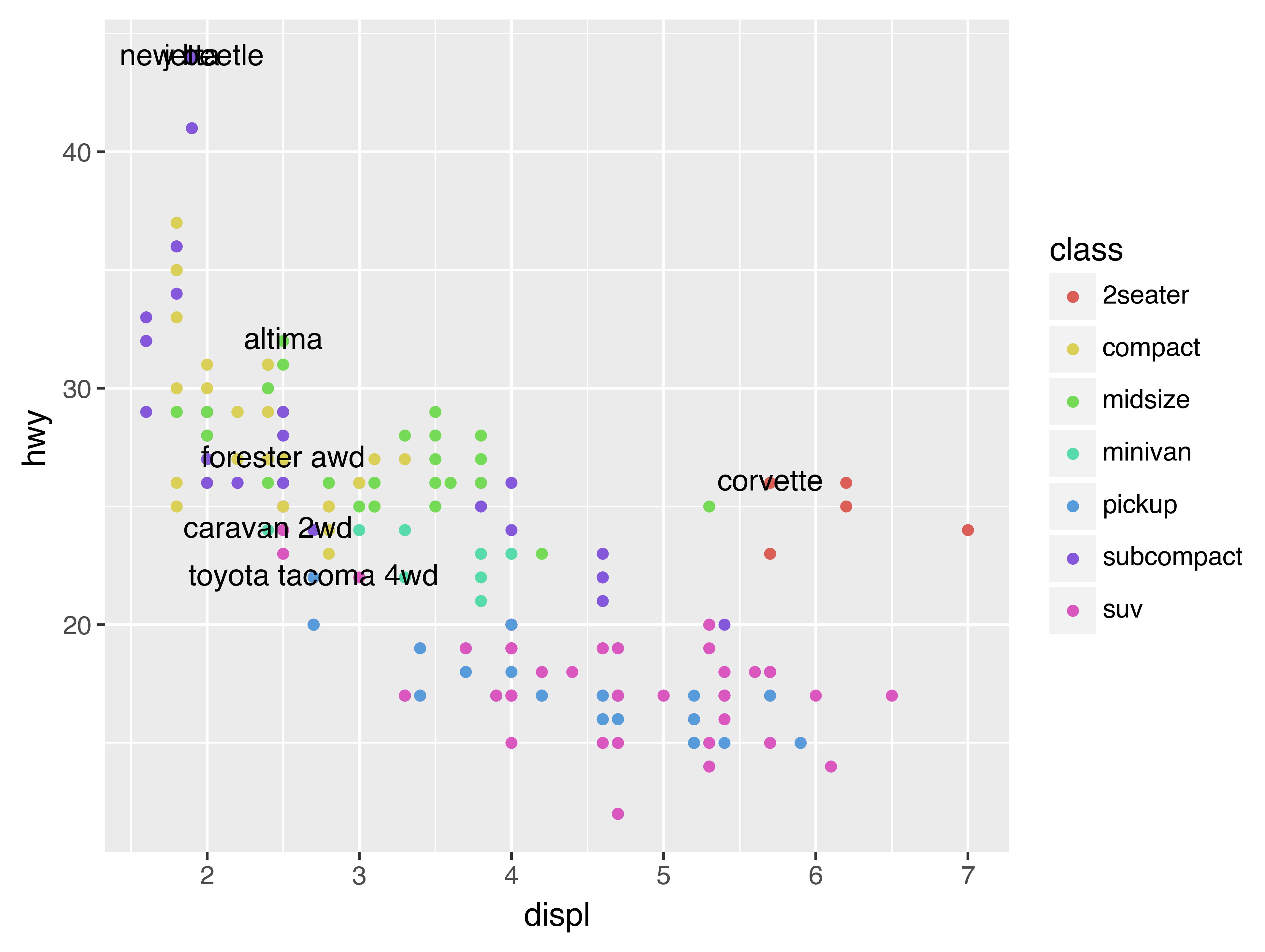
There are two possible sources of labels. First, you might have a DataFrame that provides labels. The plot below isn’t terribly useful, but it illustrates a useful approach: pull out the most efficient car in each class with pandas, and then label it on the plot:
best_in_class = (
    mpg
    .sort(by="hwy", descending=True)
    .group_by("class")
    .first()
)

(
    ggplot(mpg, aes("displ", "hwy"))
    + geom_point(aes(colour="class"))
    + geom_text(aes(label="model"), data=best_in_class)
)
This is hard to read because the labels overlap with each other, and with the points. We can make things a little better by switching to geom_label() which draws a rectangle behind the text. We also use the nudge_y parameter to move the labels slightly above the corresponding points:
(
    ggplot(mpg, aes("displ", "hwy"))
    + geom_point(aes(colour="class"))
    + geom_label(aes(label="model"), data=best_in_class, nudge_y=2, alpha=0.5)
)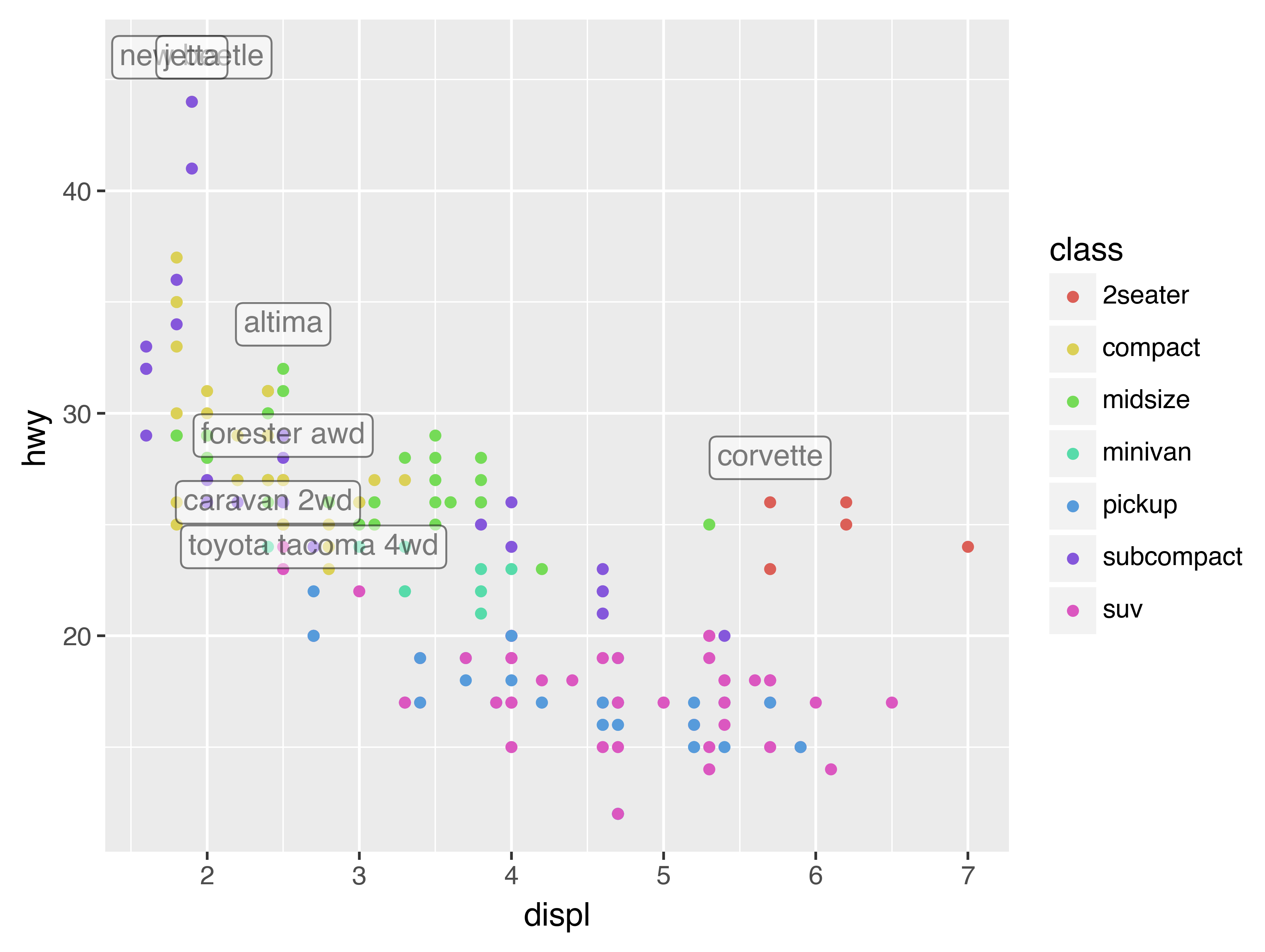
That helps a bit, but if you look closely in the top-left hand corner, you’ll notice that there are two labels practically on top of each other. This happens because the highway mileage and displacement for the best cars in the compact and subcompact categories are exactly the same. There’s no way that we can fix these by applying the same transformation for every label. Instead, we can use the adjust_text argument. This useful argument, which employs the adjustText package under the hood, will automatically adjust labels so that they don’t overlap:
(
ggplot(mpg, aes("displ", "hwy"))
+ geom_point(aes(colour="class"))
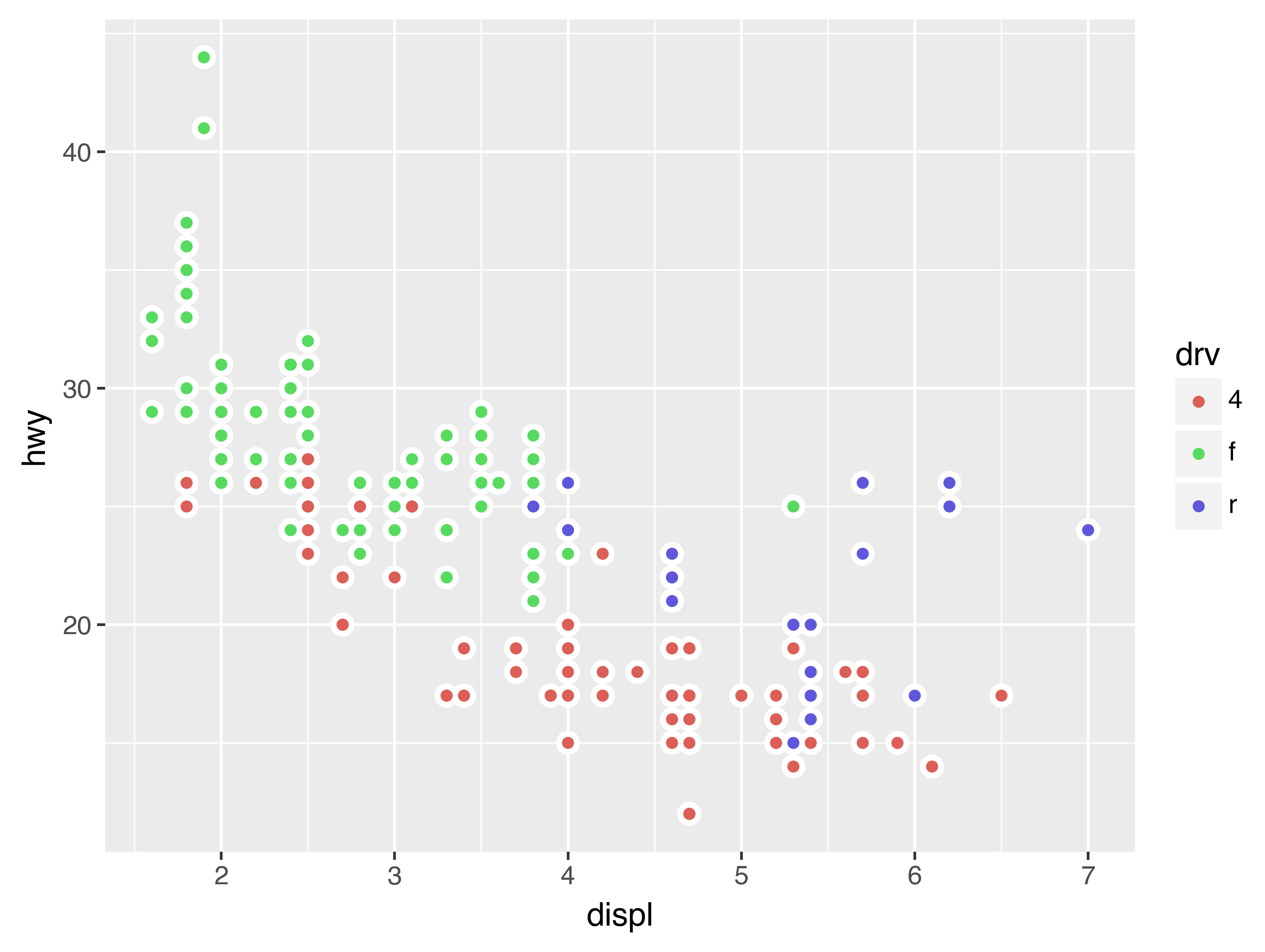
+ geom_point(data=best_in_class, fill='none')
+ geom_label(aes(label="model"), data=best_in_class, adjust_text={
'arrowprops': {
'arrowstyle': '-'
}})
)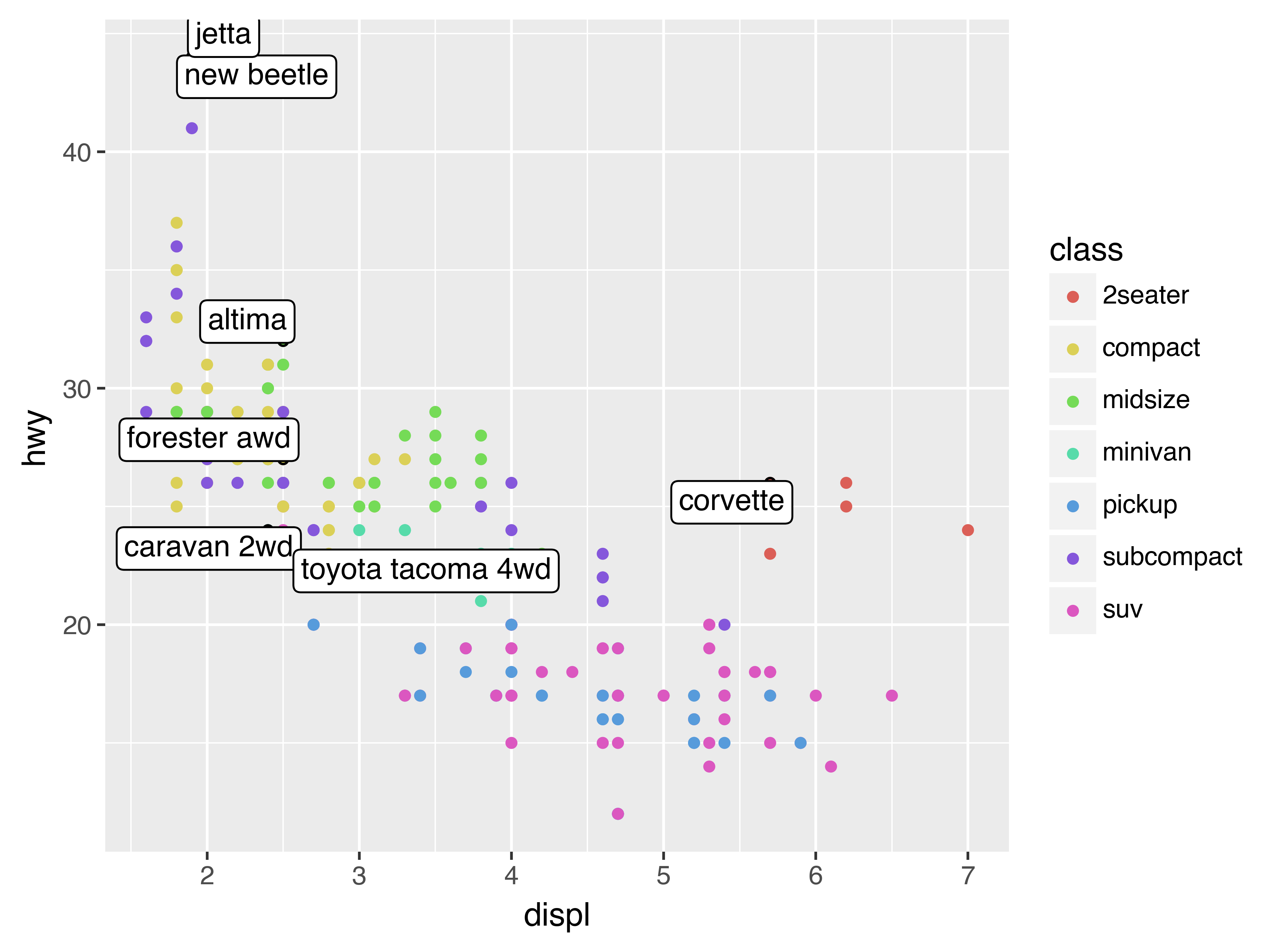
Note another handy technique used here: I added a second layer of large, hollow points to highlight the points that I’ve labelled.
You can sometimes use the same idea to replace the legend with labels placed directly on the plot. It’s not wonderful for this plot, but it isn’t too bad.[7]
(theme(legend_position="none") turns the legend off — we’ll talk about it more shortly.)
class_avg = (
    mpg
    .group_by("class").agg(
        pl.col("displ", "hwy").median()
    )
)

(
    ggplot(mpg, aes("displ", "hwy", colour="class"))
    + geom_point()
    + geom_label(aes(label="class"), data=class_avg, size=16, label_size=0,
                 adjust_text={'expand_points': (0, 0)})
    + geom_point()
    + theme(legend_position="none")
)
Looks like you are using a tranform that doesn't support FancyArrowPatch, using ax.annotate instead. The arrows might strike through texts. Increasing shrinkA in arrowprops might help.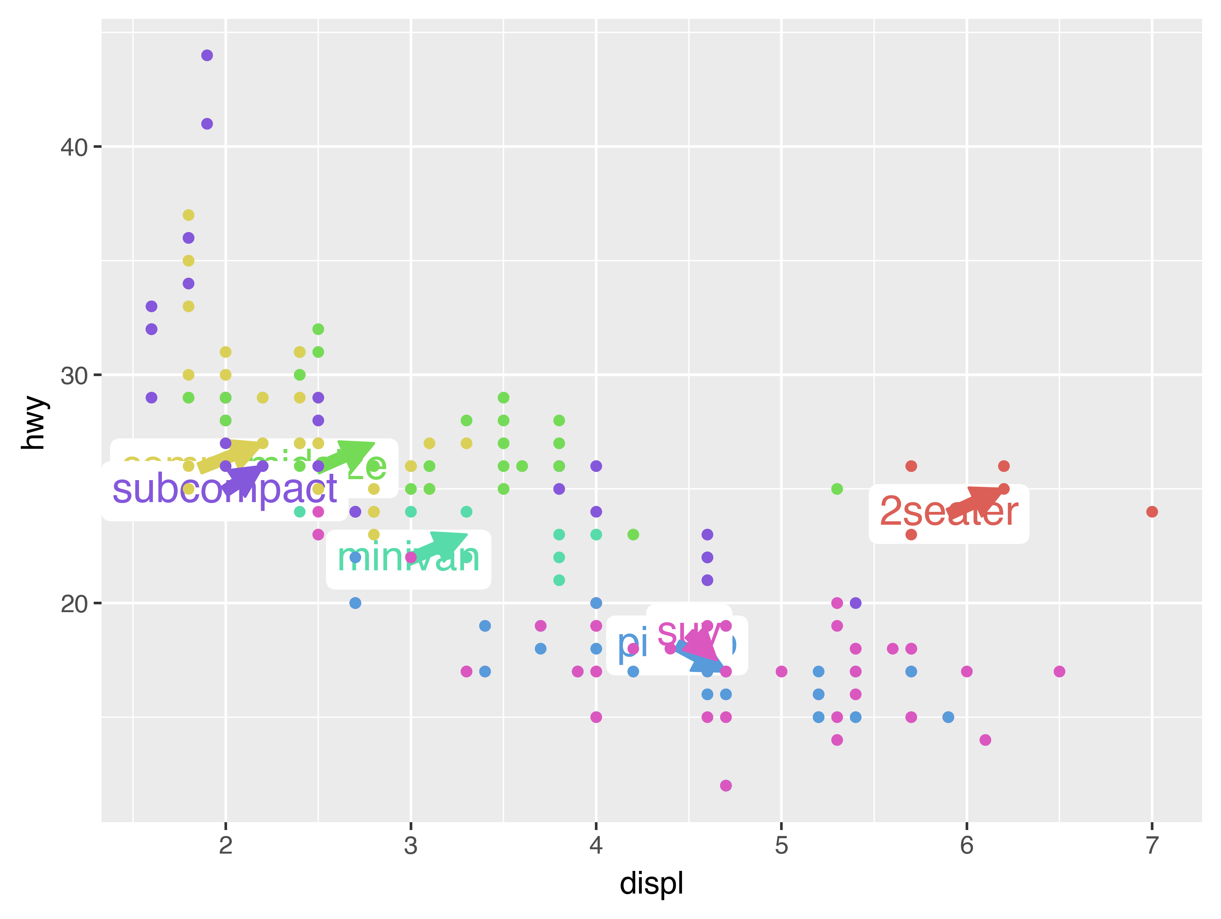
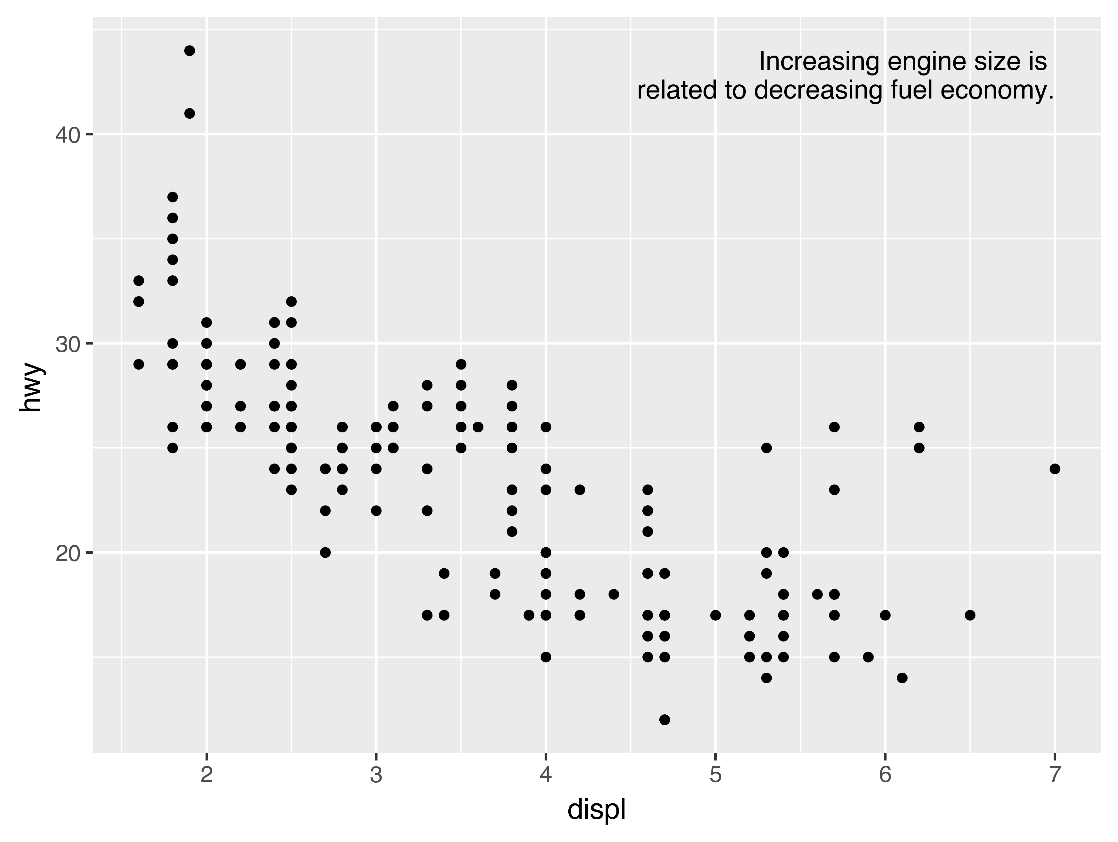
Alternatively, you might just want to add a single label to the plot, but you’ll still need to create a DataFrame. Often, you want the label in the corner of the plot, so it’s convenient to create a new DataFrame using pl.DataFrame() and max() to compute the maximum values of x and y.
label = pl.DataFrame({"displ": [mpg.get_column("displ").max()],
                      "hwy": [mpg.get_column("hwy").max()],
                      "label": ("Increasing engine size is \n"
                                "related to decreasing fuel economy.")})

(
    ggplot(mpg, aes("displ", "hwy"))
    + geom_point()
    + geom_text(aes(label="label"), data=label, va="top", ha="right")
)
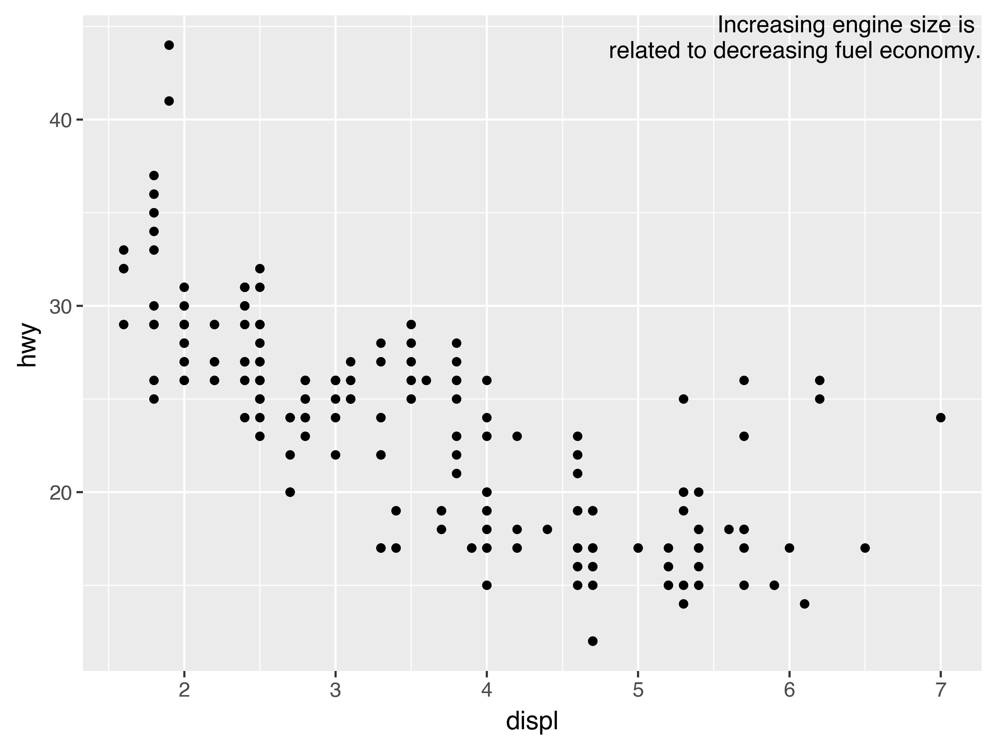
If you want to place the text exactly on the borders of the plot, you can use +np.Inf and -np.Inf:
label = pl.DataFrame({"displ": [np.inf],
                      "hwy": [np.inf],
                      "label": ("Increasing engine size is \n"
                                "related to decreasing fuel economy.")})

(
    ggplot(mpg, aes("displ", "hwy"))
    + geom_point()
    + geom_text(aes(label="label"), data=label, va="top", ha="right")
)
In these examples, I manually broke the label up into lines using "\n". Another approach is to use the fill function from the textwrap module to automatically add line breaks, given the number of characters you want per line:
from textwrap import fill

print(fill("Increasing engine size is related to decreasing fuel economy.", width=40))
Increasing engine size is related to
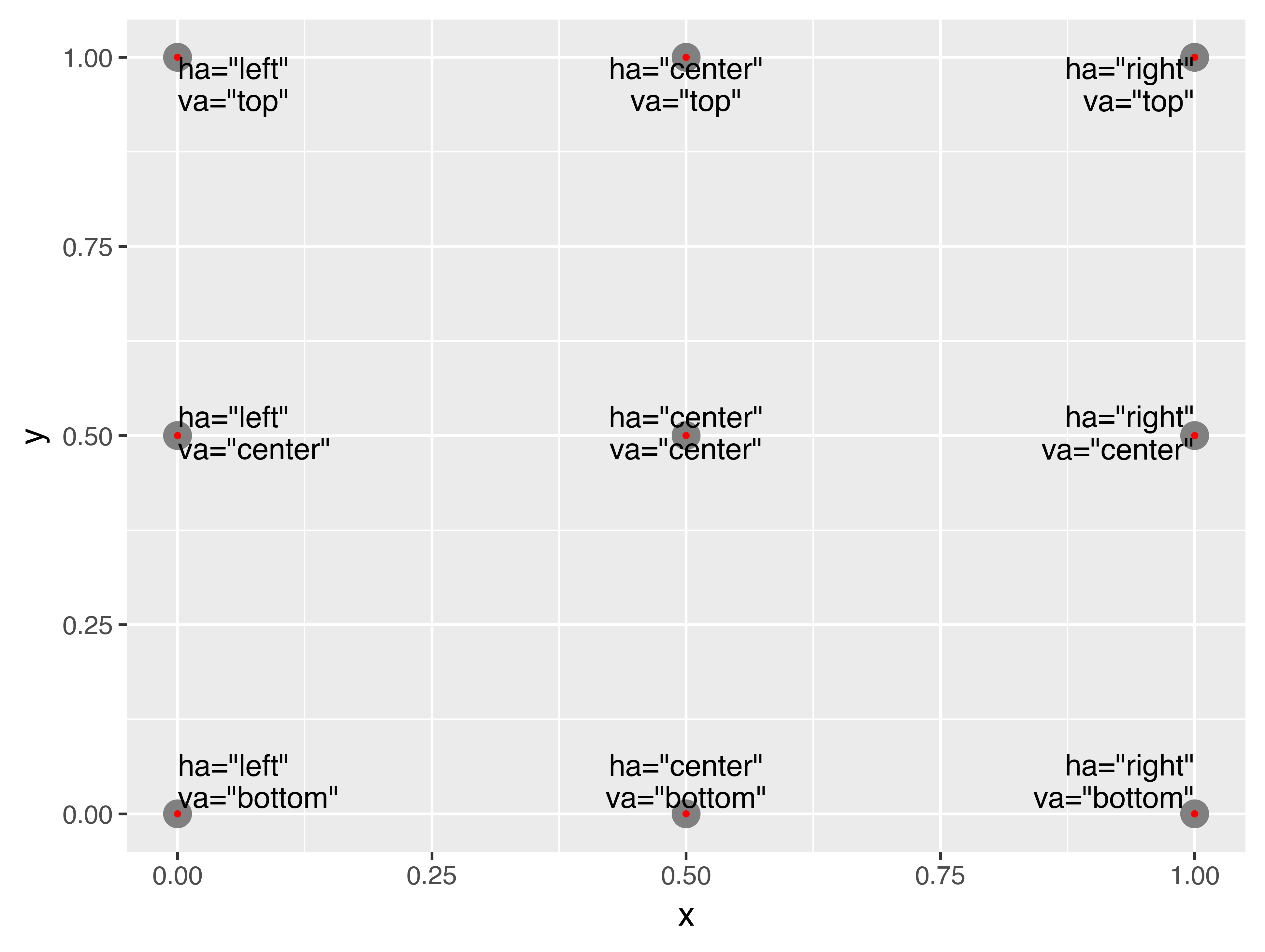
decreasing fuel economy.Note the use of ha and va to control the alignment of the label. The figure below shows all nine possible combinations.
Remember, in addition to geom_text(), you have many other geoms in plotnine available to help annotate your plot. A few ideas:
-
Use
geom_hline()andgeom_vline()to add reference lines. I often make them thick (size=2) and white (colour="white"), and draw them underneath the primary data layer. That makes them easy to see, without drawing attention away from the data. -
Use
geom_rect()to draw a rectangle around points of interest. The boundaries of the rectangle are defined by aestheticsxmin,xmax,ymin,ymax. -
Use
geom_segment()with thearrowargument to draw attention to a point with an arrow. Use aestheticsxandyto define the starting location, andxendandyendto define the end location.
The only limit is your imagination (and your patience with positioning annotations to be aesthetically pleasing)!
28.3.1 Exercises
-
Use
geom_text()with infinite positions to place text at the four corners of the plot. -
Read the documentation for
annotate(). How can you use it to add a text label to a plot without having to create a DataFrame? -
How do labels with
geom_text()interact with faceting? How can you add a label to a single facet? How can you put a different label in each facet? (Hint: think about the underlying data.) -
What arguments to
geom_label()control the appearance of the background box? -
What are the four arguments to
arrow()? How do they work? Create a series of plots that demonstrate the most important options.
28.4 Scales
The third way you can make your plot better for communication is to adjust the scales. Scales control the mapping from data values to things that you can perceive. Normally, plotnine automatically adds scales for you. For example, when you type:
(
    ggplot(mpg, aes("displ", "hwy"))
    + geom_point(aes(colour="class"))
)
plotnine automatically adds default scales behind the scenes:
(
    ggplot(mpg, aes("displ", "hwy"))
    + geom_point(aes(colour="class"))
    + scale_x_continuous()
    + scale_y_continuous()
    + scale_colour_discrete()
)
Note the naming scheme for scales: scale_ followed by the name of the aesthetic, then _, then the name of the scale. The default scales are named according to the type of variable they align with: continuous, discrete, datetime, or date. There are lots of non-default scales which you’ll learn about below.
The default scales have been carefully chosen to do a good job for a wide range of inputs. Nevertheless, you might want to override the defaults for two reasons:
-
You might want to tweak some of the parameters of the default scale. This allows you to do things like change the breaks on the axes, or the key labels on the legend.
-
You might want to replace the scale altogether, and use a completely different algorithm. Often you can do better than the default because you know more about the data.
28.4.1 Axis ticks and legend keys
There are two primary arguments that affect the appearance of the ticks on the axes and the keys on the legend: breaks and labels. Breaks controls the position of the ticks, or the values associated with the keys. Labels controls the text label associated with each tick/key. The most common use of breaks is to override the default choice:
(
    ggplot(mpg, aes("displ", "hwy"))
    + geom_point()
    + scale_y_continuous(breaks=range(15, 45, 5))
)
You can use labels in the same way (a list of strings the same length as breaks), but you can also suppress the labels altogether by passing a list of empty strings. This is useful for maps, or for publishing plots where you can’t share the absolute numbers. Note that the list of labels needs to be of the same length as the list of values, so a helper function like no_labels is convenient[8]:
def no_labels(values):
    return [""] * len(values)

(
    ggplot(mpg, aes("displ", "hwy"))
    + geom_point()
    + scale_x_continuous(labels=no_labels)
    + scale_y_continuous(labels=no_labels)
)
You can also use breaks and labels to control the appearance of legends. Collectively axes and legends are called guides. Axes are used for x and y aesthetics; legends are used for everything else.
Another use of breaks is when you have relatively few data points and want to highlight exactly where the observations occur. For example, take this plot that shows when each US president started and ended their term.
presidential = pl.from_pandas(data.presidential).with_row_index("id", 34)

(
    ggplot(presidential, aes("start", "id"))
    + geom_point()
    + geom_segment(aes(xend="end", yend="id"))
    + scale_x_date(name="", breaks=presidential.get_column("start").to_list(),
                   date_labels="'%y")
)
Note that the specification of breaks and labels for date and datetime scales is a little different:
-
date_labelstakes a format specification, in the same form astime.strptime(). -
date_breaks(not shown here), takes a string like “2 days” or “1 month”.
28.4.2 Legend layout
You will most often use breaks and labels to tweak the axes. While they both also work for legends, there are a few other techniques you are more likely to use.
To control the overall position of the legend, you need to use a theme() setting. We’ll come back to themes at the end of the chapter, but in brief, they control the non-data parts of the plot. The theme setting legend_position controls where the legend is drawn. Unfortunately, in order to position the legend correctly on the left or the bottom, we have to be a bit more explicit. Just using “left” and “bottom” may cause the legend to overlap the axis labels. Your milage may vary.
base = ggplot(mpg, aes("displ", "hwy")) +\
geom_point(aes(colour="class"))

base + theme(legend_position="right") # the default
base + theme(subplots_adjust={'left': 0.3}) + theme(legend_position=(0, 0.5))
base + theme(legend_position="top")
base + theme(subplots_adjust={'bottom': 0.3}, legend_position=(.5, 0),
             legend_direction='horizontal')
You can also use legend_position="none" to suppress the display of the legend altogether.
To control the display of individual legends, use guides() along with guide_legend() or guide_colourbar(). The following example shows two important settings: controlling the number of rows the legend uses with nrow, and overriding one of the aesthetics to make the points bigger. This is particularly useful if you have used a low alpha to display many points on a plot.
(
    ggplot(mpg, aes("displ", "hwy"))
    + geom_point(aes(colour="class"))
    + geom_smooth(se=False)
    + theme(legend_position="bottom")
    + guides(colour=guide_legend(nrow=1, override_aes={"size": 4}))
)
28.4.3 Replacing a scale
Instead of just tweaking the details a little, you can instead replace the scale altogether. There are two types of scales you’re mostly likely to want to switch out: continuous position scales and colour scales. Fortunately, the same principles apply to all the other aesthetics, so once you’ve mastered position and colour, you’ll be able to quickly pick up other scale replacements.
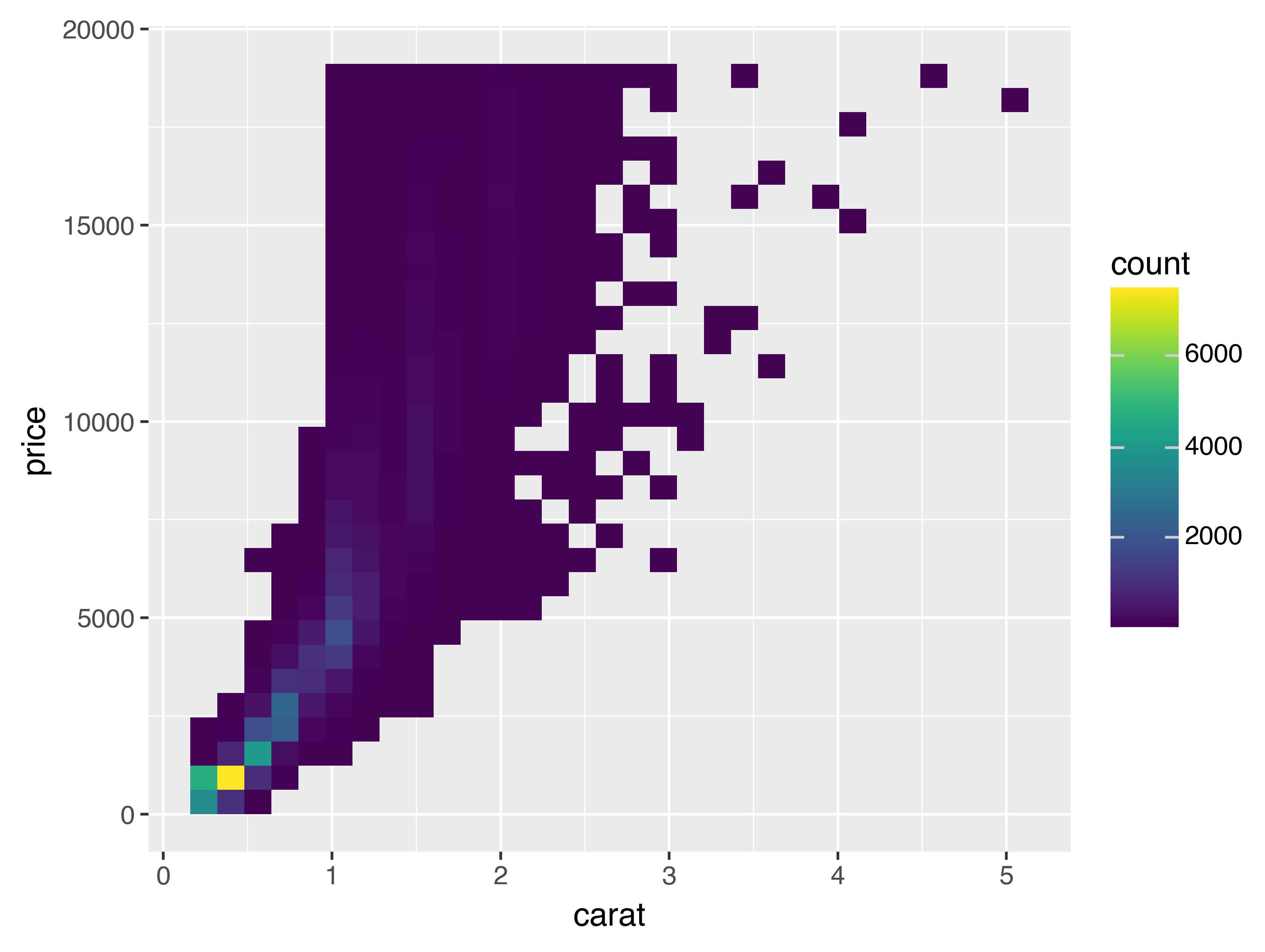
It’s very useful to plot transformations of your variable. For example, with the diamonds DataFrame, it’s easier to see the precise relationship between carat and price if we log transform them:
(
    ggplot(diamonds, aes("carat", "price"))
    + geom_bin2d()
)

(
    ggplot(diamonds, aes("np.log10(carat)", "np.log10(price)"))
    + geom_bin2d()
)

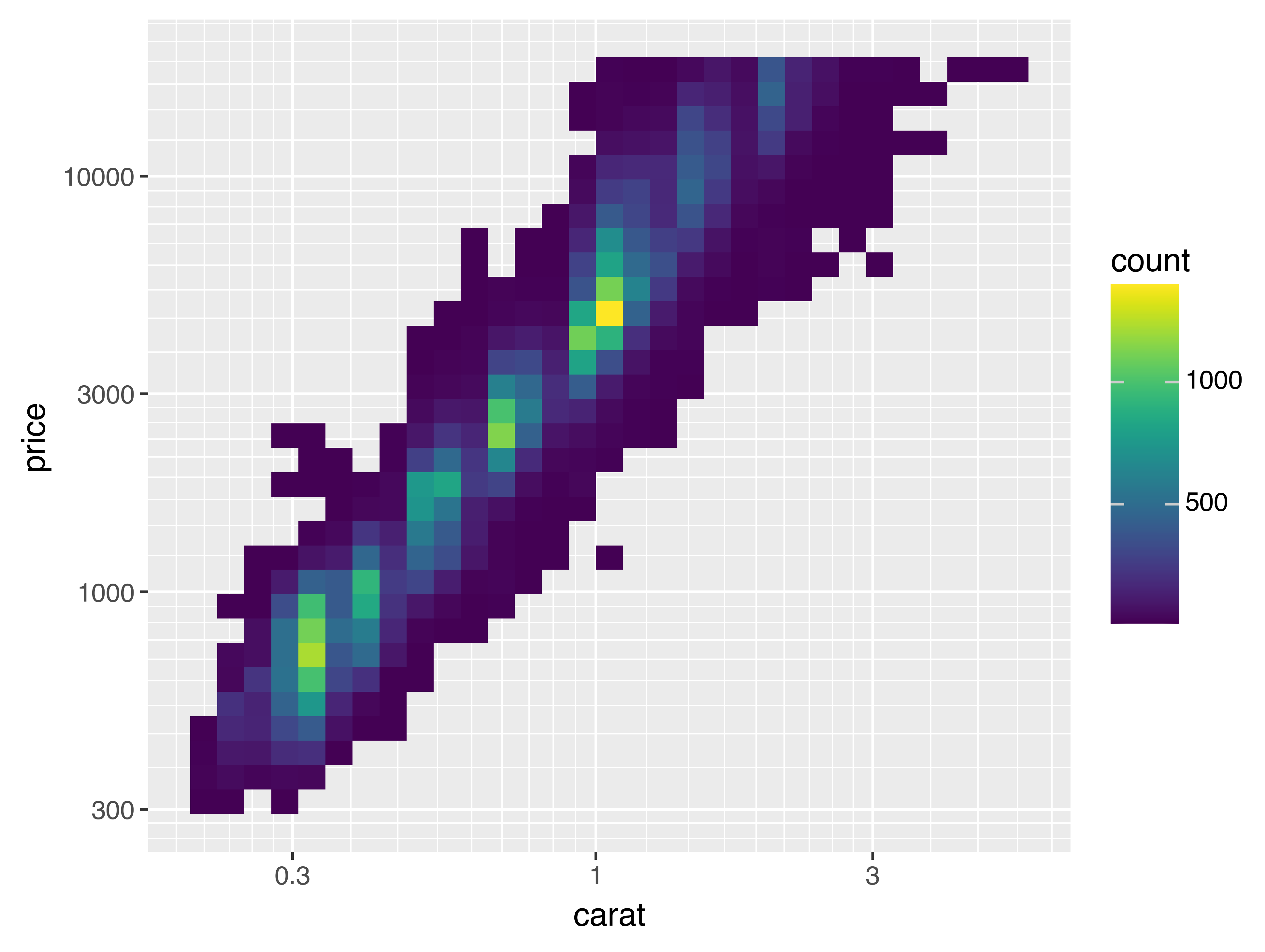
However, the disadvantage of this transformation is that the axes are now labelled with the transformed values, making it hard to interpret the plot. Instead of doing the transformation in the aesthetic mapping, we can instead do it with the scale. This is visually identical, except the axes are labelled on the original data scale.
(
    ggplot(diamonds, aes("carat", "price"))
    + geom_bin2d()
    + scale_x_log10()
    + scale_y_log10()
)
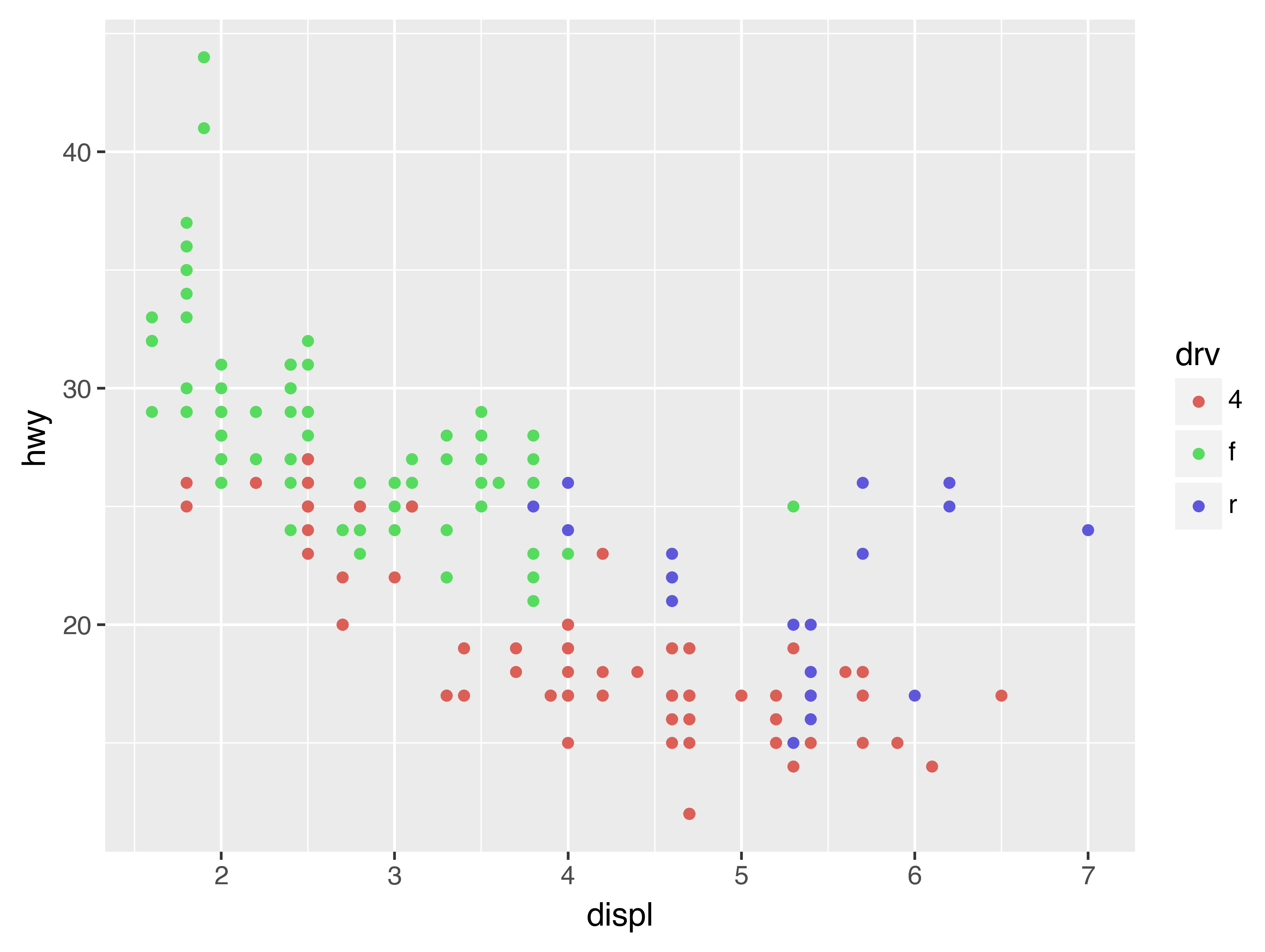
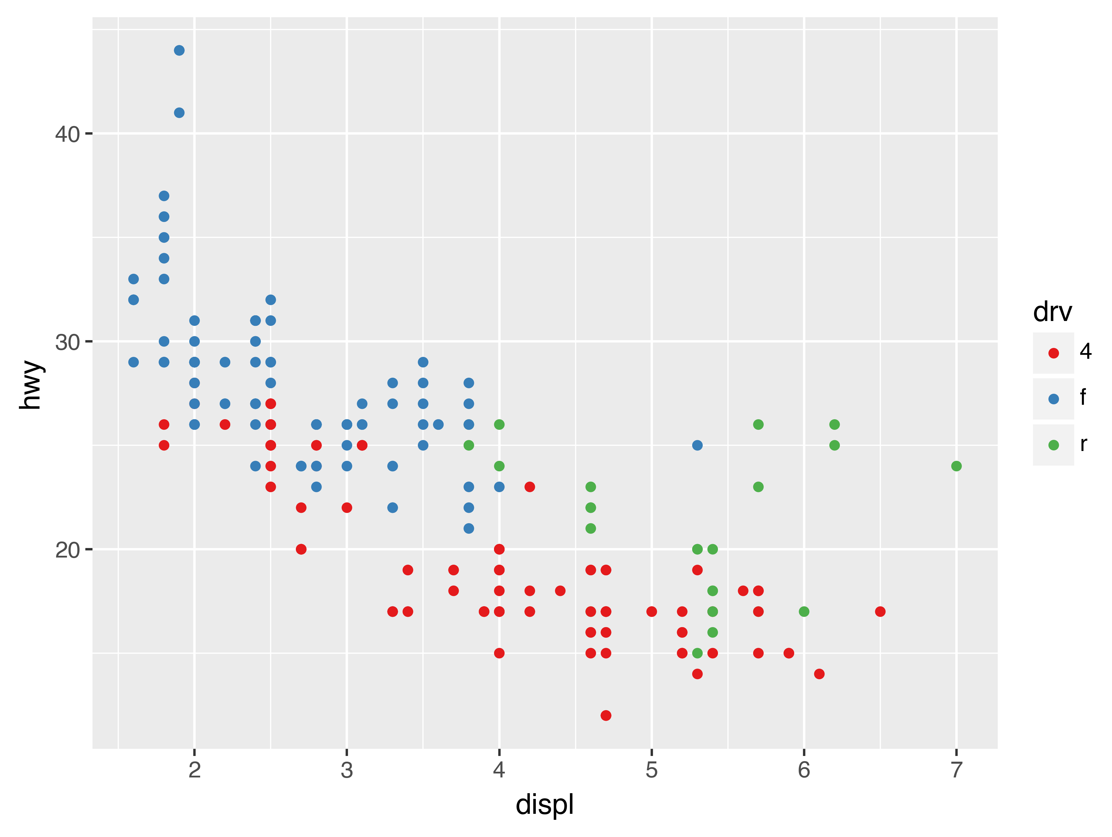
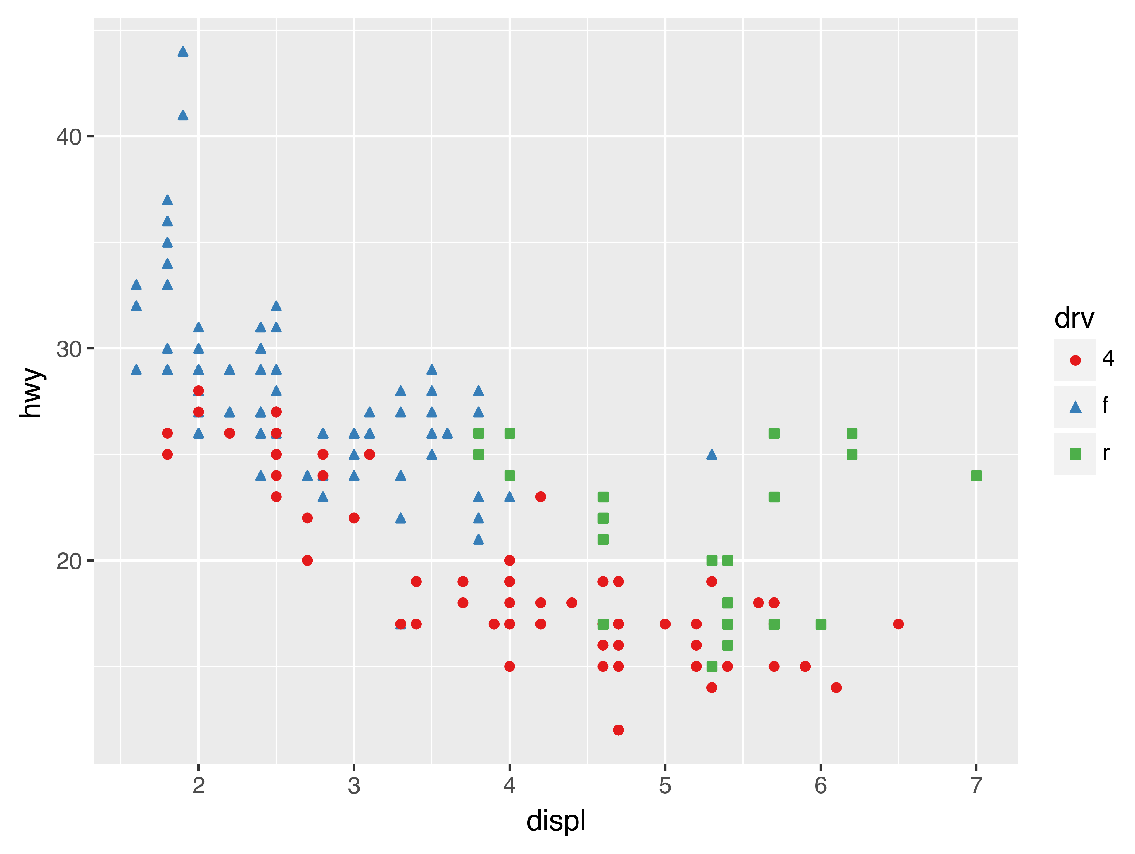
Another scale that is frequently customised is colour. The default categorical scale picks colours that are evenly spaced around the colour wheel. Useful alternatives are the ColorBrewer scales which have been hand tuned to work better for people with common types of colour blindness. The two plots below look similar, but there is enough difference in the shades of red and green that the dots on the right can be distinguished even by people with red-green colour blindness.
(
    ggplot(mpg, aes("displ", "hwy"))
    + geom_point(aes(color="drv"))
)

(
    ggplot(mpg, aes("displ", "hwy"))
    + geom_point(aes(color="drv"))
    + scale_colour_brewer(type="qual", palette="Set1")
)
Don’t forget simpler techniques. If there are just a few colours, you can add a redundant shape mapping. This will also help ensure your plot is interpretable in black and white.
(
    ggplot(mpg, aes("displ", "hwy"))
    + geom_point(aes(color="drv", shape="drv"))
    + scale_colour_brewer(type="qual", palette="Set1")
)
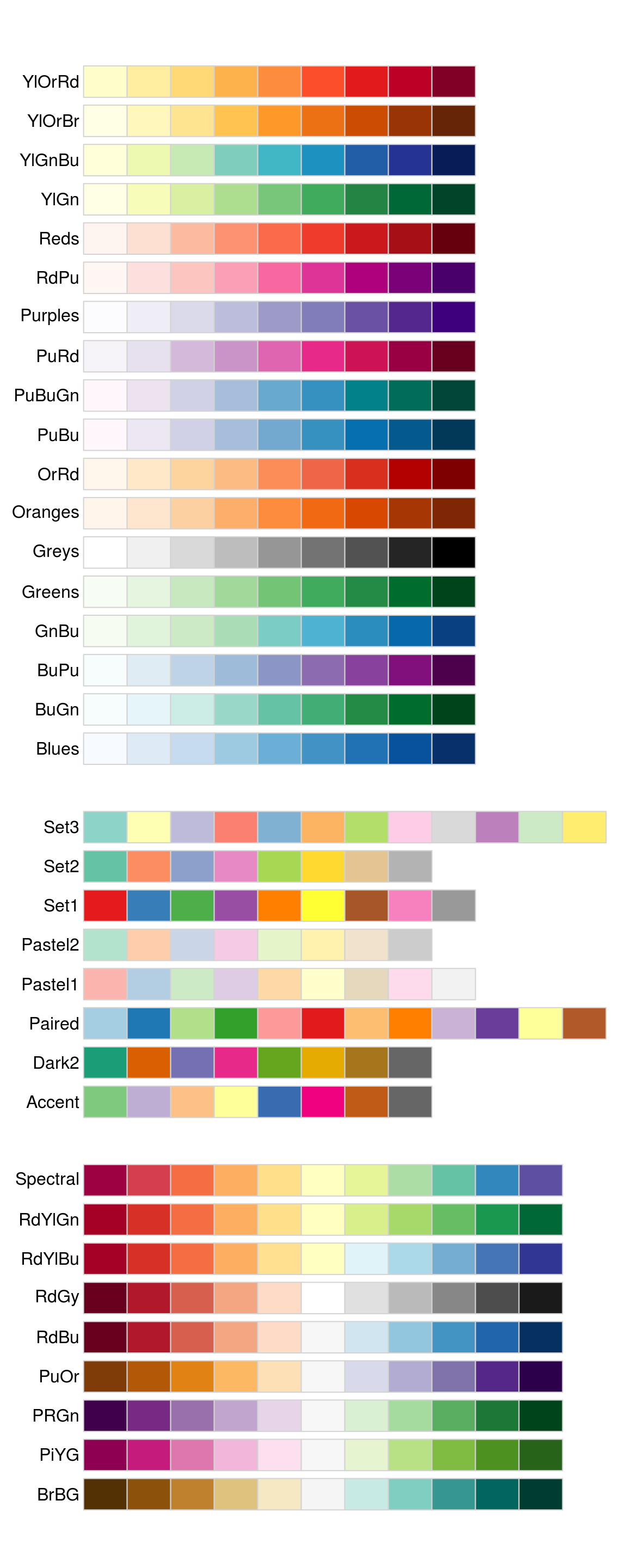
The ColorBrewer scales are documented online at http://colorbrewer2.org/ and made available in Python via the mizani package, by Hassan Kibirige.
The figure below shows the complete list of all palettes.
The sequential (top) and diverging (bottom) palettes are particularly useful if your categorical values are ordered, or have a “middle”.
This often arises if you’ve used Expr.cut() to make a continuous variable into a categorical variable.
When you have a predefined mapping between values and colours, use scale_colour_manual(). For example, if we map presidential party to colour, we want to use the standard mapping of red for Republicans and blue for Democrats:
(
    ggplot(presidential, aes("start", "id", colour="party"))
    + geom_point()
    + geom_segment(aes(xend="end", yend="id"))
    + scale_colour_manual(values=["red", "blue"], limits=["Republican", "Democratic"])
)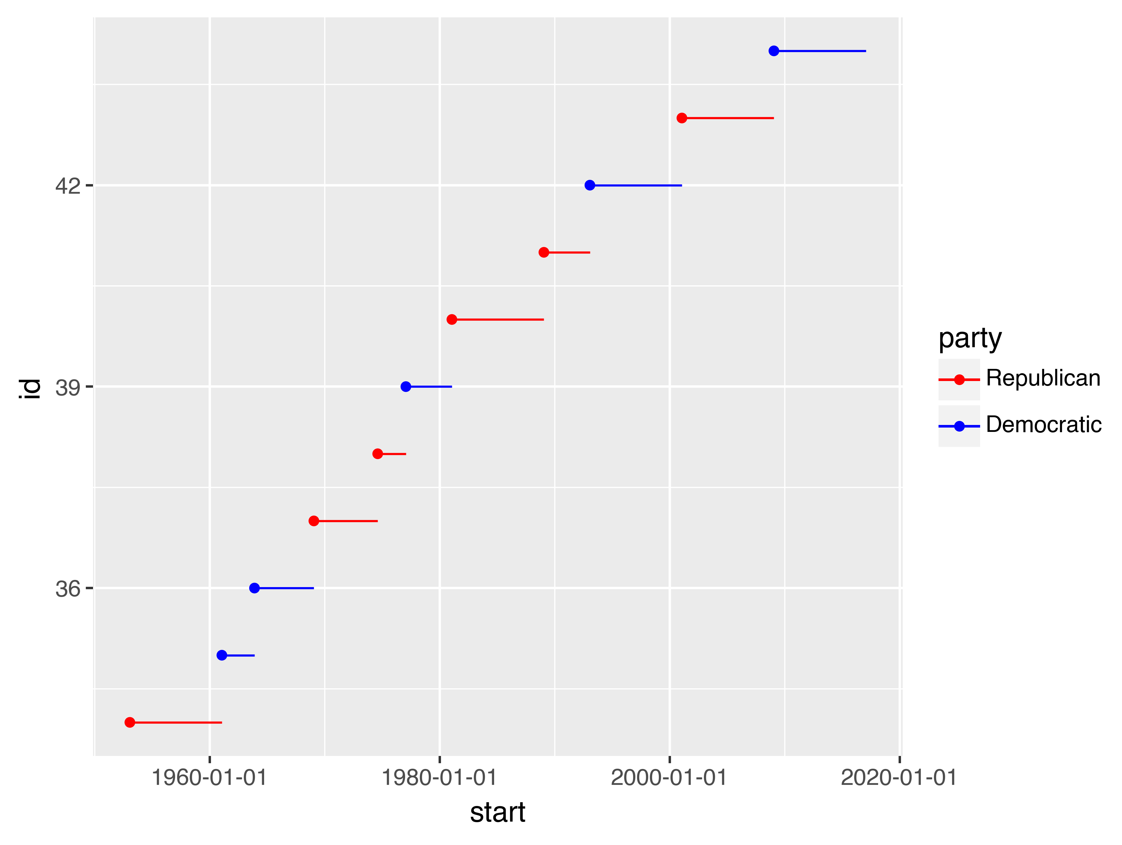
For continuous colour, you can use the built-in scale_colour_gradient() or scale_fill_gradient(). If you have a diverging scale, you can use scale_colour_gradient2(). That allows you to give, for example, positive and negative values different colours. That’s sometimes also useful if you want to distinguish points above or below the mean.
Note that all colour scales come in two variety: scale_colour_x() and scale_fill_x() for the colour and fill aesthetics respectively (the colour scales are available in both UK and US spellings).
28.4.4 Exercises
-
Why doesn’t the following code override the default scale?
( ggplot(df, aes("x", "y")) + geom_hex() + scale_colour_gradient(low="white", high="red") + coord_fixed() ) -
What is the first argument to every scale? How does it compare to
labs()? -
Change the display of the presidential terms by:
- Combining the two variants shown above.
- Improving the display of the y axis.
- Labelling each term with the name of the president.
- Adding informative plot labels.
- Placing breaks every 4 years (this is trickier than it seems!).
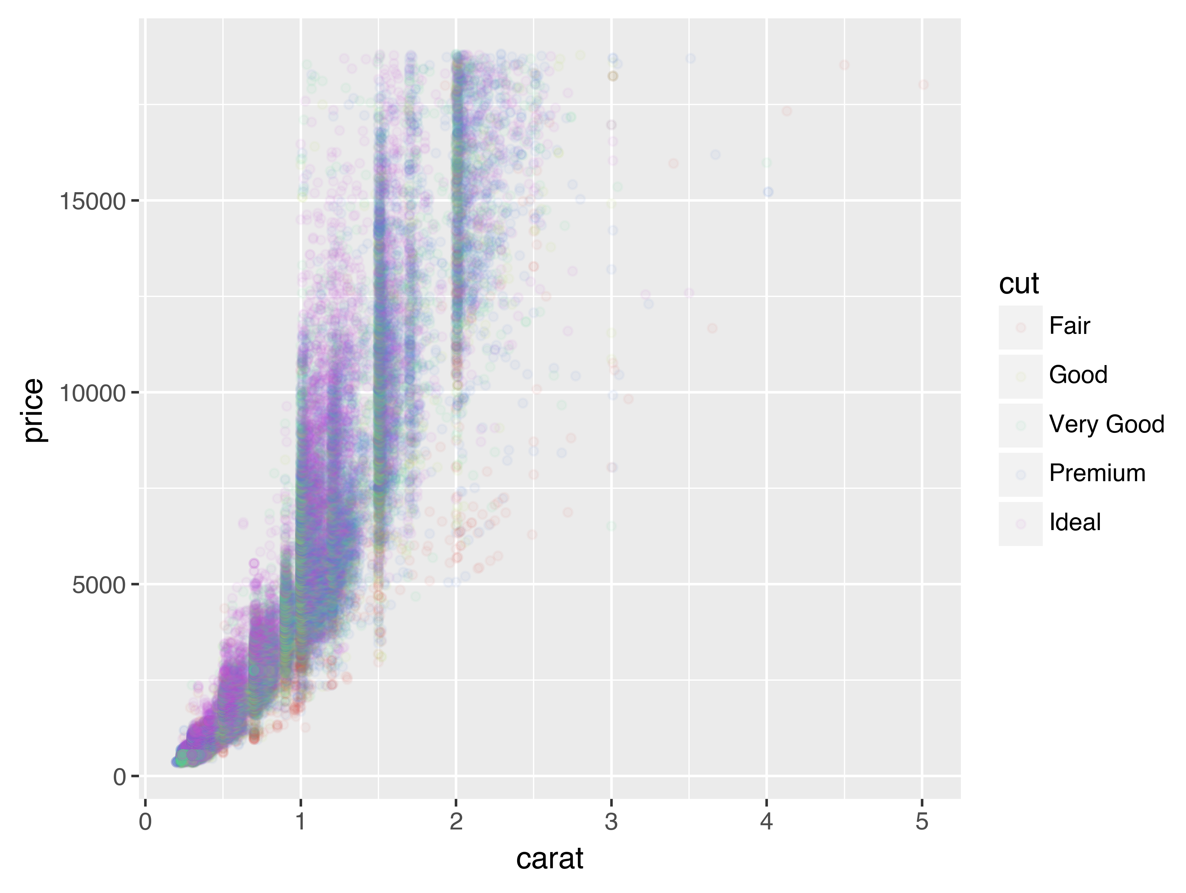
-
Use
override_aesto make the legend on the following plot easier to see.( ggplot(diamonds, aes("carat", "price")) + geom_point(aes(colour="cut"), alpha=1/20) )
28.5 Zooming
There are three ways to control the plot limits:
- Adjusting what data are plotted
- Setting the limits in each scale
- Setting
xlimandylimincoord_cartesian()
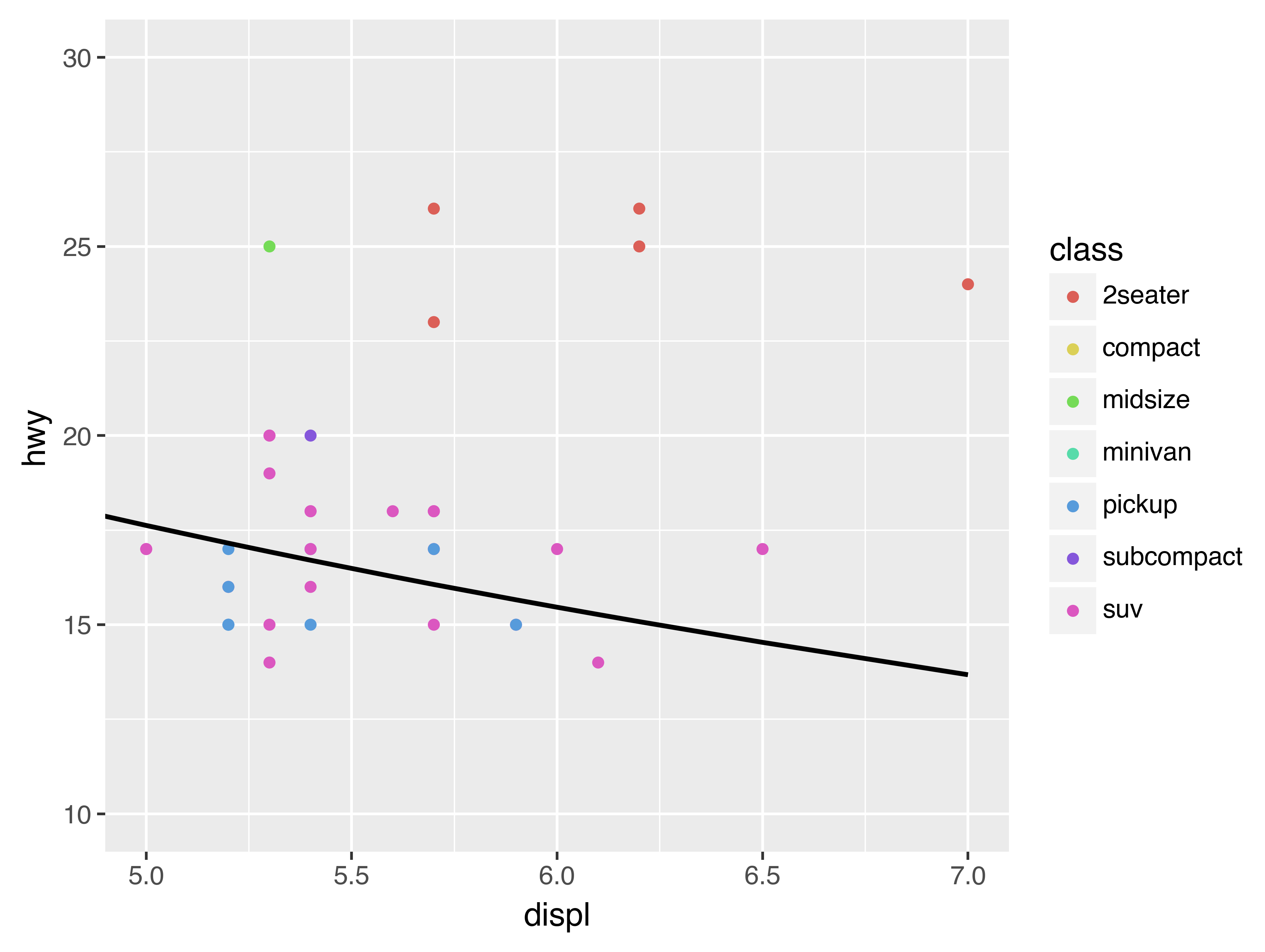
To zoom in on a region of the plot, it’s generally best to use coord_cartesian(). Compare the following two plots:
(
ggplot(mpg, aes("displ", "hwy"))
+ geom_point(aes(color="class"))
+ geom_smooth()
+ coord_cartesian(xlim=(5, 7), ylim=(10, 30))
)
(
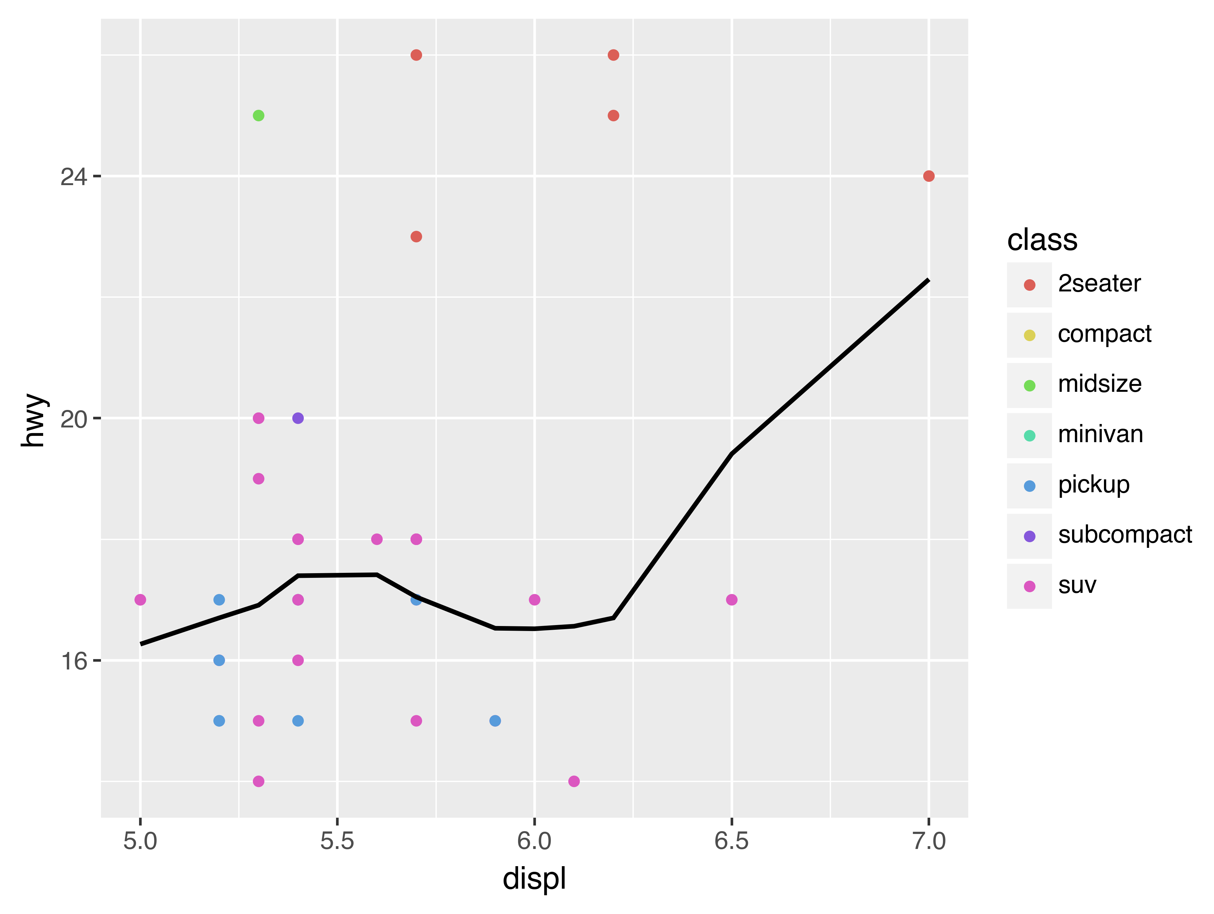
ggplot(mpg.filter(
pl.col("displ").is_between(5, 7),
pl.col("hwy").is_between(10, 30)
), aes("displ", "hwy"))
+ geom_point(aes(color="class"))
+ geom_smooth()
)
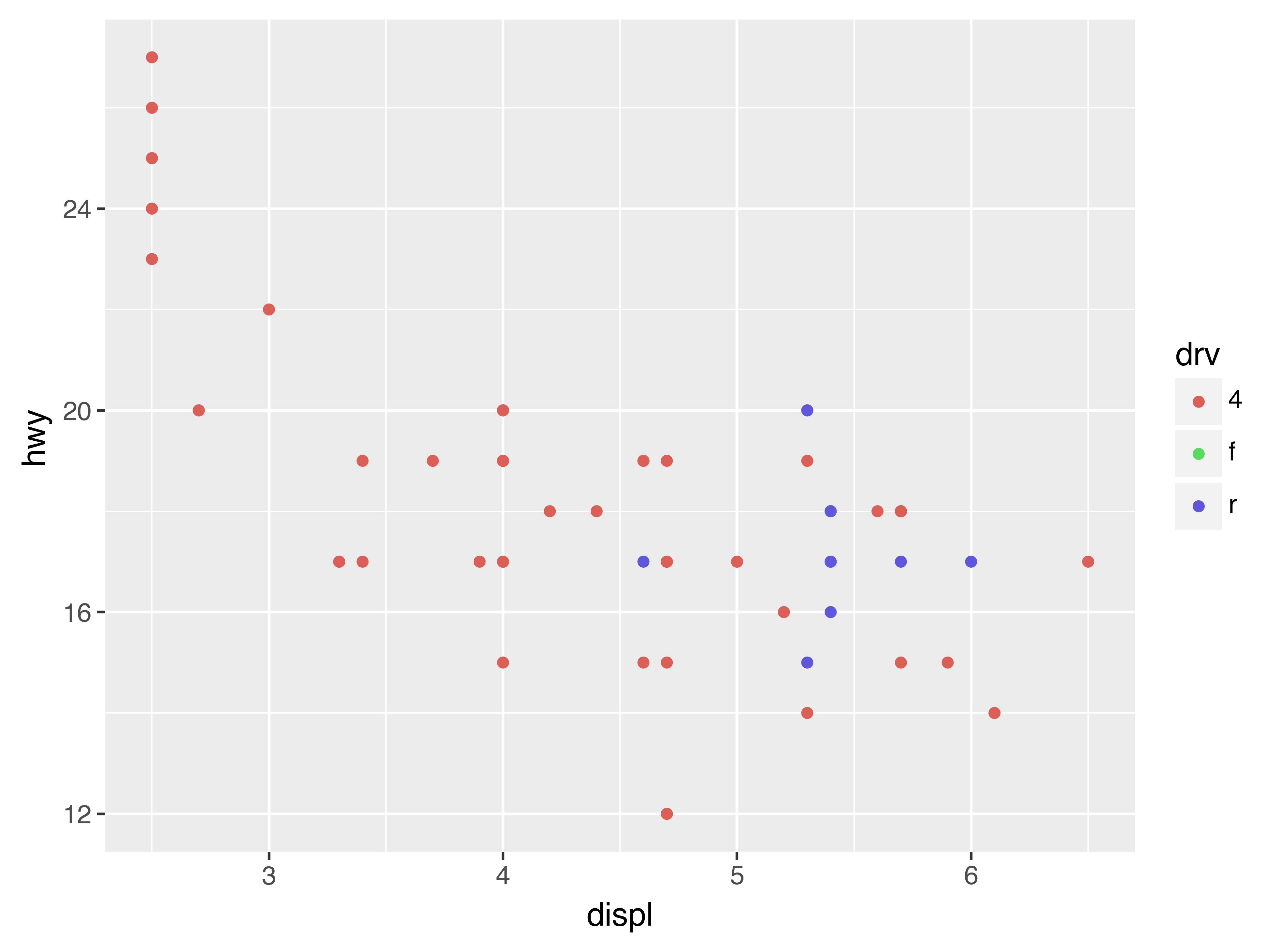
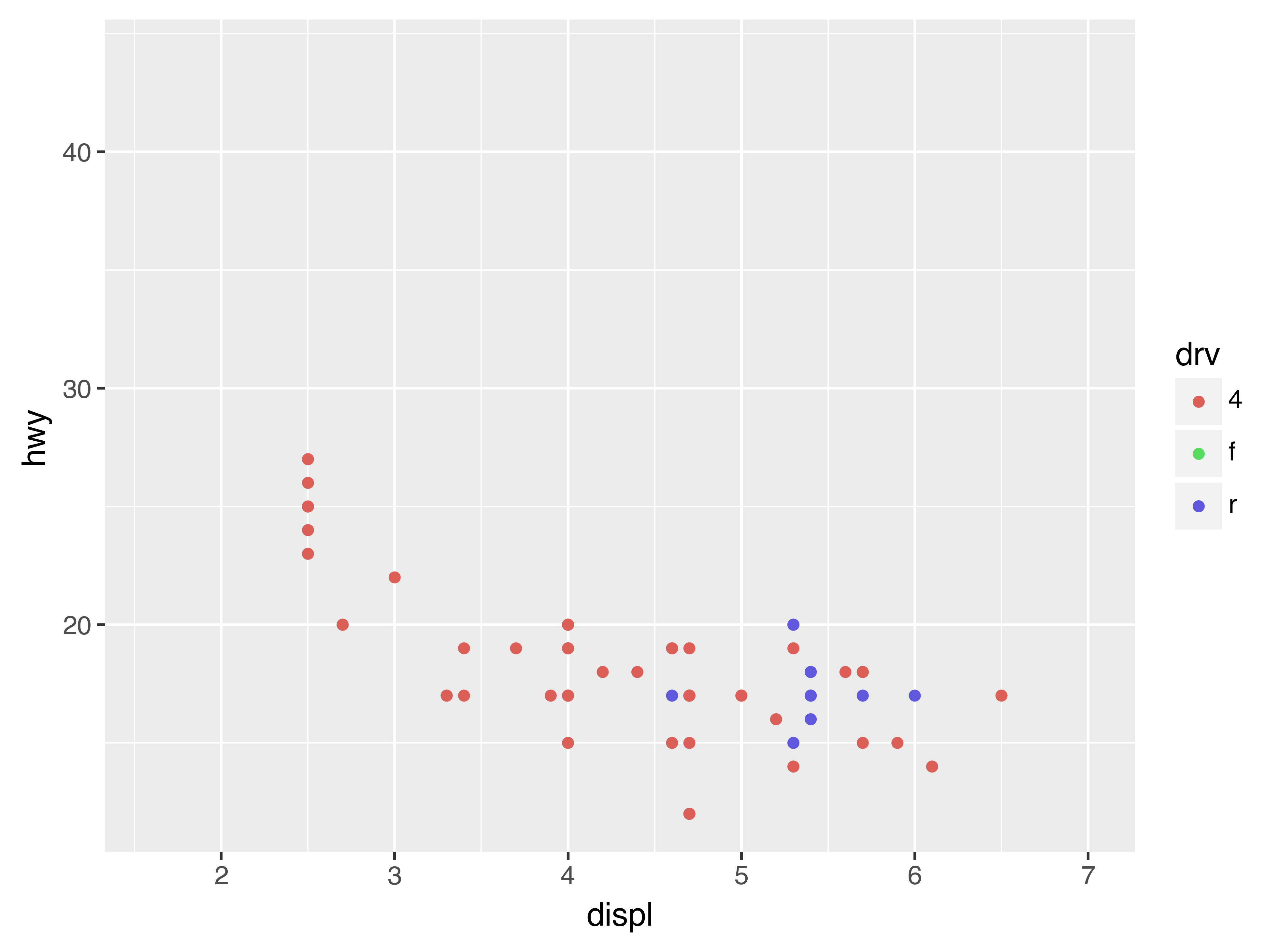
You can also set the limits on individual scales. Reducing the limits is basically equivalent to subsetting the data. It is generally more useful if you want expand the limits, for example, to match scales across different plots. For example, if we extract two classes of cars and plot them separately, it’s difficult to compare the plots because all three scales (the x-axis, the y-axis, and the colour aesthetic) have different ranges.
suv = mpg.filter(pl.col("class") == "suv")
compact = mpg.filter(pl.col("class") == "compact")

(
    ggplot(suv, aes("displ", "hwy", colour="drv"))
    + geom_point()
)

(
    ggplot(compact, aes("displ", "hwy", colour="drv"))
    + geom_point()
)
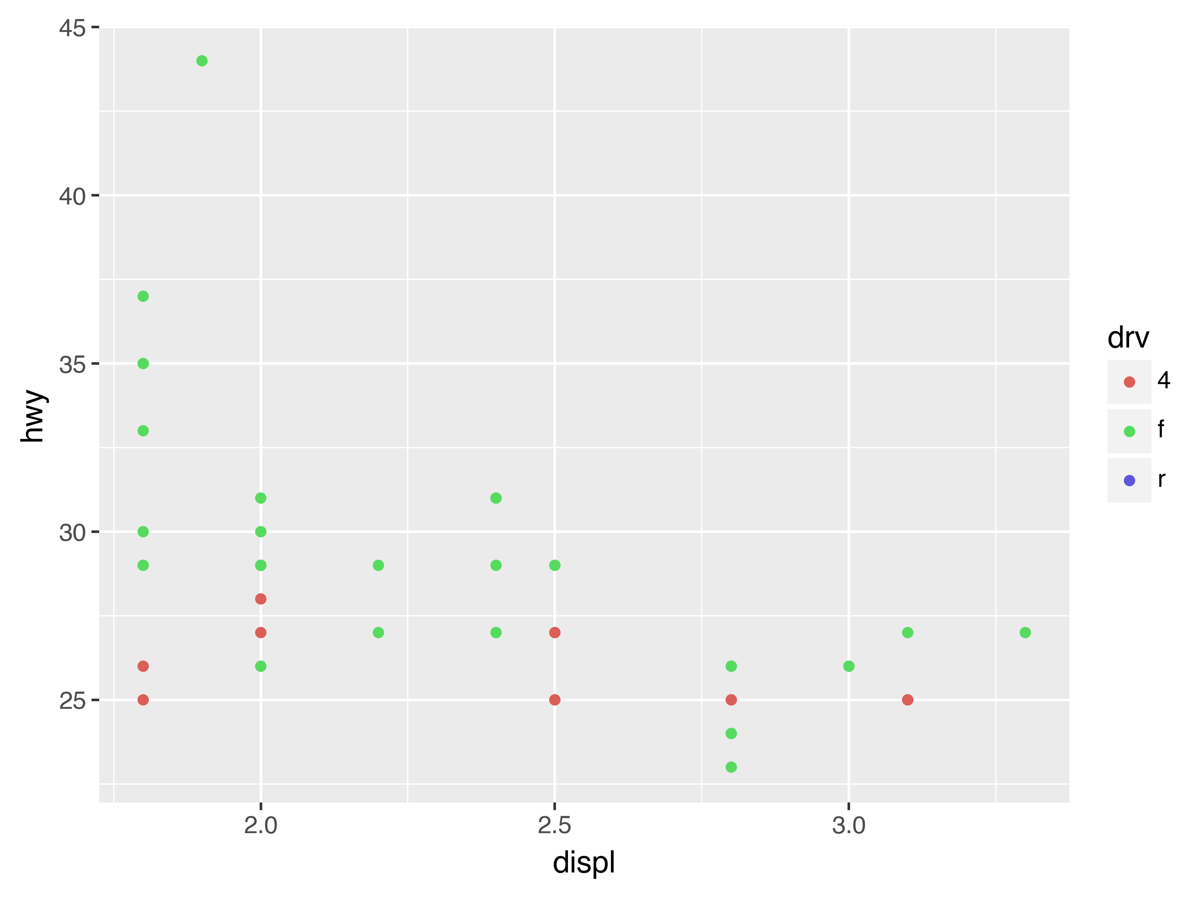
One way to overcome this problem is to share scales across multiple plots, training the scales with the limits of the full data.
x_scale = scale_x_continuous(limits=(
    mpg.get_column("displ").min(),
    mpg.get_column("displ").max()))
y_scale = scale_y_continuous(limits=(
    mpg.get_column("hwy").min(),
    mpg.get_column("hwy").max()))
col_scale = scale_colour_discrete(limits=mpg.get_column("drv").unique())

(
    ggplot(suv, aes("displ", "hwy", colour="drv"))
    + geom_point()
    + x_scale
    + y_scale
    + col_scale
)

(
    ggplot(compact, aes("displ", "hwy", colour="drv"))
    + geom_point()
    + x_scale
    + y_scale
    + col_scale
)
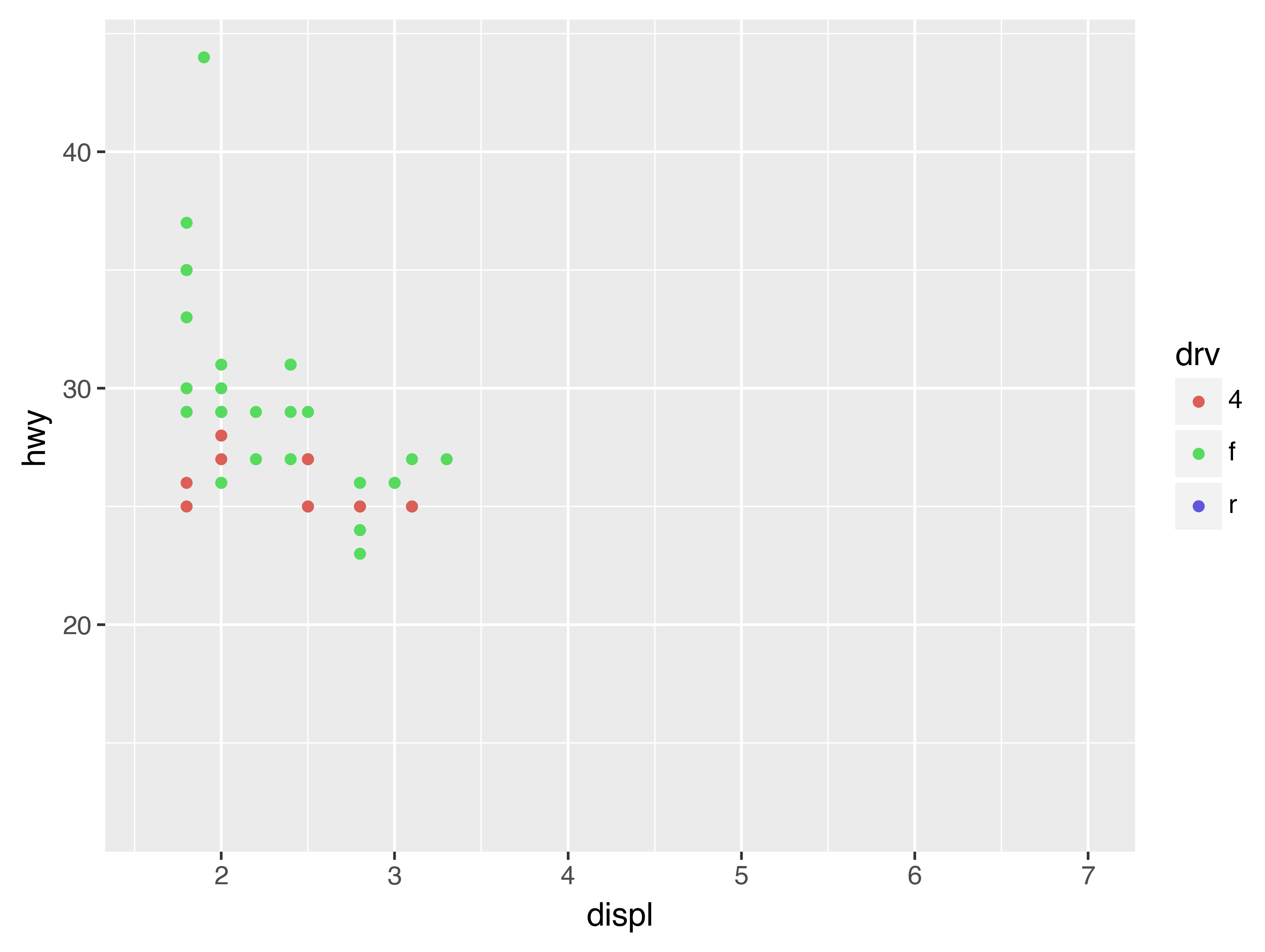
In this particular case, you could have simply used faceting, but this technique is useful more generally, if for instance, you want spread plots over multiple pages of a report.
28.6 Themes
Finally, you can customise the non-data elements of your plot with a theme:
(
    ggplot(mpg, aes("displ", "hwy"))
    + geom_point(aes(color="class"))
    + geom_smooth(se=False)
    + theme_xkcd()
)
plotnine includes twelve themes by default. The figure below shows eight of those. The documentation lists all available themes.
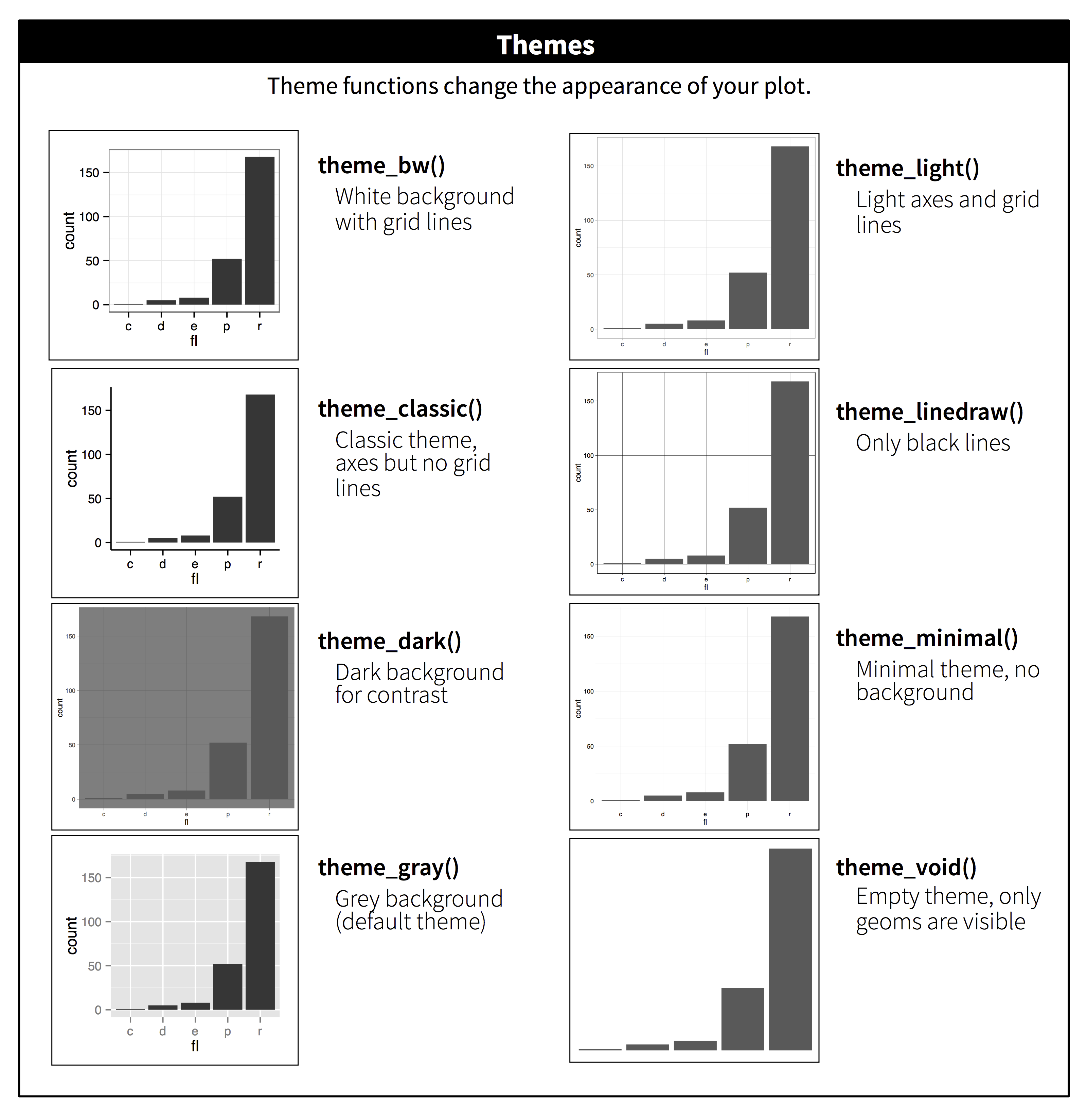
Many people wonder why the default theme has a grey background. This was a deliberate choice because it puts the data forward while still making the grid lines visible. The white grid lines are visible (which is important because they significantly aid position judgements), but they have little visual impact and we can easily tune them out. The grey background gives the plot a similar typographic colour to the text, ensuring that the graphics fit in with the flow of a document without jumping out with a bright white background. Finally, the grey background creates a continuous field of colour which ensures that the plot is perceived as a single visual entity.
It’s also possible to control individual components of each theme, like the size and colour of the font used for the y axis. Unfortunately, this level of detail is outside the scope of this book, so you’ll need to read the ggplot2 book for the full details. You can also create your own themes, if you are trying to match a particular corporate or journal style.
28.7 Saving your plots
The best way to get your plots out of Python and into your final write-up[9]
is with the .save() method. There’s also the ggsave() function, but the plotnine documentation doesn’t recommend using this. The .save() method will save the plot to disk. In a Jupyter Notebook you can refer to the last returned value using _. Alternatively you first assing your plot to a variable.
ggplot(mpg, aes("displ", "hwy")) + geom_point()
_.save("my-plot.pdf")If you don’t specify the width and height they will be set to 6.4 and 4.8 inches, respectively. If you don’t specify filename, plotnine will generate one for you, e.g., “plotnine-save-297120101.pdf”. For reproducible code, you’ll want to specify them. You can learn more about the .save() method in the documentation.
28.7.1 Figure sizing
It can be a challenge to get your figure in the right size and shape. There are four options that control figure sizing: width, height, units, and dpi.
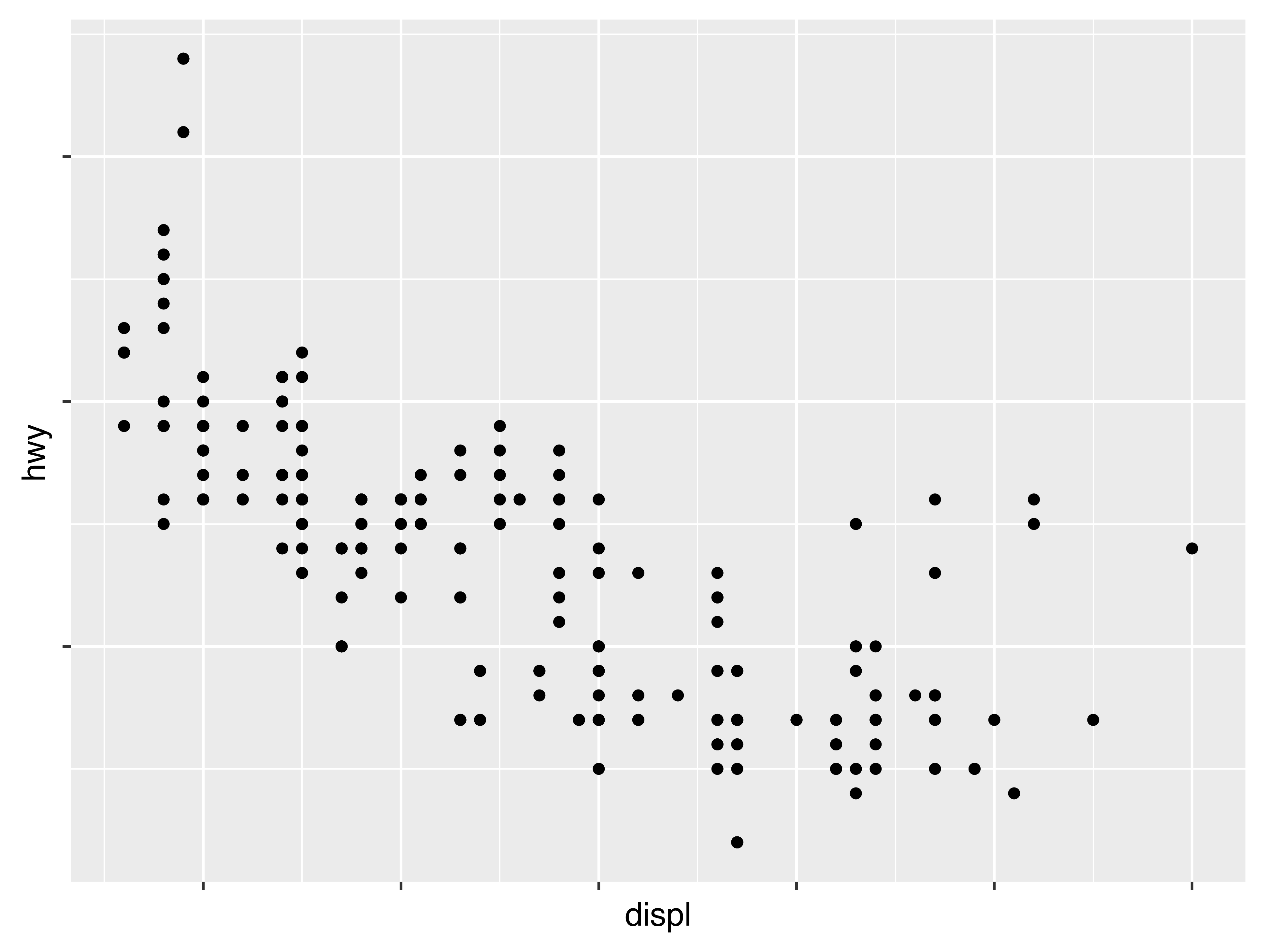
If you find that you’re having to squint to read the text in your plot, you need to tweak width and height. If the width is larger than the size the figure is rendered in the final doc, the text will be too small; if width is smaller, the text will be too big. You’ll often need to do a little experimentation to figure out the right ratio between the width and the eventual width in your document. To illustrate the principle, the following three plots have width of 4, 6, and 8 respectively (and a height which is 0.618 times the width, i.e., the golden ratio):


28.8 Learning more
The absolute best place to learn more is the ggplot2 book: ggplot2: Elegant graphics for data analysis. It goes into much more depth about the underlying theory, and has many more examples of how to combine the individual pieces to solve practical problems. Unfortunately, the book is not available online for free, although you can find the source code at https://github.com/hadley/ggplot2-book.
Footnotes
There have been other attempts at porting ggplot2 to Python, such as ggpy, but as far as I know, these are no longer maintained. ↩︎
If you ever need to translate ggplot2 to plotnine yourself, check out my follow-up post containing heuristics for doing so. ↩︎
It’s important to note that this tutorial is not meant to compare Python and R. The never-ending flame wars between these two languages are boring and unproductive. ↩︎
While it’s generally considered to be bad practice to import everything into the global namespace, I think it’s fine to do this in an ad-hoc environment such as a notebook as it makes using the many functions plotnine provides more convenient. An additional advantage is that the resulting code more closely resembles the original ggplot2 code. Alternatively, it’s quite common to
import plotnine as p9and prefix every function withp9.. ↩︎The original text has an additional exercise that contains code which is semantically wrong on purpose, but in plotnine, the corresponding code is also syntactically wrong. The reason is that in plotnine, you can only use column names in the aesthetic mapping and not literal values, e.g.,
aes(color="blue"). ↩︎ggplot2 also has
coord_quickmap()for producing maps with the correct aspect ratio andcoord_polar()for using polar coordinates. plotnine doesn’t yet have these two functions. ↩︎We have to use
geom_point()twice here because of an issue with the adjustText package. ↩︎In ggplot2 you can write
labels = NULLso you don’t need a helper function. ↩︎The original text discusses how to include your plot in R Markdown. While it’s possible to include Python code and graphics in an R Markdown document through the
reticulatepackage, like this tutorial demonstrates, it’s beyond the scope of this text. If you’re interested, you can have a look at the Github repository related to this tutorial, which includes the .Rmd source. ↩︎
Would you like to receive an email whenever I have a new blog post, organize an event, or have an important announcement to make? Sign up to my newsletter: